art

630 readers
1 users here now

Wecome to the art community of solarpunk, where we host any and all forms of art related to solarpunk!

Remember to follow the instance rules when interacting, and also:

-Cite the author whenever possible, or state it as unknown when unsure.

-This is an art community, for other aesthetic related things, check out our sister community /c/aesthetic.

-Keep it SFW.

Hope you enjoy your time here! :D

As a last thing, kindly reminder that solarpunk is not just a form of artwork/aesthetic, but also a mindset and a movemet. For more on this, you can check our community /c/solarpunk.

Icon artwork by tk-sketches

Banner artwork by 六七質

founded 2 years ago
MODERATORS
76
33
submitted 1 year ago* (last edited 1 year ago) by j_roby to c/art


nobonzo.com

77
8
submitted 1 year ago* (last edited 1 year ago) by JacobCoffinWrites to c/art


I’ve been thinking a lot about how lifestyles, routines, and the overall pace of life might be different in a more solarpunk society. That, combined with some recent discussions and research into solar cookers made me want to try a scene of a solarpunk kitchen.

Specifically, I decided to render a summer kitchen, a fixture of old farmhouses around here, usually slung between the house and the barn, just a place where you could cook without heating up the rest of the house. They fell out of favor as stoves got more efficient, and they're a luxury for people with lots of space, but I think there's value in a spot where we can cook without making air-conditioning fight the oven. Seasonality may play a much bigger role in our lives in a more solarpunk world.

I pictured our summer kitchen as a kind of three-season porch or sunroom, somewhere you could grow herbs in the windows and overwinter less-hearty fruit trees. And maybe as we reconsider cooking around slower processes, in less hectic lives, add some seating for company (conventional wisdom has it that they're gonna hang around your kitchen either way, so we might as well build the space with that in mind). By building one wall mostly out of sliding doors (with bug netting I didn’t bother to show) we can open the space to cool it, and to reduce any risk of humidity building up from the greenhouse part and rotting the house.

There are a few benefits to this design, I think – in addition to cooling, by building the summer kitchen as an outcropping from the house, we add options for north-facing sides to point our south-facing Scheffler reflector at, making it easier to retrofit old houses. And if we have a south wall to work with, we can add a proper greenhouse wall to get the most out of our natural light. And if we’re building an addition anyways, we can add a root cellar underneath, for preserving vegetables and some fruits without the use of electricity. Once I had a basic layout in mind, I turned to the folks on the solarpunk community and included as many of their ideas as I could.

So, features of this kitchen of the future:

Solar oven: I borrowed the design (and the reflector) from Tamara Solar Kitchen. The big dish beside the house uses the curved, parabolic mirrors to concentrate light on a small opening on the firebrick north wall of the summer kitchen. This light bounces off an angled mirror so it enters the oven from underneath, allowing you to bake in the brick oven, or use the cast iron plate set into the top as a stovetop.

Several of these devices exist IRL and work just fine with only manual controls. But I included the computer control panel because I wanted to show that despite some of my other pictures and their emphasis on analog designs, there's a place for technology in a solarpunk society. Modern tech, without the corporate surveillance state, and focus on wasteful extraction, is a huge part of what I think can make solarpunk work. A lot of the older technologies I'm reexamining may benefit from or become viable with better sensors and automation.

For the screens, my head cannon is that they're old, out-of-support tablets, and the co-op that makes these setups flashed them with a custom ROM, essentially turning unsupported, insecureable tablets into secure, single-purpose devices. Making them less generally useful, perhaps, but still extending their service life far beyond what their manufacturer intended. A motoring system that helps you keep track of your mirror and makes sure it’s not cooking the wrong part of your house would be a good thing to have.

Solar hot water: on the roof, another opportunity to use sunlight directly, and to make the most of our south-facing roof.

Pedal-powered appliances: This was a recommendation from the instance which would not have occurred to me, though I’ve used old pedal-powered grindstones before. I built these ones into the bar both because it made for easy access/maintenance, and because I wonder what 'keeping up with the Joneses' looks like in a solarpunk future, I think in any society, no matter what its values are, there will be people who go way out of their way to demonstrate those values, and I could see things like this being used as statements. This is largely remixed from a real thing a design student made, though I modified the pedal system so it would use a step set under the counter, rather than the version that stuck out the side, as I felt like I’d kick that thing whenever I walked past the bar.

Root cellar: another idea from the group, and something the people living here could benefit from all year long. You might notice that the refrigerator is missing. We talked a bit about perhaps modifying a propane-driven camper fridge to run off a solar cooker, but ultimately I decided they probably have one refrigerator, maybe set up like a chest freezer for maximum efficiency, back inside the winter kitchen.

Fermenting kit: another option for preservation and a fun hobby and another idea from the group. They might be making beer, or soy sauce, or any of a bunch of things. Similarly, I included a shoebox tempeh incubator on the counter as well.

As for making the image itself, these more realistic-looking ones take a lot more time as I can’t rely on filters or other stylizations to hide details. But I wanted this one to be detailed. While I was planning this one, I referenced some of the AI art out there of solarpunk kitchens for visuals I liked – the very fancy dark wood, red accent walls, and bright sunlight streaming in were elements I reused here. But one thing I think that sets this apart, besides the ideas I want to demonstrate, is that you can zoom in on this and really look at the bits and pieces, and they hopefully make sense. Someone (me) had to find and cut out all the jars and plants and nicknacks. There’s a reason that they’re there. Hopefully the version of the image you’re seeing still has enough detail to allow you to do that, if not let me know and I’ll find a way to send the high rez version.

I’ll say here that the stained glass windows and the carved wood panels were contributed by a friend’s midjourny bot.

One last note: buildings in a solarpunk world are going to vary drastically based on local conditions. Building in cooperation with our surroundings is one way to really cut our consumption of resources. This kitchen is built for North America because that’s what I know. Other continents, other longitudes, other climates, will call for much different designs. I’d love to see those if anyone can depict them.

And, like the other Postcards from a Solarpunk Future, this image is CC-BY, meaning you can use it for whatever you like. I'm not sure how, in-world, this ended up as a postcard, maybe the homeowners won a contest or made it to the cover of a homesteading zine or something.

78
58
submitted 1 year ago by j_roby to c/art


nobonzo.com

79


So this one is kind of different from most solarpunk art, but then I suppose that’s the goal of this series. It’s not a scene of a farm, or a homestead, or a city full of people gardening. But I think scenes like this might be necessary. One thing I've noticed about solarpunk art is that the societies it depicts are usually pretty developed, plenty of concrete and refined metals in many of the scenes. But there's almost no scenes of solarpunk industry.

So where do all the tools, vehicles, and building supplies in the happy pastoral scenes come from? If we never show it either we've got no answers or we're might be implying that there's an underclass off-screen somewhere bearing all the costs (pollution, habitat loss, dangerous labor) of producing these goods so the people in the pictures can LARP as self-sufficient farmers. I want solarpunk art to be punk, not solarneoliberal so I want to make it clear that this future is genuinely equally distributed. I want to imagine the industry of a society almost obsessed with internalizing externalities. I want to see "but what happens with the waste?" and "where will the power come from?" affecting their every decision.

I think that society might be proud enough of whatever solutions they come up with to put them on a postcard.

I decided to start with steel recycling - steel and concrete production are both incredibly fuel-heavy industries, and society needs a certain amount of both to work, especially when rebuilding. Both take tremendous amounts of heat to produce.

I decided to try a scene where that heat was provided by a solar furnace using a ton of computer-controlled mirrors arranged stadium-seating style on the walls of an old pit mine, and a massive parabolic concentrator focusing the light on something like a blast furnace. I know almost nothing about steel manufacturing or solar furnaces so I'm certain my attempt to smash them together gets a lot of details laughably wrong (ironically steel can be smelted just fine using an electric arc furnace, so it'd probably be easier to just use existing industry technologies and hook it up to a green grid. I might try another junkyard someday scene showing that someday.) Perhaps cement production would have been a better fit for a solar furnace but I think that would require even longer stretches of heat.

I chose the design of the solar furnace with the giant parabolic mirror because they’re an established technology – several of these things exist in real life, and that seemed like a safer bet. Perhaps a better design would have been to do the scene in reverse, without the parabolic concentrator. Place the furnace up on the cliff, looking out over a massive, rising field of mirrors, all aimed at the furnace like a solar collection tower. Maybe I’ll do that one someday too.

Possibly these folks would use an electric arc to get the furnace primed in the morning, and the solar furnace to heat it through the day. I imagine the place is just as busy at night, with crews cutting and sorting scrap and preparing the mix of metals in the skip cars for the day shift.

One thing I really like about solar furnaces (and the reason I wanted to use one in a scene of heavy industry, even when I’m not sure about the practicality of the idea) is that they’re so simple. Mirrors, framework, and established formulas for overall shape, and you can produce incredible heat - up to 3,500 °C. The materials are commonly available, and require very little tech base to produce or assemble, and they can take some of the highest-resource-consuming tasks off the grid. They’re not as reliable as electric power, and that’s a trade-off, but the right combination of technologies, and some adjustment of expectations and schedules, could significantly drop the overall, societal requirements for the collection and storage and distribution of electricity.

I think it’s very much worth considering all sources of power, but also reconsidering some ways we’ve industrialized around profit motives and while ignoring externalities. A lot of technologies were in use recently (last 100 years) that might be a better fit for a more solarpunk world, but were dropped because they weren’t as fast at making product, or because modern power or fuel are so cheap.

And I think there are some cool old designs with potential (and, as always, tradeoffs). For example, in all the scenes I’ve done and have planned, you’ll see cable-powered streetcars and trains, rather than battery-powered electric busses. I’m not against batteries by any means, but they’re a limited resource. Streetcars worked fine for decades long before batteries were anywhere near efficient enough to move a vehicle they were onboard, and having the cars powered directly by grid the means more batteries available for other tasks, or simply less need to destroy habitats mining for the materials to make the kind of maximum-efficient batteries needed for onboard vehicles (and fewer to recycle after they’ve been used and reused long past the end of their functional life).

As for the negatives of a solar furnace, for one, they’re absolute hell on local birds. They’ll burn up anything that flies through the solar flux. (I’ve got a workshop design in the works where the dangerous parts are indoors, which I actually prefer). They depend on clear skies, not just of clouds but airborn dust, smoke, and haze can severely impact their effectiveness. Perhaps a more solarpunk world would have a different pace of life, less need to grind. Maybe the workers would be essentially on-call and if weather is good enough that day, they get on a train to the site, and if it isn’t, they get the day off, work at a different site, or perhaps the steel co-op pays them to help with other work in the community. A place that prioritizes minimizing harm over profits would likely be a very foreign country to all of us.

80
12
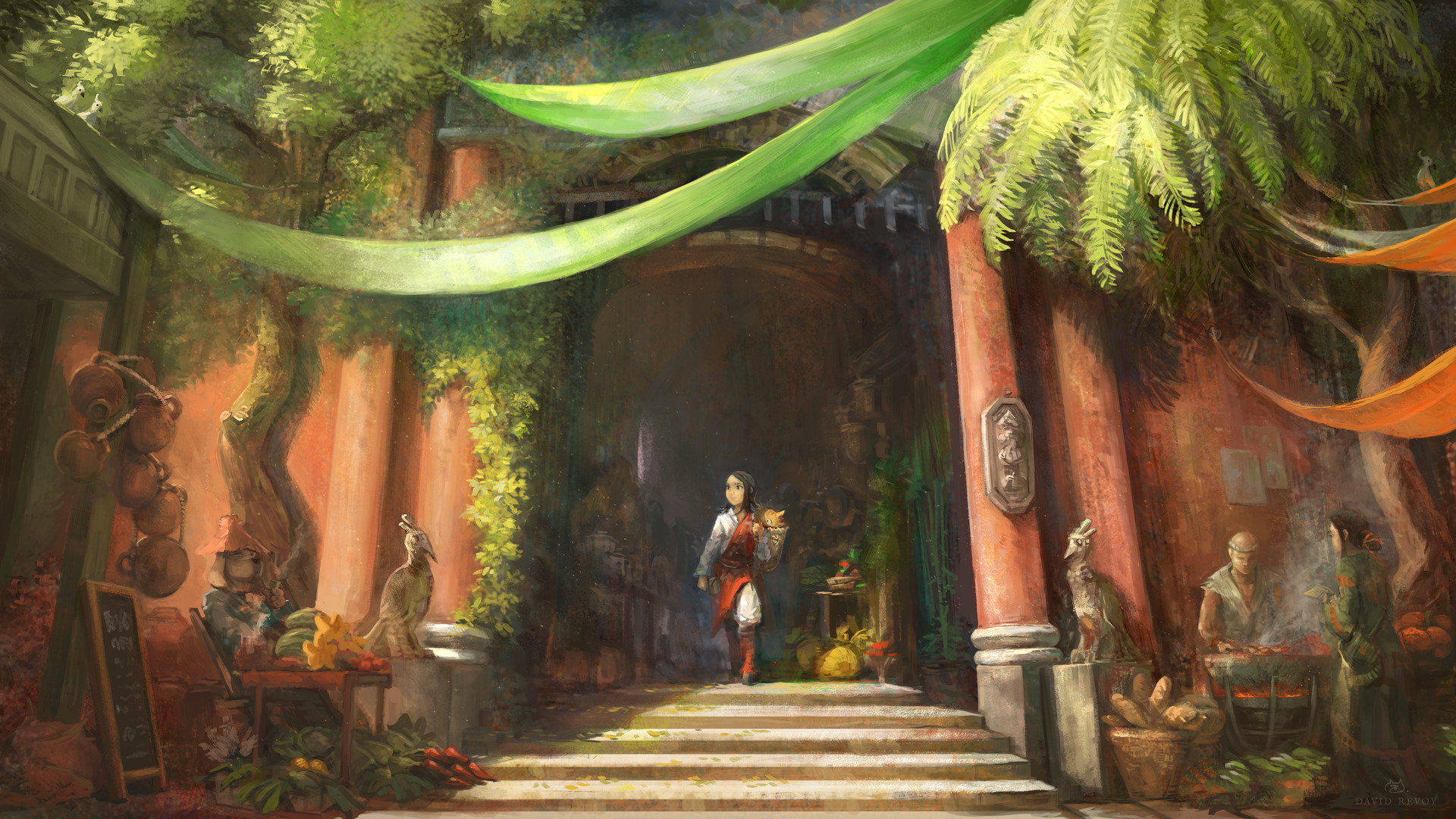
"The Market" by David Revoy (www.peppercarrot.com)
submitted 1 year ago* (last edited 1 year ago) by Five to c/art
 
 
81
5
submitted 1 year ago by Five to c/art


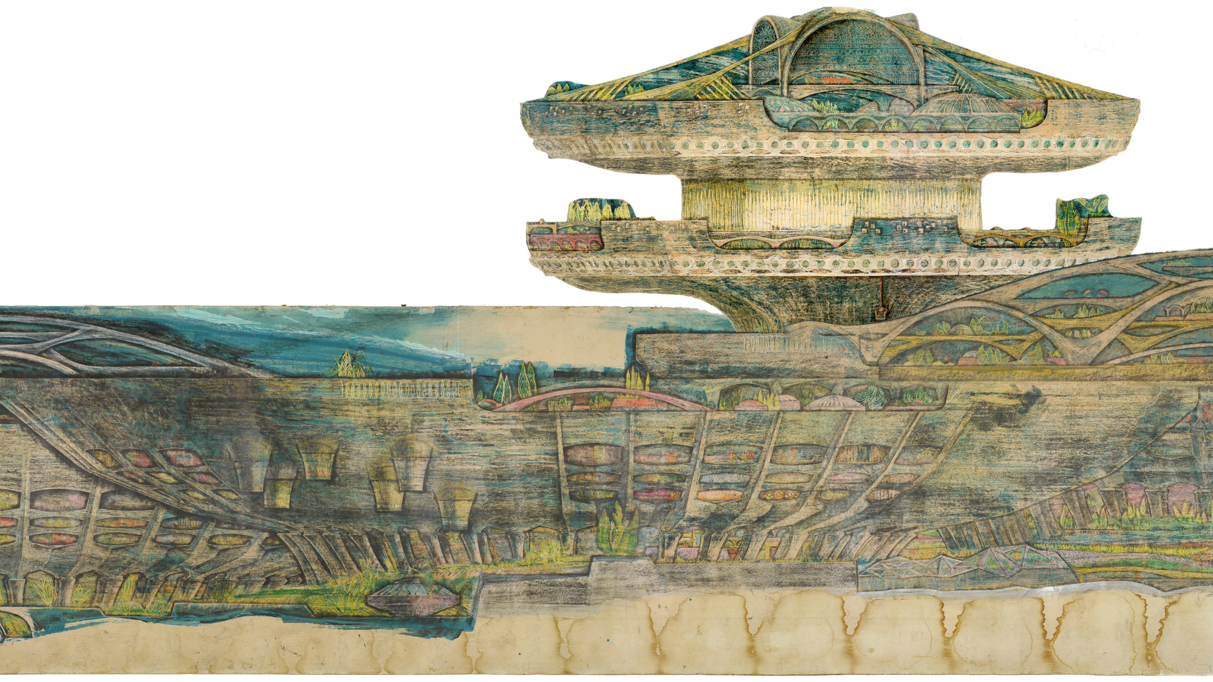
Paolo Soleri's Arcosanti : The City in the Image of Man

Paolo Soleri, detail, Mesa City Market (Arts and Crafts), 1961. Pencil, Charcoal, pastel on paper. Collection of the Cosanti Foundation. © Paolo Soleri. Photo: Cosanti Foundation/Soleri Archives/David DeGomez

82
10
submitted 1 year ago* (last edited 1 year ago) by JacobCoffinWrites to c/art


Another postcard from a solarpunk future. Leaning in on the postcard thing this time. This is kind of a mix of a traditional photobash and the style I’ve been using/making for a rural cyberpunk comic I’ve been working on. The difference is that this time I kept the source images underneath the line art, and used them for the color, whereas with the comic, I convert each element to lines individually, then combine and draw over them, and then color by hand underneath. As with the rest, it’s collaged together from images from all over the place, mostly textures.com, pexels, freepik, and of course, the lowes, amazon, and home depot websites, plus some screenshots of 3d models. I’ll disclose that I did use AI art for two elements of this one, I asked a friend’s midjourny bot to make the deer spraypaint mural, and the colorful mandala I used on the street car.

This was a scene I’d been picturing for awhile, I started building a more dynamic, two point perspective, but kept coming back to this flatter version whenever I thought about this building. I got talking with my SO about the streetcar in that scene, and realized that’s what I could put in the foreground here. That, and the simplicity of the design and the fact that I could bang it out in a couple days, convinced me to just go ahead and make this one too. It’s brighter, and different than most stuff I’ve made, but I’m pleased with it just the same.

I imagine this building is somewhat well known in this fictional place. I think it was probably converted into living space while the world was busy being a little more postapoclyptic than solarpunk, with new residents just scavenging materials from whatever they could. It’s since grown into a sort of community art project, proud of its history, squatters rights, and the reuse of its materials. The first floor is mixed residential/commercial space (you’d almost have to go out of your way to keep a former parking garage from being handicapped accessible, but I figure some first floor places would make things much easier). The roof is covered in a fruit tree orchard, I used apple, pear, and peach trees, all carefully found and cut out in detail before completely blasting them to get them to fit the style I was picturing. I figure these are planted in big planters, rather than directly on the surface of the roof. The building can support it, but standing water, especially in places that freeze, can be really bad for buildings, and tree roots can crack concrete just as well as ice.

As I said, I thought a lot about the design we'd use for the streetcar. My SO and I had some good conversations about aesthetics and what they implied because of genre conventions, down to real world infrastructure, maintenance, and the role of community in a project like this. We considered cyberpunk designs, with all kinds of planes and angles and sleek black coatings, to things that looked halfway like boats or other weird contraptions.

I was torn between wanting its purpose to be visually clear at a glance, and wanting to show something genuinely strange or futuristic.

I settled on a 1910s-ish streetcar for the base both because it's visually clear, and because I think it might be a practical starting point for a society that's trying to rebuild from scratch using entirely local manufacturing. The design is kinda crude but it's proven - streetcars like this were ubiquitous in the US once upon a time. And they used 1910s-era motors, controls, metallurgy, and manufacturing. It feels like this would be a reasonable starting point, especially with a ready supply of scavenged components and high quality metals laying around above ground in the form of existing vehicles (even wrecks).

I like to imagine that this is a newer phase in this citys' public transit infrastructure, that they're starting to standardize their vehicles to simplify things. I like the idea that the first generation of these streetcars were genuinely a community project, that the city/public transit folks settled on some specifications and devoted their limited budget and manufacturing to producing standardized bases, (basically the bottom frame, wheels, motors, and pantograph rig) and that people built the carriages out of whatever they had access to. Each streetcar would be a unique, craft-built contraption, sort of 'public transit by way of Weekend Wasteland.' All kinds of crazy streetcars made from campers, boats, old school buses, whatever people had access to. City safety inspectors and a committee of local people with an emphasis on the disabled, would review each one and specify any necessary changes. This got them a fleet of ready streetcars quickly, allowing them to start providing services while more slowly manufacturing standardized ones to replace the most problematic of the home-built machines.

The slow standardization would be somewhat contentious within a community that took pride in building it's own infrastructure, and in the art-like variety. They might chafe at standardization and formalization, like it's a sign that society is stratifying again. Though the convenience of a more reliable transit network might help balance it out. As a nod to the artistic spirit and history of the fleet, the new vehicles are painted uniquely by members of the community.

Previous postcards:

https://imgur.com/gallery/BJHdVTP https://imgur.com/gallery/hefGfW6

83
17
submitted 1 year ago by poVoq to c/art


Here's the finished #solarpunk artwork. Inspired by permaculture farms and off grid communities and the like

84
10
submitted 1 year ago by Five to c/art


Macro-Cosanti

"Soleri sketched on long rolls of brown butcher paper laid out on his drafting table, rewinding the paper as he worked. This process allowed Soleri to draw in a stream of consciousness, brainstorming and designing numerous variations of one building.

In 1961, Soleri began work on second major city design. Macro-Cosanti compresses square footage by closely spacing buildings that reach skyward. It introduces large-scale apses filled with residences and offices; their southerly orientation captures maximum light during the winter and provides passive cooling through the shadows cast by direct summer sunlight.

The pedestrian-centric city features parks and gardens linking the elements of a vibrant city centre: residences, stores, schools, markets, churches, hospitals, libraries, theatres and museums.

In this city devoid of roads, automobiles are rendered useless, replaced by elevators and escalators that connect living and work spaces. Scale is communicated through small red human figures sitting in amphitheaters, riding in elevators and strolling through gardens.

This particular scroll is an exceptional example of a single continuous design. Because the scroll is significantly longer than Soleri's drafting table, he had to have sketched it in segments. Despite being unable to see it in its entirety, Soleri made a beautifully cohesive drawing."

85


The second photobash in what I hope will be a series; a bit larger and more visually interesting than the first. I've started thinking of these as 'postcards from a solarpunk future.’ They might not show the width and breadth of this world, but nice scenes of what this fictional solarpunk society would consider aspirational, or values worth showing off.

I feel that for a genre/movement with such a focus on intentionality, there's a lot of AI art setting the tone online, along with a tendency to accept anything that looks partway futuristic and green, even if it's a massive cityscape or sort of generically utopian. I want to try to pull the visual aspect towards a more lived-in, human future that sets out to show possibilities/options.

My goals for this one were pretty simple: I wanted to show a setting where cars are no longer the priority, and to show that a solarpunk society will embrace new technology and infrastructure where it's a good use of limited resources (in contrast to the focus on reusing what’s here that I'm trying to include in other images). I also wanted to show that there’s room for more than one solution (and more than one kind of lifestyle) as with the bicyclist towing a kind of traditional-looking wagon.

As with the other photobashes, there are ruins in this scene. One of my overarching goals is to keep these pictures from looking utopian or like some kind of scratch-built future. Things will be messy, resources will be scarce, and tasks will go undone. As in our world, the debris of abandoned projects will pile up around human society, no matter how good its intentions are. I’m pessimistic enough to see bad times ahead, but I want to emphasize in these that that doesn’t mean giving up. For me, that’s a big part of the appeal of solarpunk, that the people in it keep working to mitigate the damage at any level they can access, and will try to rebuild more deliberately, carefully when they can. So these scenes are a little postapoclyptic, with hopefully a more inclusive, vibrant, and colorful society on the other side.

86
 
 
87
88
89
14
Solarpunk Mural - Dan Cohen (dc-creativelabs.com)
submitted 1 year ago by Five to c/art
 
 
90
 
 
91
15
submitted 1 year ago* (last edited 1 year ago) by solinus@lemmy.cafe to c/art
92
29
submitted 1 year ago* (last edited 1 year ago) by JacobCoffinWrites to c/art


I’ve been thinking lately that I’d like to see more art that was meant from the start to be solarpunk. So I put together this photobash. If it goes over okay, I think I’ll try some other scenes along similar lines, trying to depict what I think of as aspirational aspects of a fictional solarpunk society.

This one shows part of a tech salvage co-op on a tech raid (inspired by arcade cabinet raids) where members of a co-op have located unused, in-tact technology, and have negotiated with the current occupants (or owners if no one lives there) for the recovery of the devices. These will then be used to extend the meshnet or add redundancies, improve the capabilities of libraries, or provide to others in their community.

I picture this being a kind of exciting event for those involved – all the members of the co-op, along with friends and relatives who wanted to help, would participate. People would pack for spending all day or days exploring and working in an abandoned building, and a motley collection of vehicles, mostly electrical and pedal-powered, would navigate some fairly rough and overgrown roads to the site. The co-op would hopefully have a fairly well planned system, with different roles (based on training and capabilities) and necessary equipment, defined ahead of time.

At the site, they’d meet with any occupants or owners, announce themselves, and start confirming whatever earlier scouting parties might have found. From there it would be something of a combination of urbexing, unlicensed electrical work to make things safe, and a lot of physical labor hauling everything out and packing it for the ride home. There’d likely be a fairly steady stream of vehicles rolling from the site back to whatever settlement the co-op operates out of.

I imagine a lot of the people supporting a raid are volunteers, either along for fun or on a favor-for-favor basis. I imagine that the local cycling clubs, rock climbing clubs, volunteer medics, bakeries, and bike-repair co-ops who support the thing all have excellent technology back home.

As for likely raid sites, I see office parks as being kind of unnecessary in general, and especially so in this setting (one I’ve been playing with for a bit but haven’t published anything in yet), where society and infrastructure crumbling have made commuting unreasonable and some of the work unnecessary. Being outside the cities and not in immediate use, they would have been a low priority for restoration/re-occupancy, making them a good candidate for this kind of salvage operation decades on.

93


A painting on the side of a building in Saint-Imier celebrates the watchmaking heritage of the town and the local anarchist movement of the 19th century. Credit Crimethinc

94
15
submitted 1 year ago by poVoq to c/art


Solar ~ solarpower and other renewables, the power of nature

punk ~ against the current dominant culture

95
 
 
96


https://www. artstation.com/artwork/QXza14

I came across this art posted to Mastodon and wanted to share it here. I really dig this one - it looks futuristic but reasonable, more practical than a lot of depictions of solarpunk buildings I've seen which often remind me of the kind of elaborate, temporary structures countries put up for the Olympics or to showcase how modern they are.

I always love the kludged-together mix of old and new, it's core to some of my favorite cyberpunk scenes, but I think it should fit solarpunk even better since it aligns with avoiding waste and reusing what's already here.

I like how it fits both genres thematically. In cyberpunk, it's part of the rejection of the idea that technology can fix everything. Even in a future where they build lots of Jetsons-looking skyscrapers, someone's getting left out, and the stories are most interested in those people. The future being distributed inequally helps them discuss wealth inequality, exploitation of workers, and other themes core to the genre.

In solarpunk, I think that mixing of tech and construction could/should be aspirational. Older buildings might have used too much concrete, or lots of synthetic materials, but they're here now, and it's practical to use what we have and avoid waste where possible. Sort of emphasizing reuse in art, rather than depicting a scratch-built future. In addition, it's realistic; people upgrade the places they live. They might love the place, or just not have the resources to move or replace it. And one of my favorite things about solarpunk is that it's not utopian but optimistic. I'll keep an eye out for more like this.

97
98
99
23
submitted 1 year ago by WanderingPhoenix to c/art


Art by Atlas0

100
9
submitted 1 year ago by poVoq to c/art
view more: ‹ prev next ›