this post was submitted on 28 Apr 2024
100 points (99.0% liked)

Map Enthusiasts

3367 readers
37 users here now

For the map enthused!

Rules:

founded 1 year ago
MODERATORS
 

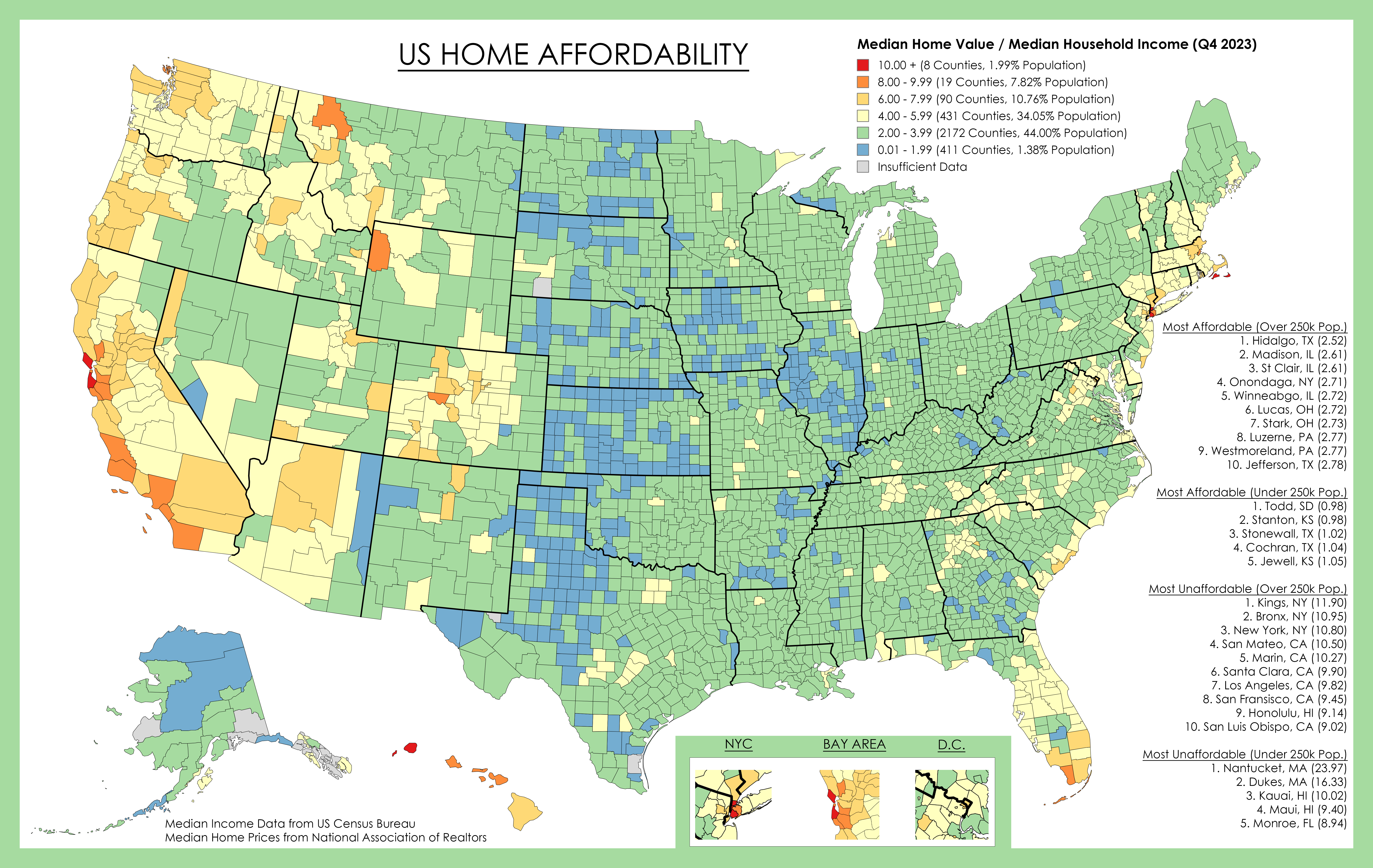
This shows county median home values divided by county median household income, both for 2023.

For example a score of "5" means the median home price in that county is 5 times the median household income in that county.

Generally, a score under 4 is considered affordable, 4-6 is pushing it, and over 6 is unaffordable for the median income.

There are of course other factors to consider such as property tax, down payment amount, assistance programs, etc. Property tax often varies at the city/township level so is impossible to accurately show.

Median Household Income Data is from US Census Bureau.

Median Home Value from National Association of Realtors, and Zillow/Redfin .

Home Values Data Link with map (missing data pulled from Zillow/Redfin/Realtor)

https://www.nar.realtor/research-and-statistics/housing-statistics/county-median-home-prices-and-monthly-mortgage-payment

Source: https://ghostarchive.org/archive/YaavC

top 19 comments
sorted by: hot top controversial new old
[–] friend_of_satan@lemmy.world 12 points 4 months ago* (last edited 4 months ago) (1 children)

A few years ago I moved from a Silicon Valley 8-9 county to a Midwest 2-4 county. Something about seeing this map makes me feel good with my decision. I felt morally conflicted living in Silicon Valley where I knew most people at the stores I would shop at were struggling to afford housing. The house I was finally able to afford was about 20% of the starting price of where I lived in SFBA, and about twice the starting price of the market where I bought.

[–] deegeese@sopuli.xyz 3 points 4 months ago (1 children)

Is there any moral conflict in moving someplace cheap and outbidding all the locals with cash from selling your California house?

[–] friend_of_satan@lemmy.world 3 points 4 months ago

Not for me because that's not what I did.

[–] ME5SENGER_24@lemmy.world 7 points 4 months ago (1 children)

I’d love to see this with an overlay of jobs and average salary, cause I have a sneaky suspicion that all the blue counties are the ones with the fewest jobs and lowest salaries

[–] RaoulDook@lemmy.world 1 points 4 months ago (1 children)

It does show income, as part of the ratio of home value / income that the colors represent.

[–] ME5SENGER_24@lemmy.world 1 points 4 months ago (1 children)

That’s the division of the value of the home to earnings. I’d like to know the median salary by county. Buying a house in West Bumblefuck, Nebraska and earning $30k a year means you’re never leaving West Bumblefuck. I’m in a red zone and would love to trade that for somewhere more affordable, but I can’t unless I’m earning enough to live somewhere cost efficient that still allows me to travel and have an exciting life.

(Sorry Nebraska)

[–] RaoulDook@lemmy.world 2 points 4 months ago (1 children)

The Census Bureau should have that data on median salary by county if you visit their site FYI

[–] Got_Bent@lemmy.world 6 points 4 months ago

I was fortunate enough to find a completely rebuilt house in Dallas for just over 2X my income.

However, it's small size (roughly one third of your standard mcmansion) and location in an older neighborhood devoid of a militant HOA doesn't exactly make it a chick magnet.

I suppose at this point in life, that's a plus. I'm perfectly comfortable here and don't need the hassle of any cohabitants or invasive HOA board members testing the DNA of my grass to ensure that it's a compliant species.

It took me twelve years of renting in a rat infested shithole with no heat to recover from losing the first house that was a mcmansion in a militant HOA.

I think I'm one of the lucky ones.

[–] fireweed@lemmy.world 6 points 4 months ago

Important to note this is based on "median home values," not "housing affordability."

This map does not take into consideration many directly-related-to-housing costs such as: utilities cost, natural disaster-related costs, insurance rates, property tax rates, etc. It also does not take into consideration other cost-of-living factors such as: transportation costs (how much are you spending on gas every month if you live 50 miles from anything?), necessities costs (e.g. food and other essentials), and opportunity costs (for everything else).

[–] CraigeryTheKid@lemm.ee 5 points 4 months ago

So 80% live in counties <6x? That's less bad than I thought.

And then 45% at <4x seems decent too. Meaning more decent than I thought. Less than 4x should still be higher.

[–] Tower@lemm.ee 4 points 4 months ago (1 children)

Probably not a whole lot different than https://xkcd.com/1138/ . Still good to see the data.

[–] taiyang@lemmy.world 1 points 4 months ago

It's technically supposed to be per capita in a sense because it's a ratio of income to property values. That said, it's got it's own flaws since living situations can vary drastically from place to place (and cities skew because of population density). So ... Yeah, xkcd.

[–] eran_morad@lemmy.world 3 points 4 months ago

Jfc, Brooklyn has really become a new place, innit.

[–] Anticorp@lemmy.world 2 points 4 months ago

They definitely got the fuckin Seattle area wrong. You can't get a house on the east side for less than three quarters of a million dollars, and that's for a 800 sq ft, run down, 1960's two bedroom. Seattle proper isn't much better in the worst areas, and is considerably more in the good ones.

[–] kcuf@lemmy.world 2 points 4 months ago

San Luis Obispo has like 50k people, not sure it's listed under 250k+ pop

[–] esc27@lemmy.world 2 points 4 months ago

Interesting. So two of the yellow counties in Alabama are home to the states two largest public universities. The third is the fastest growing area in the state and home to the state’s best beaches.

The blue one is lowndes county and was one of two mentioned a while back in that UN poverty report about open sewers, disease, and poor sanitation.

[–] Pandantic@midwest.social 2 points 4 months ago

Hey, my home county made one of the lowest lists!

[–] OhmsLawn@lemmy.world 1 points 4 months ago

I've been watching a lot of Ryan Hall recently. It's interesting how closely that swath of blue matches the area where the big thunder storms develop.