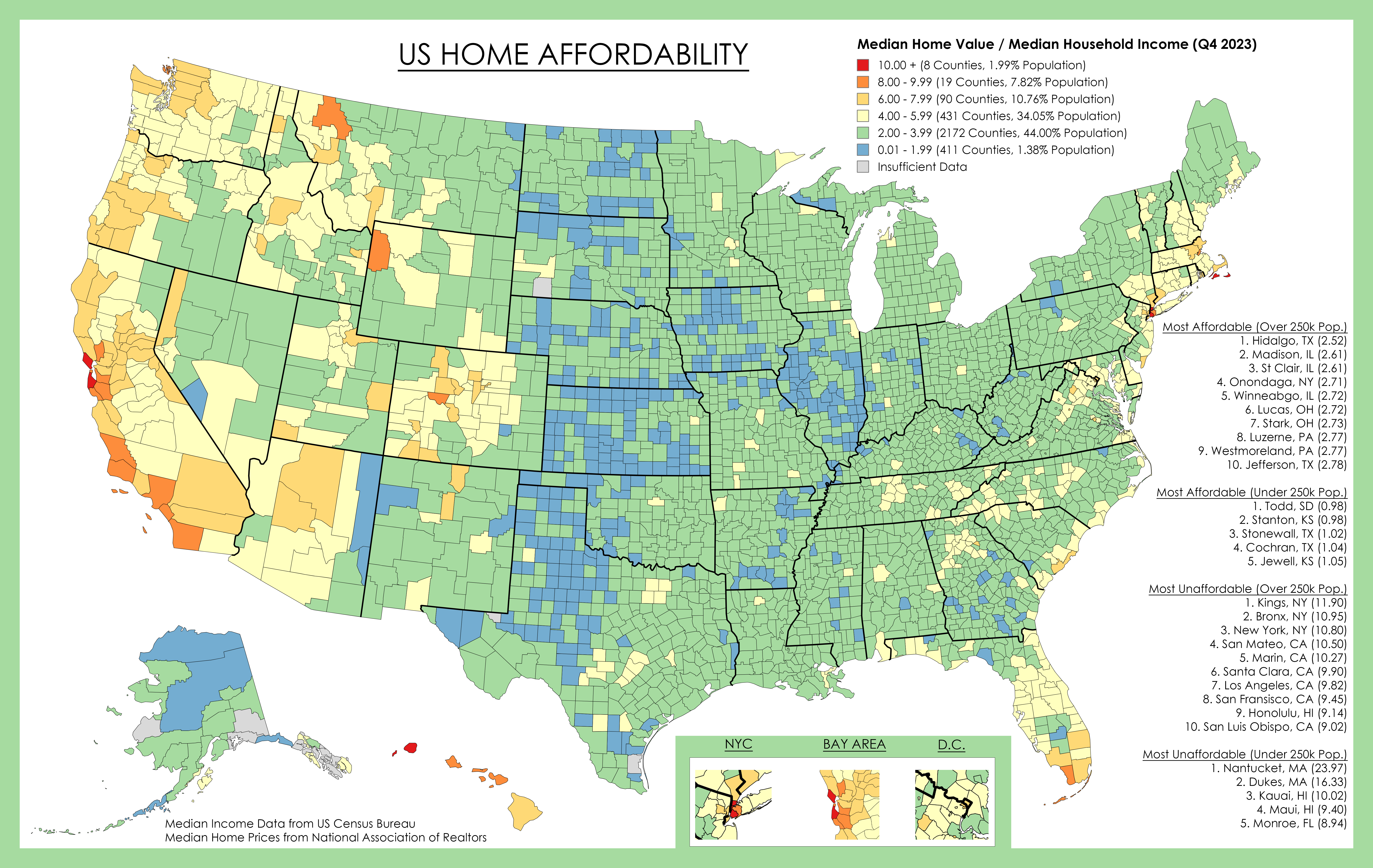
This shows county median home values divided by county median household income, both for 2023.
For example a score of "5" means the median home price in that county is 5 times the median household income in that county.
Generally, a score under 4 is considered affordable, 4-6 is pushing it, and over 6 is unaffordable for the median income.
There are of course other factors to consider such as property tax, down payment amount, assistance programs, etc. Property tax often varies at the city/township level so is impossible to accurately show.
Median Household Income Data is from US Census Bureau.
Median Home Value from National Association of Realtors, and Zillow/Redfin .
Home Values Data Link with map (missing data pulled from Zillow/Redfin/Realtor)
https://www.nar.realtor/research-and-statistics/housing-statistics/county-median-home-prices-and-monthly-mortgage-payment
Source: https://ghostarchive.org/archive/YaavC

I’d love to see this with an overlay of jobs and average salary, cause I have a sneaky suspicion that all the blue counties are the ones with the fewest jobs and lowest salaries
It does show income, as part of the ratio of home value / income that the colors represent.
That’s the division of the value of the home to earnings. I’d like to know the median salary by county. Buying a house in West Bumblefuck, Nebraska and earning $30k a year means you’re never leaving West Bumblefuck. I’m in a red zone and would love to trade that for somewhere more affordable, but I can’t unless I’m earning enough to live somewhere cost efficient that still allows me to travel and have an exciting life.
(Sorry Nebraska)
The Census Bureau should have that data on median salary by county if you visit their site FYI
Found it! My hypothesis is mostly confirmed. https://public.tableau.com/views/18_5yr_Income/2018Income?:showVizHome=no