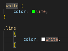
The author should be killed for indentation alone.
Programmer Humor
Welcome to Programmer Humor!
This is a place where you can post jokes, memes, humor, etc. related to programming!
For sharing awful code theres also Programming Horror.
Rules
- Keep content in english
- No advertisements
- Posts must be related to programming or programmer topics
I know, right? Needs more tab.
We are witnessing a hate crime.
Client: "Can you switch these two colours, you have 1 minute to fix it or you're fired!"
Result:
color: lime !important;
z-index: 1000000;
I love the superstitious z-index just in case it does something to help.
At least that's actually easy and quick to do and is the only way of doing it. Centering a div however has 81639393 ways and it seems the one that works is different every time
Bro its so easy bro, just use flexboxgridcolumns its been a standard since 2010 just flex it bro you haven't learned to flex yet just check w3c schools and add a flex you can polyfill it but don't use that hacked one use the good flexpolyfill then { content-align-middle-child-elements: center-middle-true-neutral } so easy with flex bro
I know you meant this sarcastically, but yes, flex is a good option for centering something. Either that or setting the left and right margins of the element to auto, which is generally even easier.
Basically, if you're in a flex container use flex, if you're in a grid use grid, and if neither of those apply set the left and right margins to auto.
Also seriously, anybody having problems with flexbox should try this:
I'm not sure there's any version of it for grids, but IMO grids are inherently more intuitive, so it may not be needed. Flexbox is the one that is hard to learn.
Well, flexbox and grid have different purposes in my opinion/experience. Personally I use grid for "top level" layouts like the layout of the whole site, while I tend to prefer flexbox for layouts inside the grid. Of course that's just a rule of thumb, there are absolutely cases where this isn't the best option.
Dude, stop flexing on him. You're gonna make him cry.
You've perfectly captured twitter tech bro energy it's kind of incredible actually
Not allowed to credit the site in your text editor?
Is the owner in the room with you now?
This screenshot is not mine, it was sent to me via Matrix
You get used to it. I don't even see the code
Do you have a built-in browser in your brain that renders it?
All I see is blonde, brunette, redhead. Hey uh, you want a drink?
Free drink? Absolutely
It's good for two things: De-greasing engines and killing brain cells.

It's only now that I realise that I understood that reference so late
Took ya a bit Keanu, but you got there.
…it was sent to me via Matrix
That’s how they do pull requests there
Well, that's what you get for using classes like "white" and "lime".
Exactly this. Bootstrap killed the css star.
People learning CSS through shitty frameworks:
At first I only noticed the indent. Wtf
I'm appalled that classes representing visual styles are still a thing. I thought everyone already figured that it was a bad idea back in bootstrap days. But then I recently had an opportunity to work on project that uses Vuetify and saw quite long poems about flexboxes in class names...
And then came Tailwind…
I know! What a mistake of a framework. Glad my colleagues drummed it out of me.
Aren't classes in CSS supposed to represent visual styles? What else could they be for?
Pretty sure they're referring to class names describing the visual style being applied, rather than what that class represents semantically.
E.g. .red-bold vs. .error-text
Oh, that makes sense.
Well, there's not exactly a ~~class~~ training you have to take before writing CSS, so everyone starting out with it gets to make all those same mistakes for themselves before they know how to use classes sensibly. I myself am some backend guy, who has to write CSS far too often.
It certainly also does not help that various CSS frameworks out there do exactly that...
"Some coders just want to watch the word ~~burn~~ get colored white and/or lime."
And if you delete one or the other, or condense the code into a single command, the whole site breaks.
Worse.

Isn't cascading styles the whole point of Cascading Style Sheets?
You absolute fool. You must never utter its full name, lest you summon its wrath!
I don't get it, isn't this a pretty normal way of using media queries. Granted you're more likely to see the widths defined in px.
Shhh... The poster doesn't understand CSS and we shouldn't embarrass them in a community with memes
My imposter syndrome kicked in full swing. I was ready to learn a CSS best practice and feel uncomfortable about it for the rest off the day.
the userstyle experience:
Yeah, userstyles are wild. You learn so many ways how to not use CSS. Everything is !important and rather than adjusting the HTML to change the structure, you get to do it all in CSS. 🫠
I am very, very surprised about the competence of the commenters here. I have had many discussions on reddit about the advantages of meaningful instead of presentational class-naming and you're normally met with great resistance, especially with users of frameworks like Bootstrap and Tailwind.
Here, everyone seems to either 'get it' or is willing to hear why classes like .lime are bad. Very cool.
People that advocate for presentation naming haven't endured a major company rebrand.
No! I wanted orange!
