this post was submitted on 18 Apr 2024
1105 points (98.6% liked)
Microblog Memes
5756 readers
2555 users here now
A place to share screenshots of Microblog posts, whether from Mastodon, tumblr, ~~Twitter~~ X, KBin, Threads or elsewhere.
Created as an evolution of White People Twitter and other tweet-capture subreddits.
Rules:
- Please put at least one word relevant to the post in the post title.
- Be nice.
- No advertising, brand promotion or guerilla marketing.
- Posters are encouraged to link to the toot or tweet etc in the description of posts.
Related communities:
founded 1 year ago
MODERATORS
you are viewing a single comment's thread
view the rest of the comments
view the rest of the comments

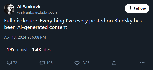
It should be illegal to have a font where Il| are not all easily distinguishable.
lI|Also, O and 0. And there's a special place in Hell for font designers that make 1 look like I
O.0
but that's literally most default fonts
Straight to jail
STRAlGHT T0 JAlL Y0U SAY?
And lose jokes like Al's?
Sure all that fraud sucks, but there are tech fixes (which also have problems - SSL certificates prevent old computers from using the internet without a translating proxy)
Discord solved it by giving
lthe same tail thatthas, I wish more sans-serif fonts did thatAh yes but that font
looks kinda ugly tbh :(Hard disagree all my homies fw consolas
Give me Cascadia Code or give me death!
Careful, the programmers may rise up!
Then you have the
1l1L problem