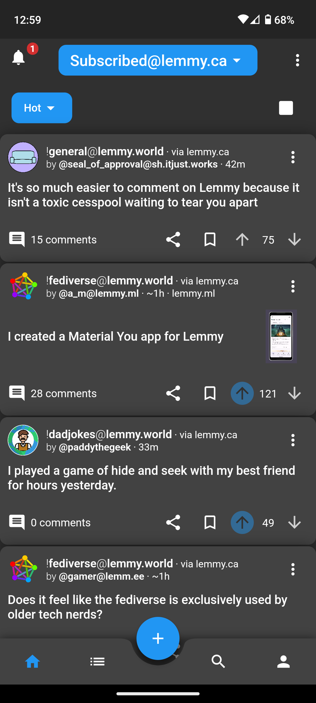
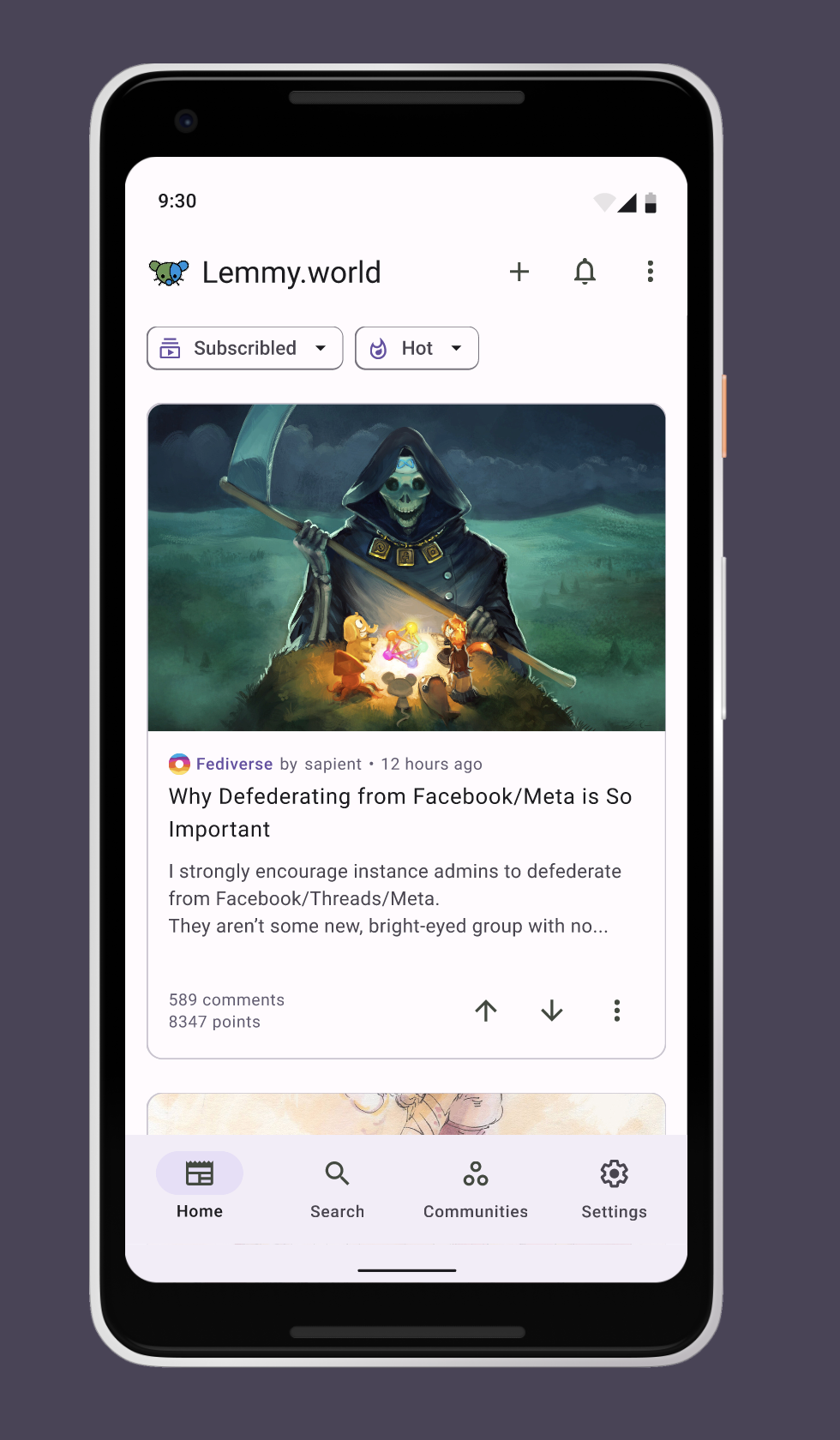
Personally prefer to read the title before the image. It's one of the reasons I don't use the Connect app
Fediverse
A community to talk about the Fediverse and all it's related services using ActivityPub (Mastodon, Lemmy, KBin, etc).
If you wanted to get help with moderating your own community then head over to !moderators@lemmy.world!
Rules
- Posts must be on topic.
- Be respectful of others.
- Cite the sources used for graphs and other statistics.
- Follow the general Lemmy.world rules.
Learn more at these websites: Join The Fediverse Wiki, Fediverse.info, Wikipedia Page, The Federation Info (Stats), FediDB (Stats), Sub Rehab (Reddit Migration), Search Lemmy
The connect app now has that as a setting, if that makes a difference for you.
Cool. Thanks
Noted. I was also considering where should I put the title as well. This is just a quick prototype to find out whether any dev is interested in collaboration, so just take it with a grain of salt 😉
top would be preferable.
often the title is needed in order to understand the picture - or the picture is the "punchline" to a joke set up by the text.
I'm using Connect and your can meme the title be before the image in the settings, that's what I did
Thanks, must be a recent update. I'll check it out!
I've mostly committed to Connect, and can confirm there's an option near the bottom to select where to put the title in relation to the picture.

This is something that has been disturbing me with Thunder app, Connect in their latest versions added a switch for this!
This looks really great! If you're interested in contributing to an app you should check out Liftoff!
We're totally open source and community contribution driven and we're moving fast! But we're lacking designer contributions!
If you're interested check out our open GitHub issues/enhancements:
Got that, I'm checking Matrix so we could have a chat
I just discovered liftoff last night on the Playstore. Finally really getting into Lemmy now that I have a good app to use.
The apps are certainly in need of all the help they can get. I have Lemur and Jerboa, and they're both janky as all heck.
Liftoff is perfect.
Liftoff is pretty great. Devs keep making improvement every day.
I am still waiting for Sync for Lemmy to come out, but Liftoff might convert me.
Does liftoff look different on Android? I feel like it’s ugly as sin on iOS.

I think it looks fine on android, but it probably doesn't integrate with iOS nicely. I also think light themes are bad by default so I can't judge your photo accurately lol.

The card shadows are a little much. I forgot those were on my default. @mykl@lemmy.world would you agree?
Liftoff is better but compared to the greats that existed in the reddit ecosystem these are very crude. The platform just needs time for devs to catch up to the 10+ years they had invested in Reddit development. The dev behind sync for Reddit has been hard at work on an client for Lemmy with as much feature parity as possible.
Thunder and Connect are better than Jerboa, haven't tried Lemur
Using thunder now. It's not perfect, but it's the best experience for me that I've found so far.
Memmy on iOS has been great so far.
I'm currently using connect for lemmy. It works fine, but I still have to use the web version to jumping between servers, which is why I come up with this idea.
I'm really enjoying wefwef. It's smooth and works well. No weirdness or issues on my end.
Wow that front page looks like sync 😁
lol, I use basic components from material library so it should be familiar :)))
"Video is not rated. Log in to watch"
Nope.
Can you try again? I think it's fine now
'fraid not. Still requires login :(
Still not working for me without logging in
Works for me without login in
I'm putting the final touches on an app using material design. I've broken away from cards and haven't even considered a light mode yet, but I've been pretty unhappy with the search/explorer
This just got me unstuck on it, so thanks
I don't know why, but this exchange felt of fucking romantic. Keep up the good work you amazing people!
I'm a fullstack dev building my own app for Lemmy. I'd be interested in opening a dialogue if you're interested. UI/UX is my weak point :P
Awesome, I just sent u a message
very cool! we need more ux/ui designers in open source and free software!
This is beautiful, and a perfect example post you used there. I know it’s not a release but it makes me wish I had an Android phone to test it anyway lol
Keeping a native OS UI design language for an app is very nice. Apollo was a great example of this!
I'd love to see Android's version of the same thing.
Looking very good. I’m on iOS, but I would definitely use an app that look as good as that, as long as it performed good as well.
Congratulations and keep up the good work.
I like the look. One thing I would like to see is integration of the community search tool to make discoverability easier. Something that shows what server each community is on but also will allow you to search across servers in case you don't know where things are, and a way to view the list of all communities if you want.
This reminds me a bit of Sync, formally for Reddit. They're bringing it to Lemmy at some point in the future. Love all the new apps coming out for here, great work :)
