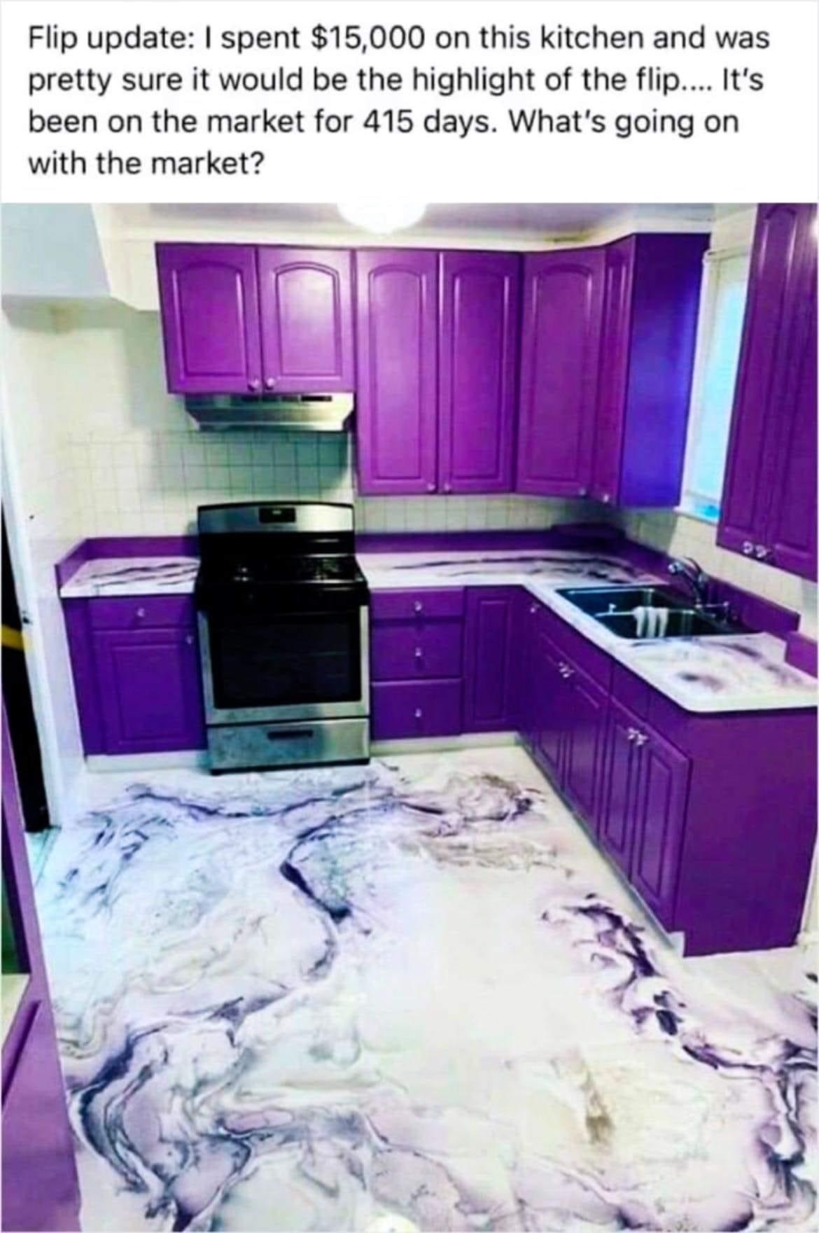
Wow. Purple is my favorite color and this still makes me want to vomit. The white walls are really jarring. The floor is pretty slick, but not at all right for a kitchen. This is awful in every conceivable way.
Terrible Estate Agent Photos
Terrible photos listed by estate agents/realtors that are so bad they’re funny.
Posting guidelines.
Posts in this community must be of property (inside or out) listed for sale which contains a terrible element. “Terrible” can refer to:
-
the photo itself (finger over the lens, too far away, people in the shot, bad Photoshop, etc.)
-
the property (weird layout, questionable plumbing, unsound structure, etc.)
-
the interior (carpeted bathrooms, awful taste interiors, weird mannequins/taxidermies/art, inflatable pools indoors, etc.)
-
the actual listing itself including unusual descriptions and unrealistic pricing. However, this isn’t a community to discuss the housing market in general. This is a comedic community - let’s keep it light.
-
Photos can be sourced from anywhere and be any age, but please check they haven’t already been posted.
-
Censor any names/contact details of private individuals.
-
Mark the post NSFW if it includes nudity or sensitive content
Rules.
This community follows the rules of the feddit.uk instance and the lemmy.org code of conduct. I’ve summarised them here:
- Be civil, remember the human.
- No insulting or harassing other members. That includes name-calling.
- Respect differences of opinion. Civil discussion/debate is fine, arguing is not. Criticise ideas, not people.
- Keep unrequested/unstructured critique to a minimum.
- Remember we have all chosen to be here voluntarily. Respect the spent time and effort people have spent creating posts in order to share something they find amusing with you.
- Swearing in general is fine, swearing to insult another commenter isn’t.
- No racism, sexism, homophobia, transphobia, xenophobia or any other type of bigotry.
- No incitement of violence or promotion of violent ideologies.
I love purple and I even love cabinets with some color in it. But this ain't it, chief. It's like they deliberately chose the most vibrant and gaudy color imaginable.
I cannot even believe this is the actual color. It looks so bad plus there's just something off about the color of light coming through the window. Imagine if the saturation was less and it was a little more red. It'd be a perfectly normal color choice in that case. Hard to say if it's just the photo or not, or if it was photoshopped to exaggerate a slightly-off color.
Might be a weirdly overly saturated photo. Sometimes I feel like real estate agents go a bit wild with the color alterations they do in photos.
This is why you have accent pieces or walls and not an accent room.
I could see like...a row of purple accent tiles in a backsplash. But fuck.
This has the aesthetics of spilled ice cream.
Or a Smurf massacre
I’m thinking Two Scoops of drawer bases in every kitchen
The floor is incredibly cool tho
I hate it. It permanently looks like something has spilled on it
Yeah... but that floor is what makes me think that all is just color edit of the image.
Agree 100% it's a photo shop.
Was something done in like photoshop with the colors in this pic? It looks off to me, but I'm not an expert.
Most listings have their photos over saturated and the shadows lifted to make things appear brighter and more colorful. In this case, it's like a flash bang.
I originally saw this on my phone with a red light filter… I thought the cabinets were brown and the marble a bit much.
… now without the filter this is much worse lol.
yeah it was shopped. you can tell by the pixels.
100% with you on this. The light coming from outside is blue? What planet has a blue sun?
It isn’t the blue sun…or is it? Sunlight when outside doing a long exposure is blue. But this is more due to the atmosphere than the sun. This is why “daylight” light bulbs have a bluish tint. The sun itself is not blue, it is just the atmosphere interacting with it that change the way we perceive the light on objects from it.
Doung this for yourself ? All the power to you, it's unhinged, but in a fun way.
Doing this for resell? I know that people are tired of bland greige houses, but you may want to tone it down a bit.
Motherf#@ker stabbed grimace on that floor then dragged him out.
I think it's really awesome! But I would never want to live in it 😔
I love it, but I have horrible taste (exemplified by the fact that I'd love it even more if the white was black.) This was definitely not the move to take if you're trying to sell quickly. Yikes.
Apart from the colour, what is up with the scale of this kitchen? The top looks to be about knee high. The weirdly tall upper cupboards and the angle of the pic make it so odd, is the ceiling at like 2m?
It's made for Barney the dinosaur.
Maybe Wario and Waluigi will take a tour after their honeymoon
Marie Schrader posted this.
Fuck house flippers
If the cabinets were more neutral it would be totally fine. A good shade of gray would make it look much nicer.
Yo dawg, i heard you like Chinese porcelain kitchen ware so i made your kitchen look like Chinese porcelain so you can prepare Chinese porcelain dishes while standing in Chinese porcelain
Can’t understand „the market“: It’s a phantasic kitchen for blueberry pudding lovers
Should never have smoked that lean blunt now i'm in the leantchen
I want this place
Because boy fuck it would be fun when high asf
Snoop Doggesque kitchen style
