this post was submitted on 10 Nov 2024
70 points (97.3% liked)

Art Share🎨

4501 readers
225 users here now

This is a friendly community for everyone who wants to share their art with the world! Everyone is welcomed 🎨

Rules

AI Art: While we appreciate AI generated art, there are more appropriate communities to post that type of art to. Please keep posts to non-AI generated art only. This rule includes AI art that was then manually manipulated (e.g. drawing on top of something generated by AI).

Nudity: Nudity is and has always been a part of art, but it may be something that some users don't wish to see or cannot view in certain circumstances (e.g. at work). If your work contains nudity, please mark it as NSFW. Work that contains nudity that is not marked as NSFW will be taken down. As long as the NSFW tag is used, we welcome nude subject matter.

Spam: Please do not spam this community. Self promotion is fine if you just want people to be aware of your work, but blatant attempts at spam will result in the past being removed and possibly a ban. If you aren't sure if what you are posting is spam, please contact the moderator first.

Conduct: Be nice, and don't be a jerk. Constructive criticism is OK, but don't be mean. Encouragement is always welcomed.

founded 1 year ago
MODERATORS
 

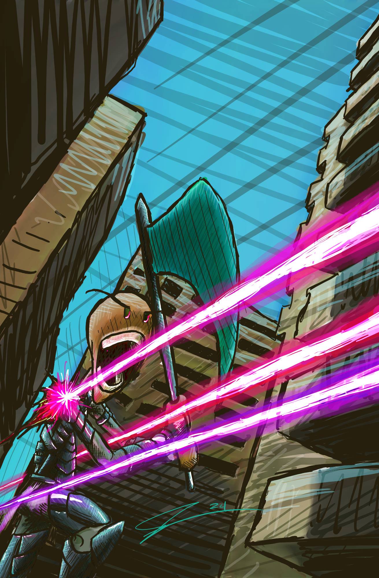
Still working on background. Critiques? I feel like I over did it with the line work...

As for the work of art:

With a fierce yell, he charges forward, gripping the battered axe as blaster fire scorches the air around him. He knows he won’t survive, but with each step, he feels the weight of his fallen friends at his backβ€”this last stand is not for victory, but for vengeance, a final tribute in blood and fire.

top 19 comments
sorted by: hot top controversial new old
[–] Corno@lemm.ee 4 points 5 days ago* (last edited 5 days ago) (1 children)

Love the colors and the perspective on this one! Your style is really unique looking and it has a lot of charm and character to it. I like how the shading is done in a cross-hatchey kind of way while the specular is bolder and more smooth, it's a contrast which looks nice to me.

My only critique would be the background, being that the buildings farthest from the character maintain the same contrast and saturation as the buildings closer to him. It kind of makes the character blend in with the background a little bit, so next time I'd try adding a screen overlay layer that is a light colour similar to the sky colour to add a kind of haze effect to the far buildings, making it seem like they're far away compared to the others, giving the piece more depth while also allowing the character to stand out more.

All in all, really good job on this piece! I've seen other art from you and you've been improving a lot, which is great to see! πŸ˜ƒ

[–] BallShapedMan@lemmy.world 4 points 5 days ago (1 children)

Thank you, fantastic advice!!

[–] Corno@lemm.ee 3 points 5 days ago (1 children)

No problem at all! I'm happy to help a fellow artist out! 😊

[–] BallShapedMan@lemmy.world 3 points 5 days ago (1 children)

Took your advice and others for this revision!

[–] Corno@lemm.ee 3 points 5 days ago (1 children)

The drawing was already great before, but now this looks amazing! The character really stands out from the background, and the haze of the far buildings really helps to work with the awesome perspective!

[–] BallShapedMan@lemmy.world 3 points 5 days ago

Thank you! I really like how it turned out. I appreciate your advice!

[–] Mechaguana@programming.dev 5 points 5 days ago (1 children)

I like the colors and the style :D

[–] BallShapedMan@lemmy.world 5 points 5 days ago (1 children)

The background wasn't sitting right with me and I think this is better.

[–] Thavron@lemmy.ca 5 points 5 days ago (3 children)

I was gonna mention exactly this. Make the background lighter so the character stands out.

[–] BallShapedMan@lemmy.world 3 points 5 days ago

Took your advice and others for this revision!

[–] kambusha@sh.itjust.works 2 points 5 days ago (2 children)

Ditto. Maybe even some red/yellow for contrast, like a fire

[–] BallShapedMan@lemmy.world 2 points 5 days ago (1 children)

Took your advice and others for this revision!

[–] BallShapedMan@lemmy.world 2 points 5 days ago

Oh that's a fantastic idea! Would look more like some crap went down too that way. Thank you!

[–] McLoud@lemm.ee 3 points 5 days ago (1 children)

Very cool! What a great angle! Nice work.