this post was submitted on 24 Jun 2023
39 points (100.0% liked)
Fediverse
28295 readers
732 users here now
A community to talk about the Fediverse and all it's related services using ActivityPub (Mastodon, Lemmy, KBin, etc).
If you wanted to get help with moderating your own community then head over to !moderators@lemmy.world!
Rules
- Posts must be on topic.
- Be respectful of others.
- Cite the sources used for graphs and other statistics.
- Follow the general Lemmy.world rules.
Learn more at these websites: Join The Fediverse Wiki, Fediverse.info, Wikipedia Page, The Federation Info (Stats), FediDB (Stats), Sub Rehab (Reddit Migration), Search Lemmy
founded 1 year ago
MODERATORS
you are viewing a single comment's thread
view the rest of the comments
view the rest of the comments

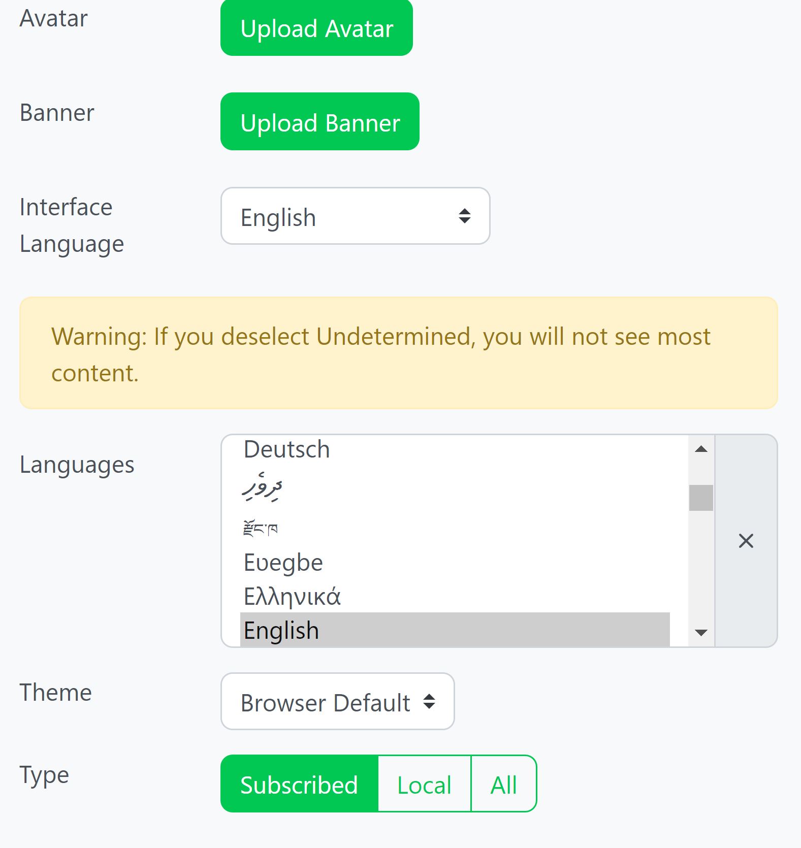
If you're on desktop you can hold ctrl and make multiple language selections. I have undetermined and English selected.
As to why this is even a thing that needs to be set I have no idea either.
The intent is to label content by language so that people can easily filter out languages they can't read. The presumption that English, say, is the default language because the big websites are all US based doesn't really hold in the Fediverse, where a lot of users, historically, were from Europe.
But the feature's just kind of... broken right now, though.
The Lemmy UI is terrible and as tagging isn't actually mandatory in Lemmy, most posts just fall under "undetermined".
Kbin has mandatory tagging - yay - but the list has maybe only like a dozen languages and I don't Kbin has the filtering implemented anyway. Though I have to say having Finnish as an option but no Swedish does make just a tiny bit happy.
Lemmy has svenska.
That means I should select the language I write into for all the posts/comments I write? Wow.
yeah, that's what i'm sayin
Just to point that this is the default and "obvious" behavior for lists since the 90's (or, rather the 80's if you count Unixes GUIs). Yet almost nobody knows it for some reason (probably because it's not obvious at all, but IDK).
That and I think in many cases people opt for the ol' box select when trying to select multiple options in a GUI, even if it's in list view.