this post was submitted on 22 Jun 2023
73 points (100.0% liked)
Technology
37734 readers
460 users here now
A nice place to discuss rumors, happenings, innovations, and challenges in the technology sphere. We also welcome discussions on the intersections of technology and society. If it’s technological news or discussion of technology, it probably belongs here.
Remember the overriding ethos on Beehaw: Be(e) Nice. Each user you encounter here is a person, and should be treated with kindness (even if they’re wrong, or use a Linux distro you don’t like). Personal attacks will not be tolerated.
Subcommunities on Beehaw:
This community's icon was made by Aaron Schneider, under the CC-BY-NC-SA 4.0 license.
founded 2 years ago
MODERATORS
you are viewing a single comment's thread
view the rest of the comments
view the rest of the comments


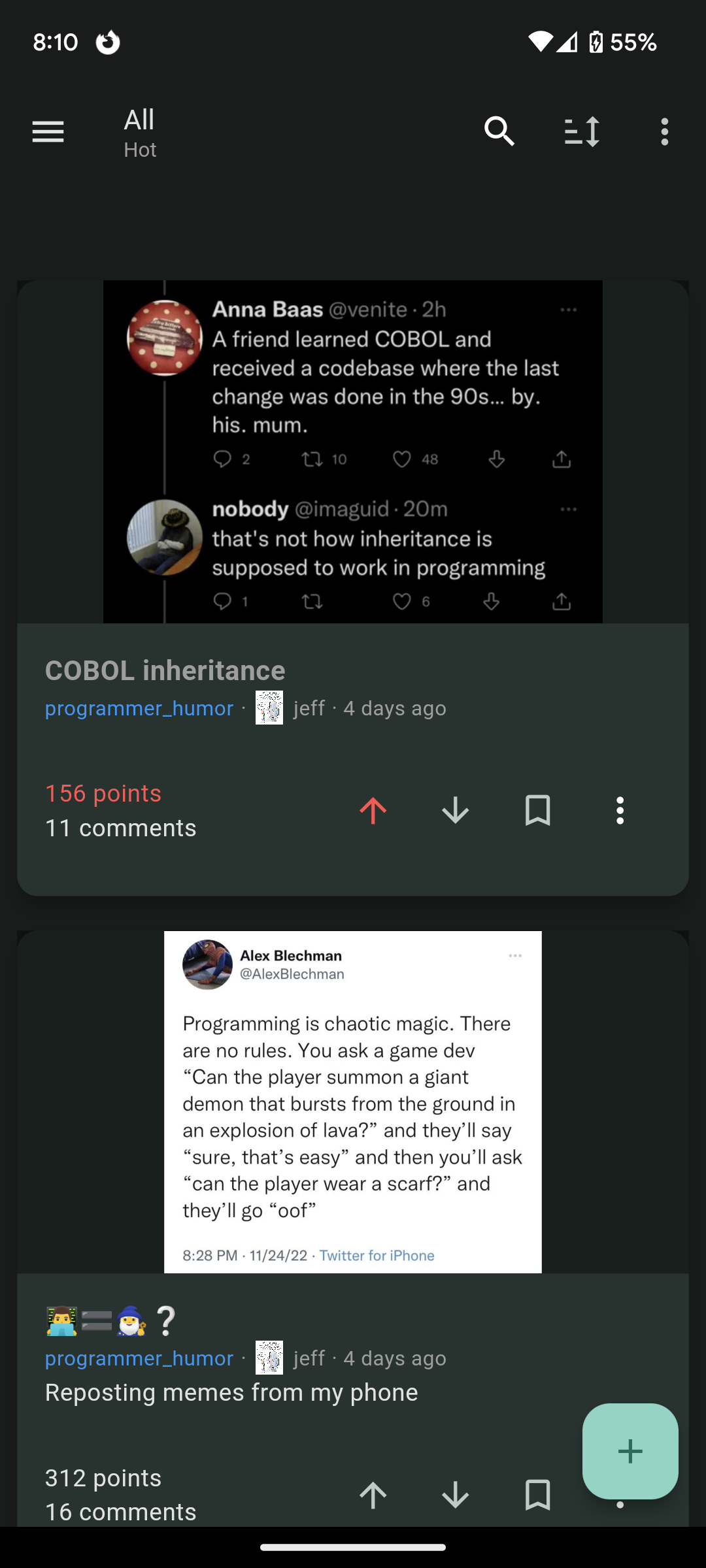
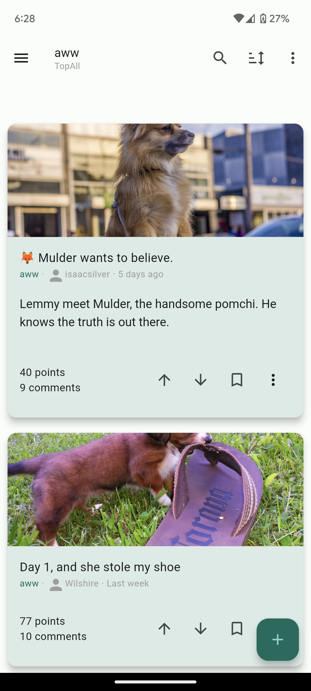
It's interesting. Needs some more formatting options imo. I liked how in boost for reddit the titles of posts were always at least as big as the preview of the body of the post. Just makes it look much cleaner imo. Could use a font size option. Could use some color options too eventually.
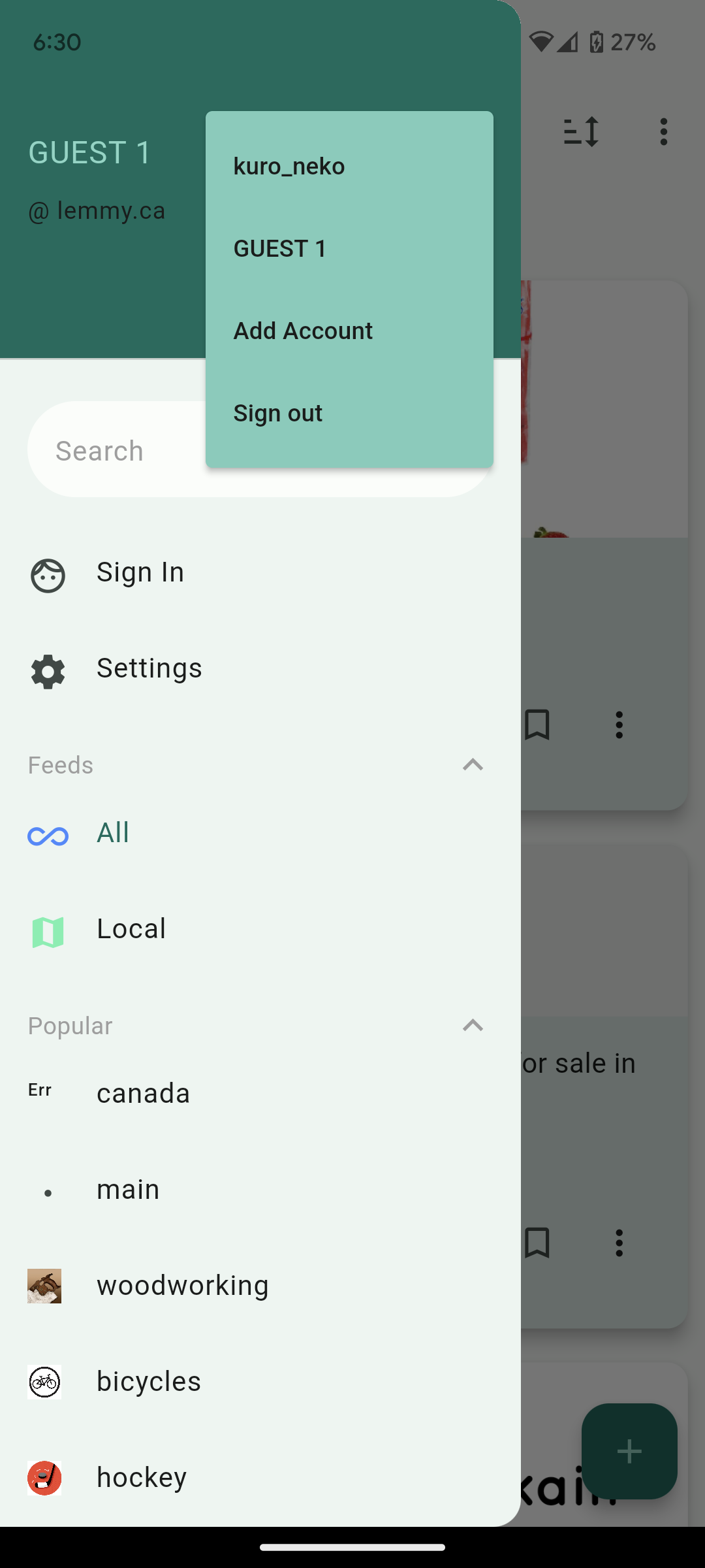
Also, it needs a "Subscribed" page. Default lemmy has this page that only shows you content from communities youre subscribed to. You should see about getting that feed on your app.
Overall though great work, it looks really promising thus far and I'm impressed with how quickly you've put this together.
'Subscribed' is called 'Frontpage' in the app, you can find it in the sidebar. Edit - oops, looks like kuro_neko beat me!
I'll take a look at how Boost for Reddit formats their titles, thanks! The 'Frontpage' once you're signed in should be equivalent to the Subscribed page.
Just adding a +1 for Boost's formatting!