Great job!
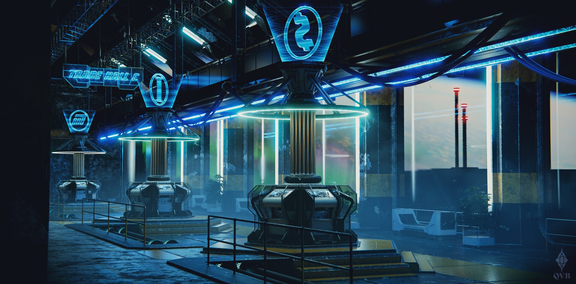
I like the volumetric lighting (at least, I think that's what it is?) I feel like it was always tricky to get right - at least, when I was working in Maya back in the day.
I do feel like the blue light is a little bit aggressive, and wonder if there'd be value in adding some more saturated colored lights to give some depth? Depends on the concept art, obviously. I'm curious - do you mind posting the reference you're working off?
