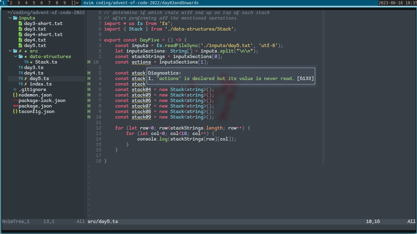
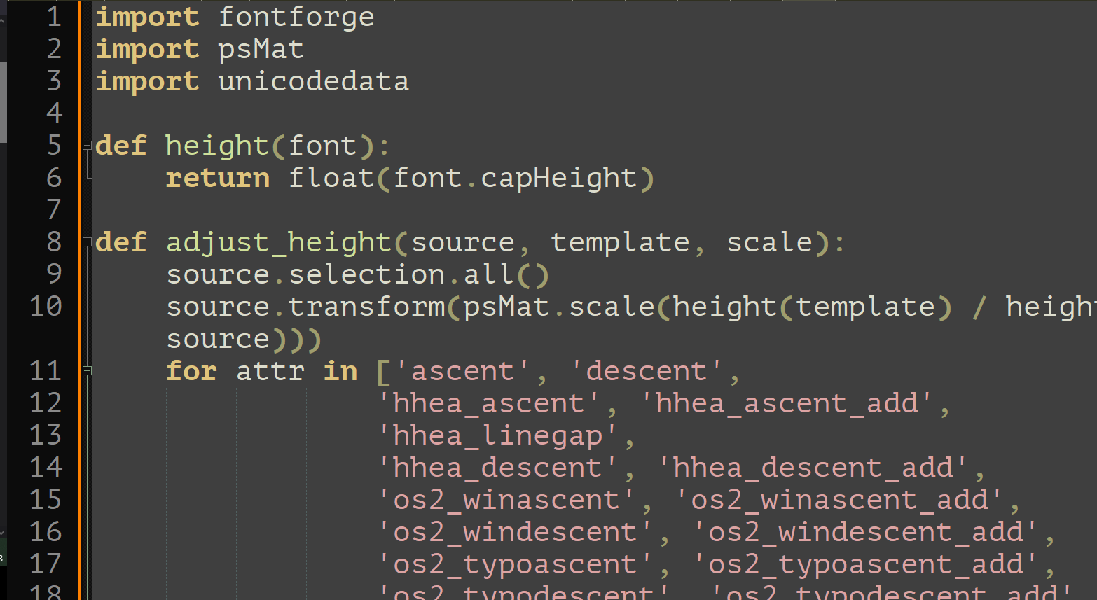
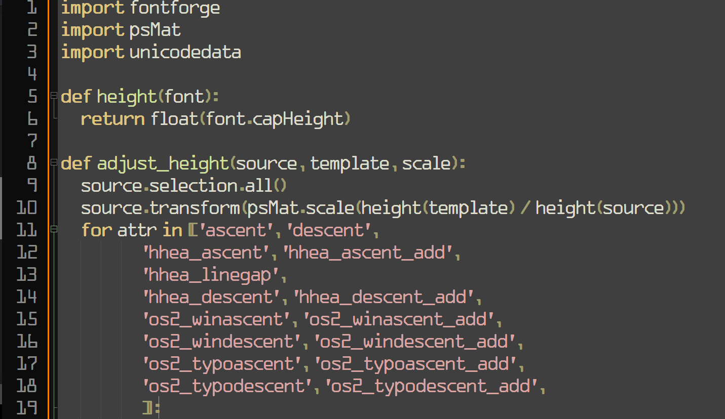
Friendship ended with font gatekeeping and dogpiling, accessibility is my new best friend
Programming
All things programming and coding related. Subcommunity of Technology.
This community's icon was made by Aaron Schneider, under the CC-BY-NC-SA 4.0 license.
I…don’t hate it? Why am I not horribly offended by this?
I feel the same way. I hate that Iike it and am now going to try it.
Does it support ligatures??
Look what you have done! I used Operator Mono for Italics. I kind of like this!

bro... how did you manage to stain a screenshot
Is it that bad? Now I have IBM Plex installed
If you like that, check out Recursive Sans & Mono
I wouldn't pick it over Fira Code but it has a bit of whimsy to it that reminds me of Comic Mono.
Blatant trolling should be banned! Get the pitchforks everyone! :P
Oh no now I want to build a whole Arch rice around that font.
...no that's not enough.
we need ComicSansOS
Holy man! If you ever do that. Please post! On unix porn as well!
I will forever believe the comic sans hate is one of the internet's seemingly random circlejerks, like hating Imagine Dragons.
There were legitimate reasons from a design standpoint. It's badly balanced, the spacing is inconsistent...and it was everywhere.
Funny enough, I suspect what makes it a badly designed font might be why some people with dyslexia have an easier time reading with it. The badly balanced, poor spacing, probably made the letters in the font more distinguishable from one another.
If you (or anyone else that's interested) have the time, I think this article, "Why You Hate Comic Sans," goes over all of it pretty well.
I recently read a review of 1990s pop aesthetics, and it was probably intentional for reasons that resonate with us again. In the 90s, with the advent of omnipresent computers, organic, amateurish handwriting became really popular, and I think that's what comic sans is good at looking like.
⚠️ I have reported this post to the proper authorities.
Title is misleading, it's a monospaced derivative of Comic Sans that's actually nice, not actual Conic Sans.
Conic Sans is the hyperbolic version of Comic Sans
I miss RES's context feature now. Thank god this thread wasn't too long, so I was able to find my comment you replied to in it in a reasonable amount of time.
I was addicted to coding with Comic Mono and ended up purchasing Comic Code. No regrets.
I mean Comic Mono is mentally relaxing and legible so great font of choice
WolfgangsChannel also recently said he used a comics sans-lile font
Oh no, I was ready to pick up my pitchfork, but that is super legible. Brb, I need to go take a look at myself in the mirror...
Yeah, I'm surprised how much I like the look of this. I'm into it.
the very typeface you’ve been trained to recognize since childhood What does this mean? I feel like the one we learned from childhood would be Times New Roman since every teacher I had required that font.
I think they mean all the notices and board that used comic sans.
Great to find another Comic Mono user! It's super easy to read. I've been using it in IDEs / Terminal for a while now.
I've even set up Stylus scripts to use it in GitHub and other sites as I find weird going back to the "normal" code fonts.
That's interesting, how can I make GitHub use Fira Code of that's what I'm used to?
I use an extension called Stylus which allows you to inject css into sites. I have a general rule that overrides the font-family for pre / code elements. There's a great community around it for custom styles for various sites - offering dark modes, decluttered views, alternative themes etc.
Cool, thank you!
This is cute~! I hated comic-sans when seeing it on lots of tacky corporate and school signs etc. but recently I ironically and then unironically fell in love with its whacky-ness, bold-ness and readability, (I use a Samsung phone, and used PT Mono on the S9, but then future phones blocked custom fonts, so I used one hack-ey Comic-Sans version since my mono ones are so underground no one developed a phone hack - now any font is possible again so I'm using the one below~ )
A few years ago my fav. font became PT Mono, from Google Fonts - cyrilic compatible, it has these angular edges, and swoopy circle curves, so cute <3
THEN there was this font printed on 2011 Pentax Q cameras and lenses that I loved, and couldn't find the original, but there was something very similar, STALKER1 and related similar fonts
PT MONO

STALKER1

How do you feel about Choco Cookie? It's ubiquitous on Samsung phones but I don't think it looks as good as Comic Sans.
I've seen it around - I'm not a fan, I like comic sans, PT Mono and STALKER1 <3
I tried that this morning at work, as a joke.
It was still there when I got off.
undefined> Wingdings
After two days, what do you think?
Still using Comic Mono, I really like it.
I'd just like to slightly increase the letter spacing. Some portions of code felt a bit too dense. Maybe I'll try to tweak that after my vacation (as of today, 8 days without a computer)
Wonderful! I also installed Comic Mono yesterday kept it until now. So far so good. Yeah you are right, sometimes the code feels a little bit dense. If you do something about that, please give us an update.
BTW enjoy your vacation!