this post was submitted on 10 Sep 2023
10 points (91.7% liked)

art

630 readers
1 users here now

Wecome to the art community of solarpunk, where we host any and all forms of art related to solarpunk!

Remember to follow the instance rules when interacting, and also:

-Cite the author whenever possible, or state it as unknown when unsure.

-This is an art community, for other aesthetic related things, check out our sister community /c/aesthetic.

-Keep it SFW.

Hope you enjoy your time here! :D

As a last thing, kindly reminder that solarpunk is not just a form of artwork/aesthetic, but also a mindset and a movemet. For more on this, you can check our community /c/solarpunk.

Icon artwork by tk-sketches

Banner artwork by 六七質

founded 2 years ago
MODERATORS
 

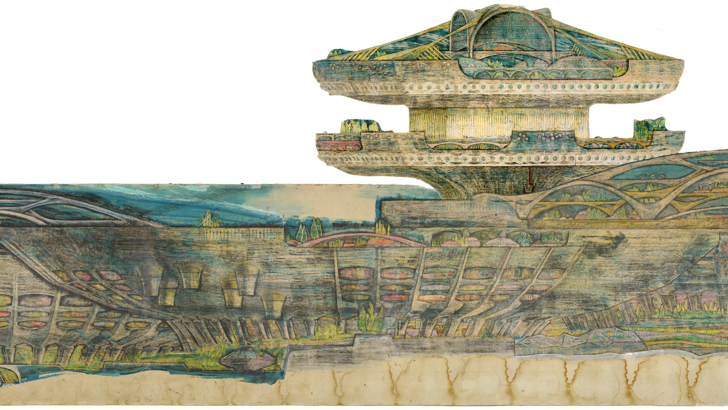
Macro-Cosanti

"Soleri sketched on long rolls of brown butcher paper laid out on his drafting table, rewinding the paper as he worked. This process allowed Soleri to draw in a stream of consciousness, brainstorming and designing numerous variations of one building.

In 1961, Soleri began work on second major city design. Macro-Cosanti compresses square footage by closely spacing buildings that reach skyward. It introduces large-scale apses filled with residences and offices; their southerly orientation captures maximum light during the winter and provides passive cooling through the shadows cast by direct summer sunlight.

The pedestrian-centric city features parks and gardens linking the elements of a vibrant city centre: residences, stores, schools, markets, churches, hospitals, libraries, theatres and museums.

In this city devoid of roads, automobiles are rendered useless, replaced by elevators and escalators that connect living and work spaces. Scale is communicated through small red human figures sitting in amphitheaters, riding in elevators and strolling through gardens.

This particular scroll is an exceptional example of a single continuous design. Because the scroll is significantly longer than Soleri's drafting table, he had to have sketched it in segments. Despite being unable to see it in its entirety, Soleri made a beautifully cohesive drawing."

no comments (yet)
sorted by: hot top controversial new old
there doesn't seem to be anything here