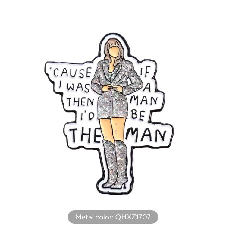
So whoever designed this started left to right, decided up to down was better part way through, then switched back to left to right... All without ever proofreading their work apparently
NoSafetySmokingFirst
Welcome to NoSafetySmokingFirst!
For images where the text reads correctly left to right, but visual cues (like colouration, vertical proximity, or horizontal separation) lead you to try to read it top to bottom.
This is similar to, but distinct from, the more widely known “DontDeadOpenInside” format. In that case, the text reads correctly top to bottom, but visual cues (like colouration, horizontal proximity, or vertical separation) lead you to try to read it left to right.
The post that started it all:
Other related communities:
- !dontdeadopeninside@lemmy.ohaa.xyz
- !yelldowlgyel@sopuli.xyz (letters arranged in any confusing order)
Yeah. This is a great one. It doesn't scan no matter how you start.
3x⬆️ multiplier awarded
'Cause if I was a man, I'd be the man
For anyone struggling
That middle part is even worse than all the other hilarious rubble that's being posted here.
If you followed the order left to right and read it line by line it'd read: "Cause if I was a then man I'd be the man." The first "man" is not directly following the "a".
Even left to right isn't legible: Cause if i was a then man id be the man.
They want you to go "a man" and then back to left to right.
cus if I was a man then I'd be the man

No problems with this whatsoever. Totally a logical reading order.
Dat som deep shit: if a man be man
A man, a plan, a canal. Panama!
Miserable pile of secrets.
If a man be man, cause I was then. AMEN 🙏
✊
....what's a Then Man?
If I was the man then man I'd be the man, man.
man oh man
You don't even have to read this one wrong for it to be wrong.
