a small tip from someone that has been at this for a while.
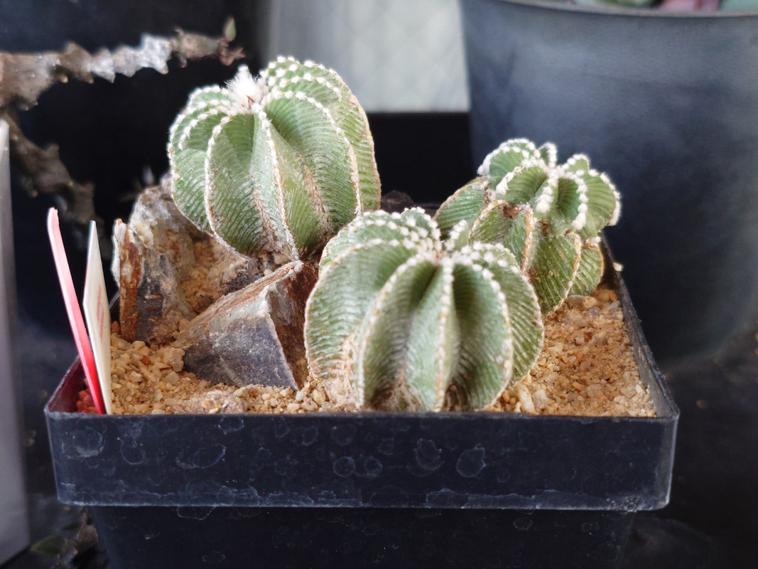
watch your highlights when you're pushing the contrast. you have some very delicate texture and detail in the whites on those plans the you don't want to lose. try pushing your highlights and shadows separately, if you aren't, instead of using the contrast slider. that way you can push the shadows down more than you push the highlights up. creating the same amount of contrast while preserving the highlights.
of course, the same can an be said in reverse for shadows. it's all a balancing act.


