this post was submitted on 20 Jul 2024
1286 points (98.4% liked)
Political Memes
5430 readers
2094 users here now
Welcome to politcal memes!
These are our rules:
Be civil
Jokes are okay, but don’t intentionally harass or disturb any member of our community. Sexism, racism and bigotry are not allowed. Good faith argumentation only. No posts discouraging people to vote or shaming people for voting.
No misinformation
Don’t post any intentional misinformation. When asked by mods, provide sources for any claims you make.
Posts should be memes
Random pictures do not qualify as memes. Relevance to politics is required.
No bots, spam or self-promotion
Follow instance rules, ask for your bot to be allowed on this community.
founded 1 year ago
MODERATORS
you are viewing a single comment's thread
view the rest of the comments
view the rest of the comments

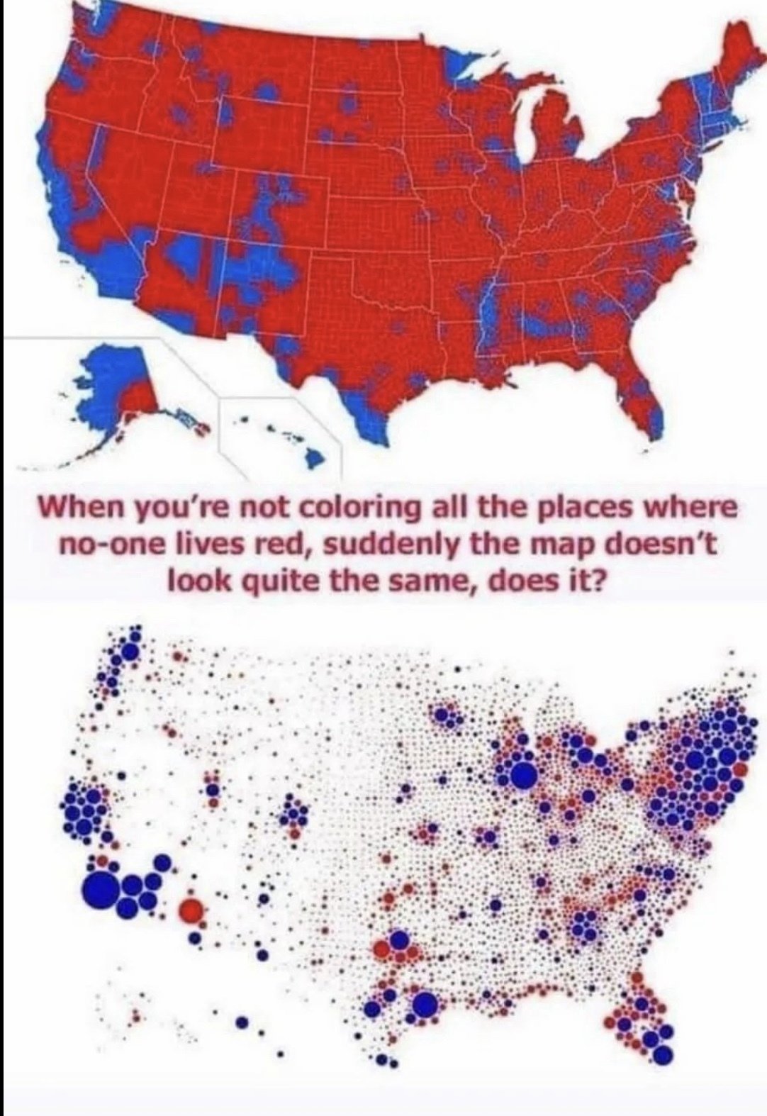
Relevant xkcd:
https://xkcd.com/1138/
I don't think it is relevant.
The xkcd points out distribution and population.
The second map highlights how much more democratic the us is than republican and that is it obviously a broken system that republican's have a chance of winning
agreed - love xkcd, happy to see it anytime, but it's very specifically out of context here.
Population maps are what it's about.
2nd map only shows full red or blue dots, whereas in reality each dot would be a pie-chart of red and blue.