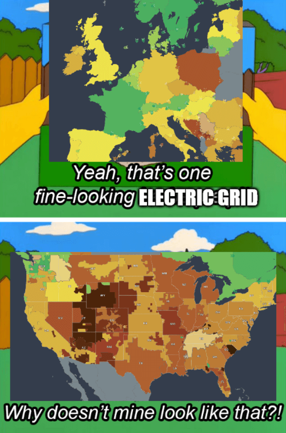
Source - The colors of the grids represent CO2 emissions
The title is a reference to the 2021 Texas power crisis
1. Be civil
No trolling, bigotry or other insulting / annoying behaviour
2. No politics
This is non-politics community. For political memes please go to !politicalmemes@lemmy.world
3. No recent reposts
Check for reposts when posting a meme, you can only repost after 1 month
4. No bots
No bots without the express approval of the mods or the admins
5. No Spam/Ads
No advertisements or spam. This is an instance rule and the only way to live.
Source - The colors of the grids represent CO2 emissions
The title is a reference to the 2021 Texas power crisis
This map underrepresents emissions from NPPs. The emissions that are assumed for nuclear are lower than everything you find in literature and are 1/5th to 1/10th of what reputable sources state. That being said, this map is otherwise a great resource and i like it very much.
Really? Because they use the figure given by UNECE, that's a pretty good source I feel? The report it comes from is also very thorough.
What sources have you seen that state a number 10 times higher? Would be interesting to see where the difference is and what numbers they give for other sources.
It will take some time but I will answer with sources. Can you post the source used in the map i have never been able to find anything that came close.
Sure! This is the report: https://unece.org/sites/default/files/2022-04/LCA_3_FINAL%20March%202022.pdf
It has a description of the methods and the ISO standards they use to determine life-cycle CO2, from the cradle to the grave numbers. It also includes all the references and sources. I'm sure there's a lot more info available about the research they did, but this is the high-level report.
The UN seems like a pretty reliable source and the report seems very thorough, but I'm not qualified to say where they went wrong. So I would love to see what other sources say on the subject.
Edit: They even state in their report why the value they give for nuclear is on the low end of most accepted literature:
But even if you double the amount, it's still the best or at least one of the best.
Lifetime CO2 numbers listed here are accurate. The only time NPPs have worse CO2 figures is when they are shut down prematurely (see: Germany.) The actual act of nuclear generation produces no CO2, and mining Uranium is difficult but significantly more efficient than than coal and when comparing the amount of silicon needed for solar to make 1mw compared to uranium needed for NPPs to produce 1mw, the uranium still has has better a better track record. Hydro is a mess with so many different designs that some aren't that impactful where others devastate entire ecosystems just by existing so it's difficult to realistically talk about it objectively.
We need NPPs, Wind and Solar if we want a dependable and sustainable power grid, but that's just one small part of a sustainable future that we desperately need to change the way we live to avert global climate catastrophe.