this post was submitted on 30 May 2024
667 points (99.3% liked)
Funny: Home of the Haha
5641 readers
653 users here now
Welcome to /c/funny, a place for all your humorous and amusing content.
Looking for mods! Send an application to Stamets!
Our Rules:
-
Keep it civil. We're all people here. Be respectful to one another.
-
No sexism, racism, homophobia, transphobia or any other flavor of bigotry. I should not need to explain this one.
-
Try not to repost anything posted within the past month. Beyond that, go for it. Not everyone is on every site all the time.
Other Communities:
-
/c/TenForward@lemmy.world - Star Trek chat, memes and shitposts
-
/c/Memes@lemmy.world - General memes
founded 1 year ago
MODERATORS
you are viewing a single comment's thread
view the rest of the comments
view the rest of the comments

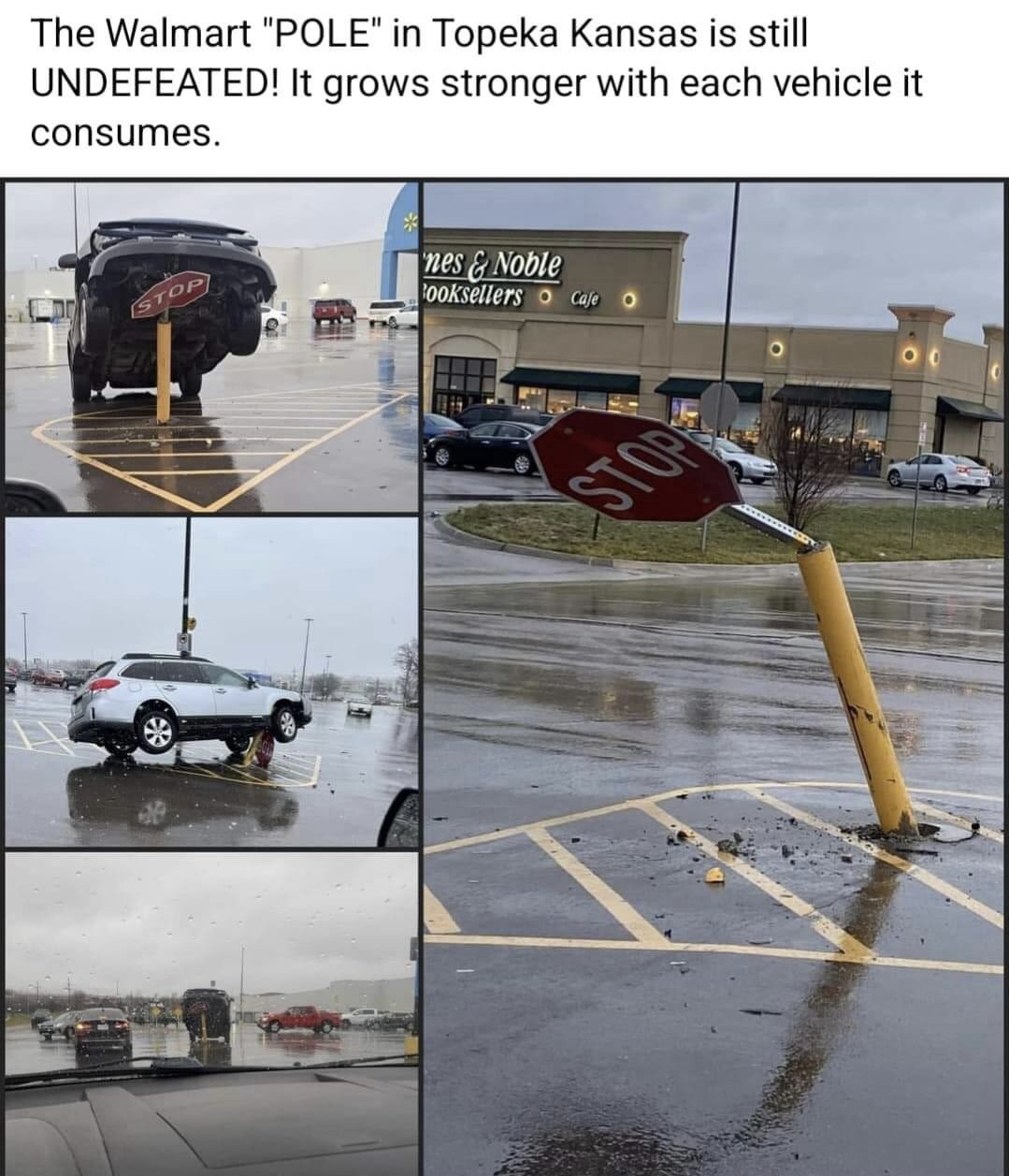
Those photos are all taken on rainy foggy days and that is one shiny, uniformly reflective parking lot surface. I wonder if the yellow pole on those horizontal lines forms enough of an optical illusion that leads somewhat distracted drivers to wildly misjudge the distance their vehicle is from the pole.
Especially with another similarly sited pole someone else posted, in similar weather conditions. and it looks like the pole is REALLY close in width to the lines on the ground. Could be a cool phenomenon to look into.
Yup. If it keeps happening, maybe there's a design flaw. Remember, nobody's perfect all of the time so we need to design things to accommodate the mistakes people inevitably make.
Indeed.
It is good to design to account for stupidity, or in these cases design around known limitations (eyesight in poor conditions, visibility from a driver’s seat).
Is the rock or sign putting people in danger? I'd argue they account for stupidity by stopping the people who aren't paying attention and shouldn't be driving right now.
The dangerous driver is stopped on an inanimate object instead of causing an accident and no one is hurt.
Correct answer.
Incidentally, but not at all coincidentally, this is precisely why Target stores always have those red concrete spheres in front of the doors. Which are typically nearly exactly the same height and thus have the same potential amount of visibility/invisibility below a driver's sightline as this rock. It's to prevent morons from crashing their vehicles through the doors.
The rock(s) pictured are not even in the parking lot like this Wal Mart pole. If you leave the road, it is reasonable to expect that you will encounter obstacles.
Not so much morons as targeted attacks. Same reason malls (remember malls?) have those great big planters placed randomly on the floors, to stop vehicles that made it past the bollards. Defensive architecture, its a fascinating and extremely depressing subdiscipline.
Lol the guy that tripped over it
The 11'8" bridge taught me that it's always human stupidity. They have regular signs, flashing signs, sensors that automatically turn the light red if you're too tall, and other stuff. And yet we still have regular videos of trucks opening themselves like tin cans.
Ooh, the bridge got a moving truck last week, lol.
EDIT: and there was a perfect can opener last month. It's hilarious how, in spite of everything, that bridge is still fucking up trucks.
They actually raised that bridge -- or rather, lowered the underpass at what was surely great expense -- and even at its new taller height of 12'4" it's still not enough to help stupid people.
No, it's Walmart.
I have lived close to several Walmarts, and each and every single one has smashed signs in the parking lot because the people who frequent Walmart are exactly the kinds of people who drive straight into solid objects.
Target had similar problems in Denver.
https://www.9news.com/article/news/local/next/drivers-cant-stop-running-over-this-rock-by-the-colorado-mills-target/73-412803465
Especially in a parking lot. If you’re not seeing a giant pole, maybe you’re also not seeing a child in a yellow coat.
They need to have some serious speed to crawl up that far. Its 1000% stupid people who cant drive/dont care.
It's a yellow pole placed among yellow lines painted on the ground. It's a terrible layout and design. There needs to be more contrast between the pole and the lines on the ground.