this post was submitted on 23 Feb 2024
167 points (82.0% liked)
linuxmemes
21263 readers
572 users here now
Hint: :q!
Sister communities:
- LemmyMemes: Memes
- LemmyShitpost: Anything and everything goes.
- RISA: Star Trek memes and shitposts
Community rules (click to expand)
1. Follow the site-wide rules
- Instance-wide TOS: https://legal.lemmy.world/tos/
- Lemmy code of conduct: https://join-lemmy.org/docs/code_of_conduct.html
2. Be civil
- Understand the difference between a joke and an insult.
- Do not harrass or attack members of the community for any reason.
- Leave remarks of "peasantry" to the PCMR community. If you dislike an OS/service/application, attack the thing you dislike, not the individuals who use it. Some people may not have a choice.
- Bigotry will not be tolerated.
- These rules are somewhat loosened when the subject is a public figure. Still, do not attack their person or incite harrassment.
3. Post Linux-related content
- Including Unix and BSD.
- Non-Linux content is acceptable as long as it makes a reference to Linux. For example, the poorly made mockery of
sudoin Windows. - No porn. Even if you watch it on a Linux machine.
4. No recent reposts
- Everybody uses Arch btw, can't quit Vim, and wants to interject for a moment. You can stop now.
Please report posts and comments that break these rules!
founded 1 year ago
MODERATORS
you are viewing a single comment's thread
view the rest of the comments
view the rest of the comments
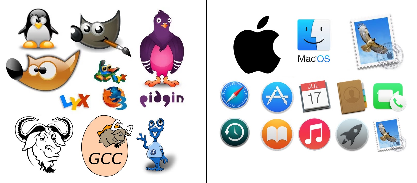
safari, and the app store aren't great.
I dont have a mac or an iphone, but actually follow tech, so Im at least aware of what apps exist... if I had to guess the rest:
calendar, contact book, video call, time machine backups (this one probably requires knowing that backups are a thing), some sort of e-reader, music app, launcher (macOS did the thing where they added an iOS type launcher when they started making "fullscreen" its own special thing right?), and given the final one is a stamp so... apple mail?
So unless I'm wrong, and we say safari, app store, time machine, and the launcher aren't clear. that's still 6/10 icons that ARE clear. Even if we take out the reader.... 5/10... it's still mostly recognizable
Compared to the FOSS side, which gets GIMP. 1/10.
and I agree there assumptions being made. Things like "App store" needs an A because English is not very inclusive, but I dont think that makes things soulless. If their assumptions were "we're making luxury items for affluent Americans (who generally speak English)" then they made a fine decision for reaching their target audience. I'd argue that the app store icon has the most "creativity" put into it.