this post was submitted on 23 Feb 2024
167 points (82.0% liked)
linuxmemes
21263 readers
572 users here now
Hint: :q!
Sister communities:
- LemmyMemes: Memes
- LemmyShitpost: Anything and everything goes.
- RISA: Star Trek memes and shitposts
Community rules (click to expand)
1. Follow the site-wide rules
- Instance-wide TOS: https://legal.lemmy.world/tos/
- Lemmy code of conduct: https://join-lemmy.org/docs/code_of_conduct.html
2. Be civil
- Understand the difference between a joke and an insult.
- Do not harrass or attack members of the community for any reason.
- Leave remarks of "peasantry" to the PCMR community. If you dislike an OS/service/application, attack the thing you dislike, not the individuals who use it. Some people may not have a choice.
- Bigotry will not be tolerated.
- These rules are somewhat loosened when the subject is a public figure. Still, do not attack their person or incite harrassment.
3. Post Linux-related content
- Including Unix and BSD.
- Non-Linux content is acceptable as long as it makes a reference to Linux. For example, the poorly made mockery of
sudoin Windows. - No porn. Even if you watch it on a Linux machine.
4. No recent reposts
- Everybody uses Arch btw, can't quit Vim, and wants to interject for a moment. You can stop now.
Please report posts and comments that break these rules!
founded 1 year ago
MODERATORS
you are viewing a single comment's thread
view the rest of the comments
view the rest of the comments
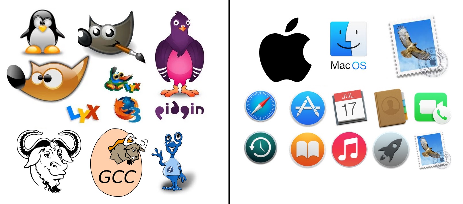
I really disagree with your first sentence. A few of the icons are obvious, but most are extremely vague. I actually use a Mac every day at work and I can't tell you what half of these icons are for (I guess I don't use them). For example the rocket icon, the book (is it a reader or a dictionary or what?), Safari's icon looks like a map app since it's a compass.
I don't know what the history/clock icon is for and the app store icon is just terrible, and has even fewer context clues in languages where the word "app" doesn't start with a Latin A character.
Icons rely on all kinds of assumptions and cultural cues. They might as well be hieroglyphics to people who aren't familiar with them, which is why they need to come with labels or tooltips.
safari, and the app store aren't great.
I dont have a mac or an iphone, but actually follow tech, so Im at least aware of what apps exist... if I had to guess the rest:
calendar, contact book, video call, time machine backups (this one probably requires knowing that backups are a thing), some sort of e-reader, music app, launcher (macOS did the thing where they added an iOS type launcher when they started making "fullscreen" its own special thing right?), and given the final one is a stamp so... apple mail?
So unless I'm wrong, and we say safari, app store, time machine, and the launcher aren't clear. that's still 6/10 icons that ARE clear. Even if we take out the reader.... 5/10... it's still mostly recognizable
Compared to the FOSS side, which gets GIMP. 1/10.
and I agree there assumptions being made. Things like "App store" needs an A because English is not very inclusive, but I dont think that makes things soulless. If their assumptions were "we're making luxury items for affluent Americans (who generally speak English)" then they made a fine decision for reaching their target audience. I'd argue that the app store icon has the most "creativity" put into it.