this post was submitted on 20 Feb 2024
980 points (95.5% liked)
Programmer Humor
32568 readers
123 users here now
Post funny things about programming here! (Or just rant about your favourite programming language.)
Rules:
- Posts must be relevant to programming, programmers, or computer science.
- No NSFW content.
- Jokes must be in good taste. No hate speech, bigotry, etc.
founded 5 years ago
MODERATORS
you are viewing a single comment's thread
view the rest of the comments
view the rest of the comments

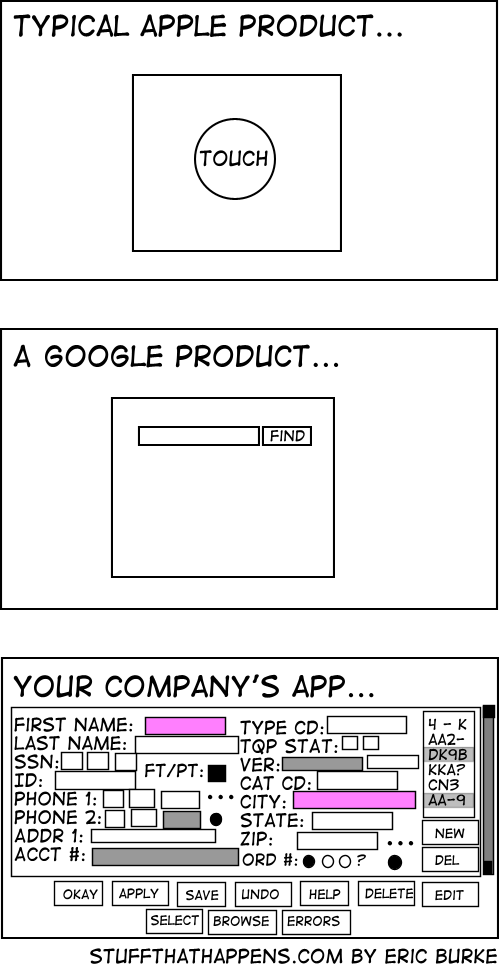
If your company is implementing an app that is basically a toggle switch or power button, it'll probably look like the first one. If your company is implementing an internal search engine, it'll probably look like the second one. If anybody is implementing a data entry system meant to be used by trained individuals at a workstation, its gonna look like option three. You might as well complain about a CNC mill being more complicated than a screwdriver, they're different tools.
That third screenshot, assuming good keyboard navigation, would likely be a godsend for anyone actually using it every day for regular data entry (well, okay, not without fixes--e.g. the SSN and telephone number split apart as separate text boxes is terrible).
This same mindset is what led Tesla to replace all their driver friendly indicators and controls with a giant shiny touchscreen that is an unmitigated disaster for actual usability.