this post was submitted on 11 Aug 2024
-43 points (12.3% liked)
Data is Beautiful
4917 readers
85 users here now
A place to share and discuss visual representations of data: Graphs, charts, maps, etc.
DataIsBeautiful is for visualizations that effectively convey information. Aesthetics are an important part of information visualization, but pretty pictures are not the sole aim of this subreddit.
A place to share and discuss visual representations of data: Graphs, charts, maps, etc.
  A post must be (or contain) a qualifying data visualization.

  Directly link to the original source article of the visualization
    Original source article doesn't mean the original source image. Link to the full page of the source article as a link-type submission.
    If you made the visualization yourself, tag it as [OC]

  [OC] posts must state the data source(s) and tool(s) used in the first top-level comment on their submission.

  DO NOT claim "[OC]" for diagrams that are not yours.

  All diagrams must have at least one computer generated element.

  No reposts of popular posts within 1 month.

  Post titles must describe the data plainly without using sensationalized headlines. Clickbait posts will be removed.

  Posts involving American Politics, or contentious topics in American media, are permissible only on Thursdays (ET).

  Posts involving Personal Data are permissible only on Mondays (ET).
Please read through our FAQ if you are new to posting on DataIsBeautiful.
Commenting Rules
Don't be intentionally rude, ever.

Comments should be constructive and related to the visual presented. Special attention is given to root-level comments.

Short comments and low effort replies are automatically removed.

Hate Speech and dogwhistling are not tolerated and will result in an immediate ban.

Personal attacks and rabble-rousing will be removed.

Moderators reserve discretion when issuing bans for inappropriate comments. Bans are also subject to you forfeiting all of your comments in this community.
Originally r/DataisBeautiful
founded 1 year ago
MODERATORS
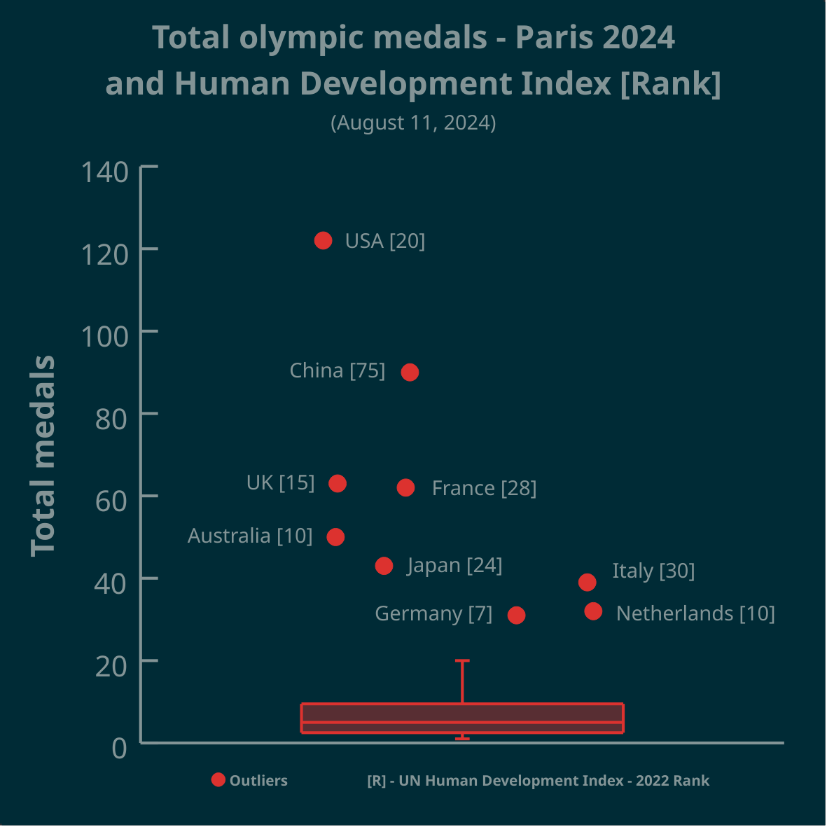
IM hearing a lot of correlation and not A whole lot of causation there, did the US have 12x the people competing in the Olympics?, did Australia pick its people from an even distribution of its populous or maybe just maybe did they Cherry pick from places that are better than the US like Sydney or Melbourne?
@stupidcasey
if a country has 12x a pool of people to pick their best athletes from, wouldn’t you agree that would hugely increase their winning chances?
If two schools compete in a chess match, 1 school has 100 students, the other 1200 students, and they both send their best chess player, with all other factors being equal, who would you put your money on?
Nope, I think both countries have more people than it would be possible to evaluate, also that’s population not living standards, also training has more to do with it than the individual initially picked also the amount of money it takes to train an athlete is such a small percentage of either country’s GDP that money just doesn’t matter either,
All that together plus the plethora of other variables makes this correlation not causation.
@stupidcasey @stupidcasey so you really seriously think based on that above chart that US and then China are the ‘best performing’ countries and the fact that they have a huge population has nothing to do with it????
No I don’t, that chart is the human development index. Why would I draw a conclusion about population from a chart about human development index? They have nothing in common.
@stupidcasey I like have conversations, but don’t appreciate your tone of voice. That’s why I’ll block you. This is not Twitter.
M k, by👋👋👋