@nicemicro @labplot@lemmy.kde.social
That would be great, thanks! 🙂
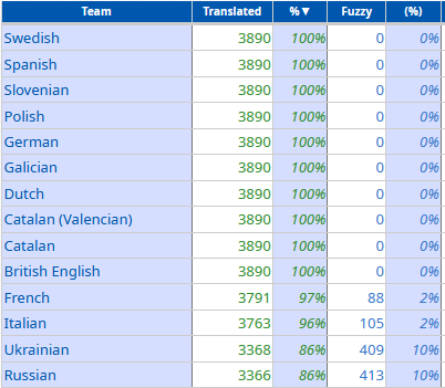
#LabPlot is now also fully available in Ukrainian and French! Thank you ❤️🙂
The following translations still need some work... And other languages need a bit more work 😉
#LabPlot is currently fully available in British English, Catalan, Dutch, Galician, German, Polish, Slovenian, Spanish, Swedish and partially available in French, Italian, Ukrainian, Russian and other languages.
We would like to thank all LabPlot's translators and encourage others to provide translations in other languages ❤️ 🙂
Check translation statistics:
▶️ https://l10n.kde.org/stats/gui/stable-kf5/package/labplot/
Please get involved!
▶️ https://community.kde.org/Get_Involved/translation
This page contains a list of external resources mentioning #LabPlot and its usage in various areas 👨🔬 🔭 🔬 .
➡️ https://labplot.kde.org/references/
If you are aware of other resources that could be listed there, please contact us.
#LabPlot #Science #Research #Students #Physics #Medicine #Chemistry #Biology #Engineering #Ecology #Electronics #Robotics #Education #OpenSource #FreeSoftware

An open access article by W. Morales González and J. E. Hernández-Ruiz: Experiencias en el uso del software LabPlot en el procesamiento analítico y gráfico de datos experimentales
#LabPlot #Students #Research #DataAnalysis #Physics #DataVisualization #experimental #Física #Teaching #Chemistry #OpenSource #FreeSoftware
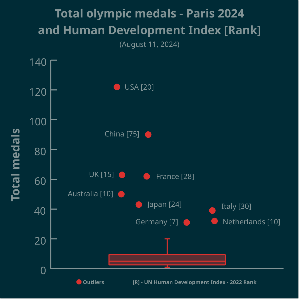
Thank you for all your comments. A jittering of data points along the x-axis was used to avoid over-plotting. But yes, a scatter plot with a boxplot attached along the y-axis (to show outliers) may be more informative in this case.
A boxplot is a 1-dimensional plot. The data points are jittered along the x-axis to make them less crowded.
More on boxplots here:
➡️ https://labplot.kde.org/2021/08/11/box-plot/
➡️ https://userbase.kde.org/LabPlot/2DPlotting/BoxPlot
▶️ Total olympic medals won in Paris 2024 and Human Development Index 🏅
➡️ https://www.businesstimes.com.sg/opinion-features/what-olympic-medal-table-really-tells-us
After reading the article we made this #boxplot using #LabPlot, an open source data analysis and visualization software.
The plot doesn't provide answers, it rather invites some thinking.
#Olympics #Olympics2024 #France #China #USA #UnitedStates #UnitedKingdom #UK #Brazil #Australia #Japan #Italy #Canada #Germany #Italy #Netherlands #DataAnalysis #DataScience #OpenSource #FOSS
Since July you can enjoy the new 2.11.1 version of #LabPlot, an open-source data analysis and visualization software.
Check your current version and ask your package maintainer to provide the latest version for your #Linux and #FreeBSD distribution.
➡️ https://repology.org/project/labplot/versions
#DataAnalysis #Statistics #Research #Ubuntu #LinuxMint #ArchLinux #Slackware #Debian #Fedora #OpenSUSE #RedHat #HaikuOS #GNU #CentOS #FreeSoftware #OpenSource #Manjaro #Zorin #FOSS #FLOSS #KDE
We used #LabPlot, a free, open source and cross-platform data visualization and analysis software.
LabPlot's homepage:
➡️ https://labplot.kde.org/
Video tutorials:
➡️ https://www.youtube.com/@LabPlot/videos
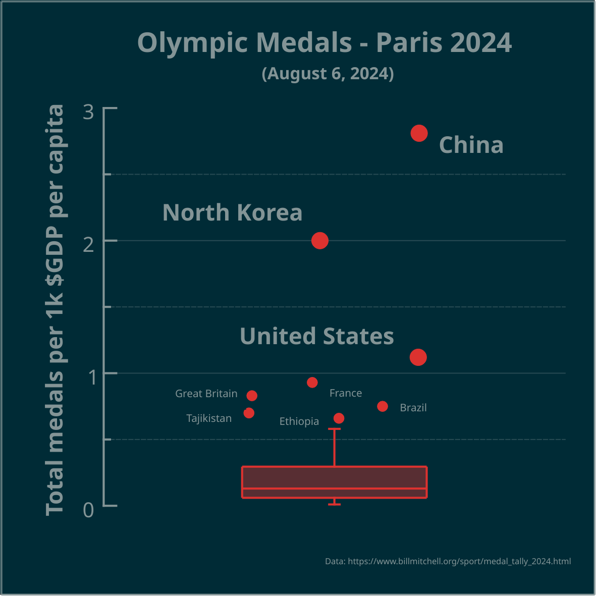
Any exploratory plot forms a question and your comment shows how to look for answers. Thanks!
▶️ Total olympic medals per 1k $GDP per capita - Paris 2024 - represented in the Tukey's boxplot 🏅
Is the highest number, relative to $GDP per capita, best? Outliers marked as circles. Made in #LabPlot, an open-source data analysis and visualization software.
Edit: the problem is framed as a question.
#Olympics #Olympics2024 #France #China #NorthKorea #USA #UnitedStates #UnitedKingdom #UK #Brazil #Australia #Japan #Italy #Canada #Germany #Spain #DataAnalysis #DataViz
@garchomp @labplot@lemmy.kde.social
The German team is certainly at the top. 😉
➡️ https://l10n.kde.org/stats/gui/trunk-kf6/team/
➡️ https://l10n.kde.org/stats/gui/trunk-kf6/team/de/