birchmures

joined 1 year ago
[–] birchmures@reddthat.com 13 points 1 year ago

Yeah, this is one of those "good for everyone" things that, unfortunately, flies under the radar.

[–] birchmures@reddthat.com 2 points 1 year ago

That might look cool.

[–] birchmures@reddthat.com 6 points 1 year ago

That looks really good.

[–] birchmures@reddthat.com 3 points 1 year ago

I get what you mean with the tree, but despite that I like it. The better symbol would likely be a cod, but that isn't green (one of the three official colors).

As for the cranberry, I think that's what makes the flag special.

[–] birchmures@reddthat.com 2 points 1 year ago* (last edited 1 year ago)

Seems like a ^small step in the right direction.


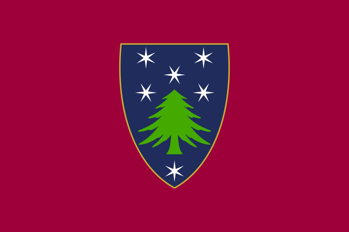
I love the colors and design of this flag despite being a shield-on-a-bedsheet. Massachusetts' official colors are blue, green, and cranberry.

This is not my design, this was created by /u/interrobang26 from this post: https://old.reddit.com/r/vexillology/comments/jvwq1y/massachusetts_cranberry_and_pine/


This was the debut music video from Scottish band We Were Promised Jetpacks.

If you like this, help us build !wwpj@reddthat.com