Not sure if it's more relavant to Creative or Technology, so cross-posting here from: https://beehaw.org/post/743965
Exactly a week later, hello again!
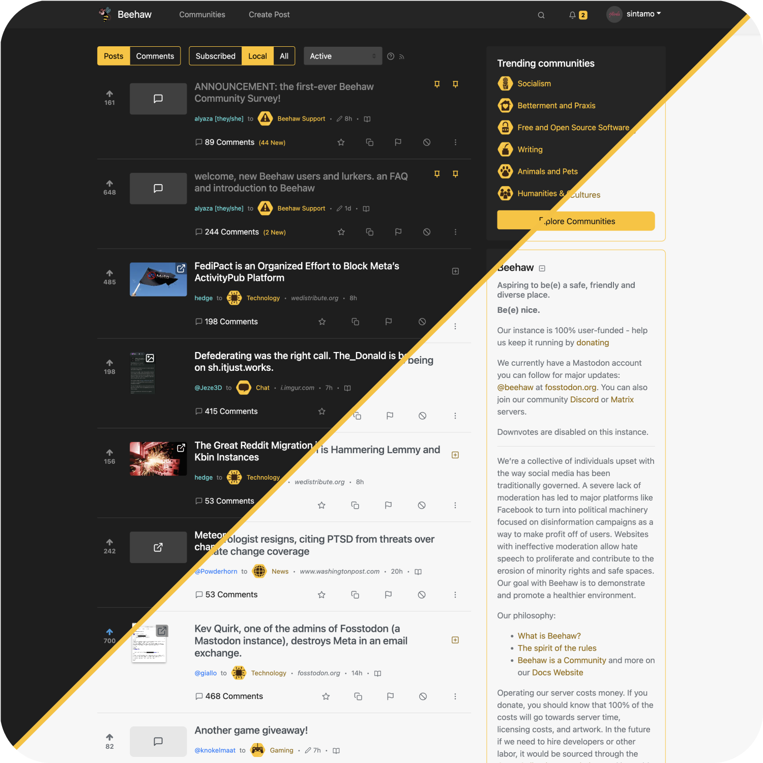
I was so flattered by people's reaction to my last post - thank you for making me feel so welcomed by this community! I'm still toying with icon redesigns, but I noticed that people were equally (if not more) interested in the theme ideas I posted - so I've spent the last week trying to make them a reality! I call them Hive Light and Hive Dark, and I think they're ready to share with you all.
I was able to incorporate lots of tweaks to Beehaw's UI, including:
- Customisable levels of minimalisation
- Consistent padding and spacing site-wide, increasing legibility and cleanliness without sacrificing too much information density
- Repositioned various UI/UX elements to make Beehaw easier and more intuitive to navigate
- Consistent bee-themed colors! Lots of yellows, browns, and blues that play nice with each other and pass accessibility standards
- Hover effects to reduce unnecessary line breaks with long hyperlinks
- And more! But not that much more, it's just some CSS after all ;)
Hive Light:
Hive Dark:
There are more screenshots on the GitHub!
Installation is pretty simple as well:
- Install Stylebot - this was the only CSS extension I found that worked reliably across browsers and consistently applied settings. YMMV with other extensions - Stylus just didn't work well for me :(
- Check your Beehaw settings and select "darkly" if you want to use Hive Dark, and "litely" if you want to use Hive Light
- Copy and paste the contents of either Hive_Light_Theme.css or Hive_Dark_Theme.css from the GitHub page into the "code" section of Stylebot
- Et Violà!
This isn't my first time designing a UI, but it is my first time doing it with CSS edits, so I fully expect there to bugs and inefficient code. I would love to hear your feedback and incorporate new ideas into future versions. And feel free to copy my homework! If I can figure out this CSS stuff in a week, so can you, and I'd love to see what other people create.
One caveat: the Lemmy v0.18.0 release includes lots of (really awesome) updates to Lemmy-UI that will break this theme. I don't know when Beehaw will update, but I imagine it's imminent, so there will be more work to be done soon I'm afraid.
Thanks for reading, and take care!


Appreciate it! I think a stretch-goal for the future could be a "muted colors" toggle, to tone things down a little while keeping the rest of the changes