this post was submitted on 15 Jun 2023
1 points (100.0% liked)

Photo Critique

0 readers
1 users here now

A community to critique photographs and learn from others.


Rules

Trying to create a similar space to /r/photocritique

founded 1 year ago
MODERATORS
 

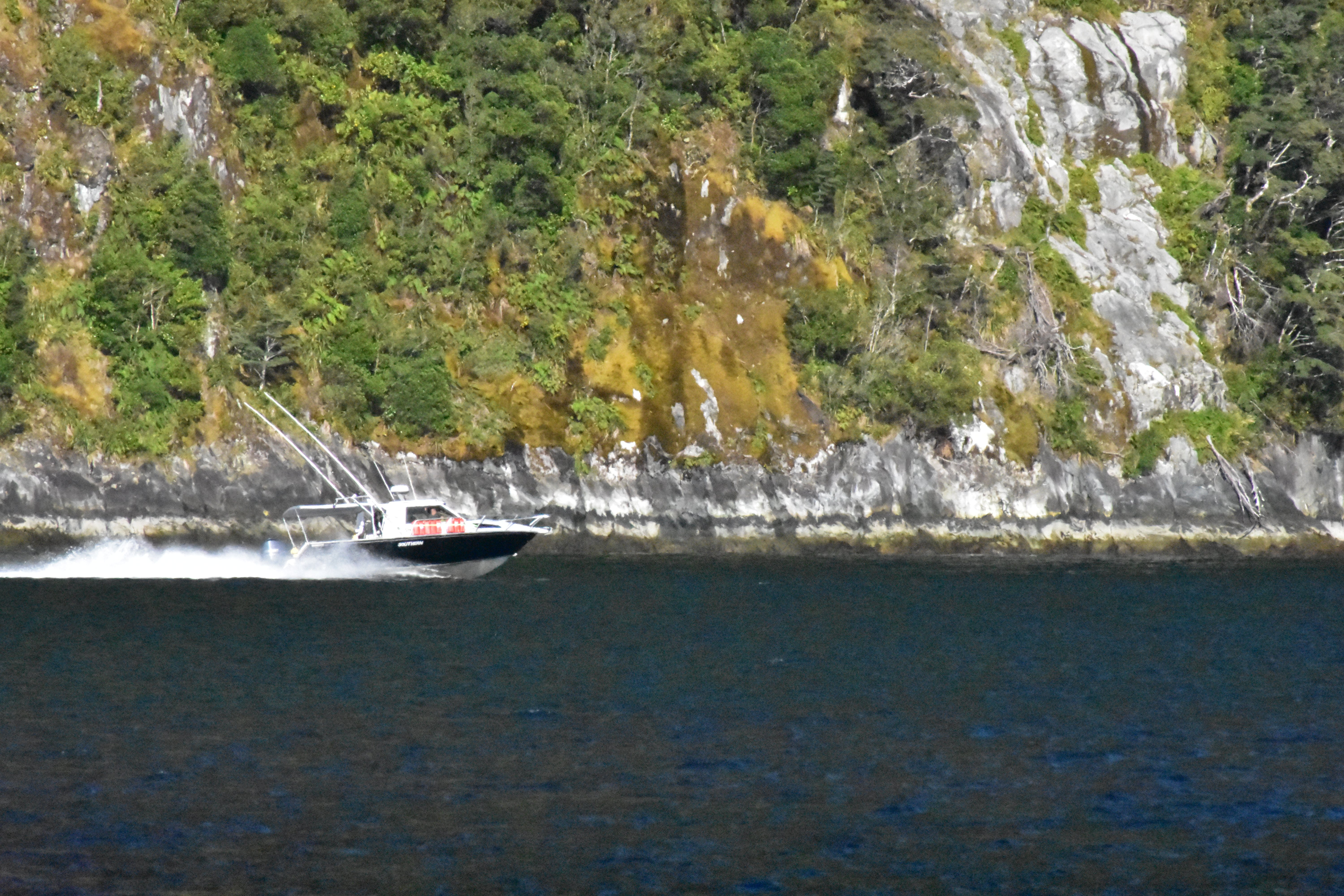
Part of me absolutely loves this picture, but part of me thinks maybe I should've done something differently. I'm interested to hear others thoughts.

Things I like:

  • I really like the contrast between the dark water and the brightness of the cliffside.
  • I also like the way the wake behind the boat appears

Things that could be improved:

  • Would it be better if the boat was on the right side of the frame? I feel like where it is right now cuts off some of the wake and detracts from the photo.

  • Also, while I like the division between light and dark, should it be framed higher so there is less of the water and more cliff? It just feels like a lot of the water is dead space to me.

no comments (yet)
sorted by: hot top controversial new old
there doesn't seem to be anything here