Pixel Dungeon
This community is a place to talk strategies, tell stories, or discuss anything related to Pixel Dungeon or its many versions.

Rules:
-
1. No hate or adult themes of any kind: NSFW or illegal material, hate speech, personal attacks, harassment, doxxing, bullying, etc. are all strictly forbidden. Crude or offensive language should be kept to a minimum or avoided entirely.
-
2. Posts must directly relate to Pixel Dungeon: All content posted must directly reference Pixel Dungeon or one of its variants in some form. Loose connections or similar nomenclature from irrelevant works do not count.
-
3. Do not use other's work without giving credit: You may post things that were created by other people, but you must link to the original and credit the author. AI generated content is prohibited, as crediting the original authors is impossible.
-
4. Follow site-wide rules: https://legal.lemmy.world/fair-use/
We have a few title tags for standout posts:
- [MOD] - Posts by moderators about the community
- [DEV] - Announcements from a developer of a PD version
- [OC] - Self-made original content
Sister Communities:
view the rest of the comments

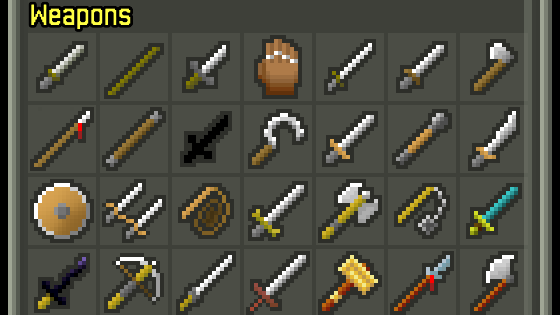
How about giving each tier a differently coloured background instead?
I like this solution if it's subtle.