this post was submitted on 23 May 2024
196 points (97.6% liked)
British Columbia
1360 readers
23 users here now
News, highlights and more relating to this great province!
founded 3 years ago
MODERATORS
you are viewing a single comment's thread
view the rest of the comments
view the rest of the comments

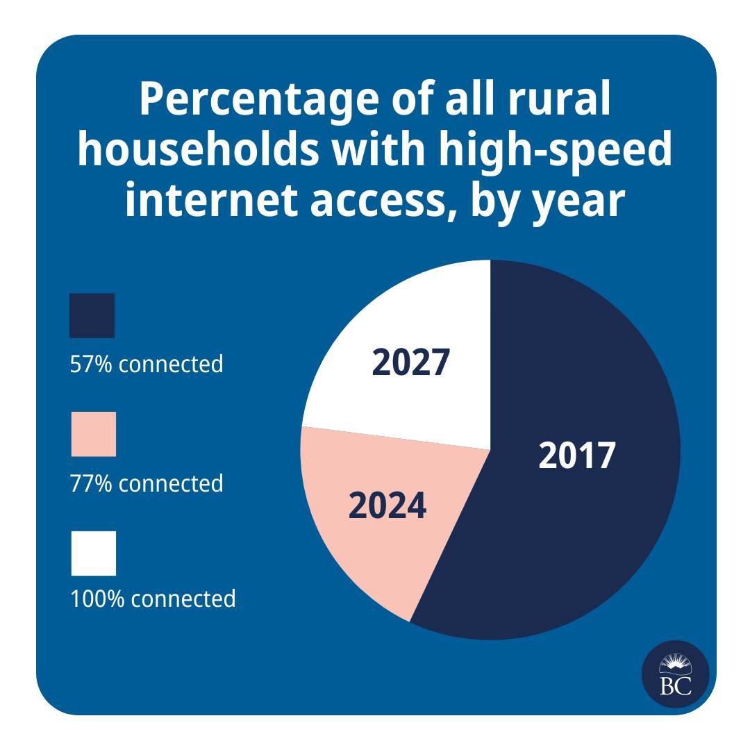
Lol this is hilariously bad though, I can't even figure out what the pie areas represent. Like, 2017 is about 55-60% of the pie. What fact in that set of data represents about 55-60% of something? It's like they just dragged the pie slices around until they liked how it looked. You can't even make graphing software give you that output.
I (somehow) figured it out. Picture it as 3 separate pie charts stacked on top of each other. Or 57% as the base amount and each subsequent area is the increase on the previous amount.
2017 = 57% 2024 = 20% 2027 = 23%
oh shit you got it.
I still don't think they could have produced this from graphing software, it must have been drawn by hand and w h y