this post was submitted on 23 Feb 2024
167 points (82.0% liked)
linuxmemes
21263 readers
572 users here now
Hint: :q!
Sister communities:
- LemmyMemes: Memes
- LemmyShitpost: Anything and everything goes.
- RISA: Star Trek memes and shitposts
Community rules (click to expand)
1. Follow the site-wide rules
- Instance-wide TOS: https://legal.lemmy.world/tos/
- Lemmy code of conduct: https://join-lemmy.org/docs/code_of_conduct.html
2. Be civil
- Understand the difference between a joke and an insult.
- Do not harrass or attack members of the community for any reason.
- Leave remarks of "peasantry" to the PCMR community. If you dislike an OS/service/application, attack the thing you dislike, not the individuals who use it. Some people may not have a choice.
- Bigotry will not be tolerated.
- These rules are somewhat loosened when the subject is a public figure. Still, do not attack their person or incite harrassment.
3. Post Linux-related content
- Including Unix and BSD.
- Non-Linux content is acceptable as long as it makes a reference to Linux. For example, the poorly made mockery of
sudoin Windows. - No porn. Even if you watch it on a Linux machine.
4. No recent reposts
- Everybody uses Arch btw, can't quit Vim, and wants to interject for a moment. You can stop now.
Please report posts and comments that break these rules!
founded 1 year ago
MODERATORS
you are viewing a single comment's thread
view the rest of the comments
view the rest of the comments

Yeah thats what soulless is in this case. The monopoly and locking users into only buying things with a bitten off apple.
Apple probably googled for some just cartoon style and used the first thing.
I'd argue it's literally the opposite of what you're saying. They are trying to make the product easier to use by making it explicit what the icon is for. If that makes you happy, that's not locking you in.
They do plenty of locking in. This is not that.
I'd much rather tell grandma "the music player is the music notes" ... she'll remember that. and not "the music player is the one with the lightning bolt" because she won't remember that.
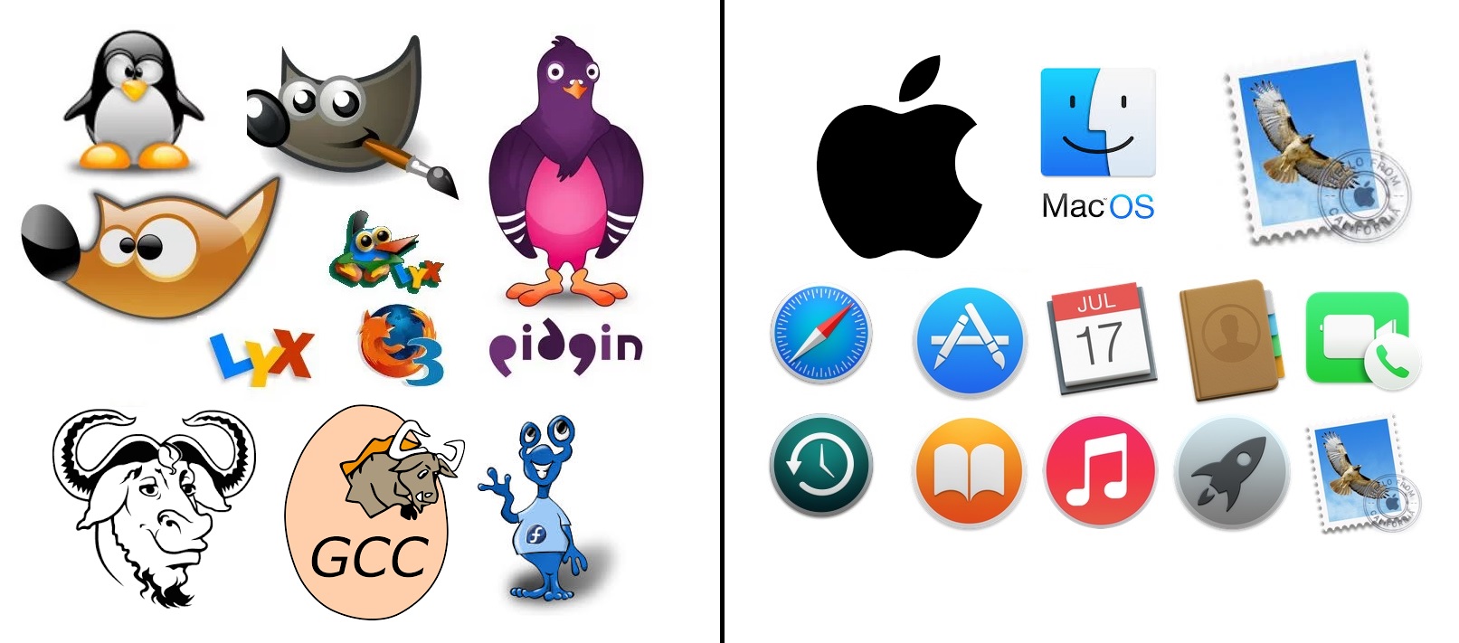
Even if you don't like him. I highly doubt Jony Ive designs things by just googling cartoons. Lots of thought went into these icons. I feel like these are from multiple eras of macOS... Theres the "consistent" ones (the circles) and the "skeumorphic" ones (the stamp, the contact book, calendar)
As far as ICONs go, I vastly prefer the ones on the right. As far as brand mascots go, I prefer the ones on the left.
We're not even comparing apples and oranges here. Neither side is soulless, theyre just achieving different objectives and you seem to have a bone to pick with apple.