this post was submitted on 15 Feb 2024
35 points (67.7% liked)
Data Is Beautiful
6813 readers
3 users here now
A place to share and discuss data visualizations. #dataviz
(under new moderation as of 2024-01, please let me know if there are any changes you want to see!)
founded 3 years ago
MODERATORS
you are viewing a single comment's thread
view the rest of the comments
view the rest of the comments

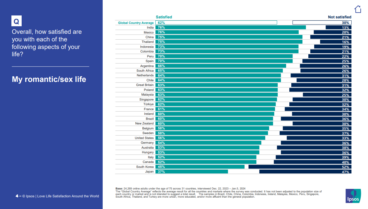
India and Mexico say the same percentage but the bars are different sizes. Either the data or the bars are inaccurate, this data is not beautiful :(
And China has a longer bar with 1% less than Mexico
They are ordered according to the midpoint position, it seems.