this post was submitted on 14 Jan 2024
355 points (96.8% liked)
Crappy Design
3004 readers
5 users here now
Noticed that theres no equivalent to r/crappydesign here yet so i made one
founded 1 year ago
MODERATORS
you are viewing a single comment's thread
view the rest of the comments
view the rest of the comments

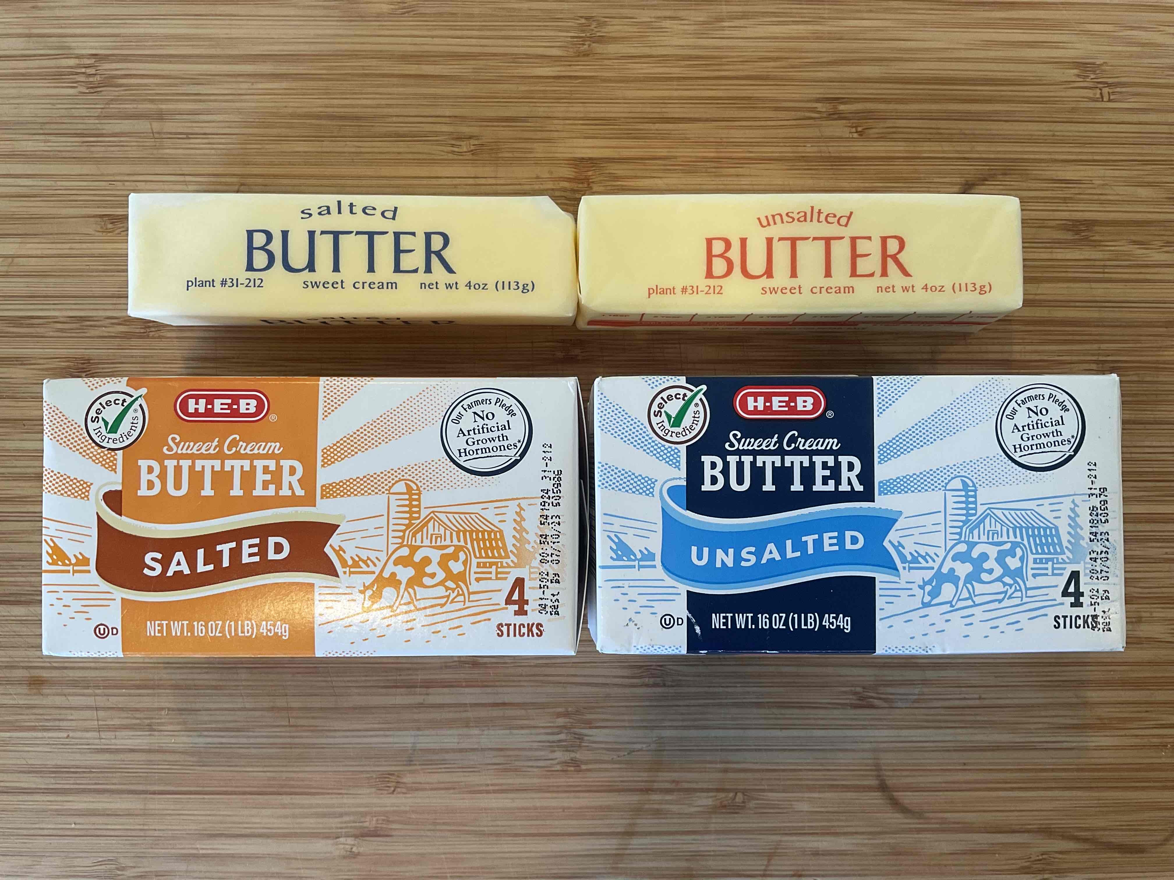
So after some googling, apparently this is a VERY widespread practice spanning multiple brands, multiple manufacturers, all around the US; but I can’t seem to find any explanation. It can’t just be industry-wide madness, right? …Right?
It's always profit.
This actually makes "sense," my last stick is blue, better get the blue box!
Exactly, they rely on absentmindedness and habit..
Same deal as shrinkflation - the package and price are the same, so you assume it's the same as always, but there is less in it now than there was before, and you only notice if you pay close enough attention (which they also make sure you don't not only by using distracting graphics and design, but shit like the music in store, shelving "design" and so on, and if you go even deeper - by working you too hard to have brain power left at the end of the day to notice they're fucking you over. Perfecting ways to manipulate customers is a multi trillion dollar industry).
Not saying there isn't a better reason, but absolutely this could be it
I buy Costco butter, and they pull similar crap. The salted butter is in a blue package, but the wrap has red text, and the unsalted is in yellow packaging and the wrapper has blue text. What's even worse is the unsalted butter package has the word "unsalted" in bold red letters.
Here's a pic.