this post was submitted on 30 Dec 2023
124 points (90.8% liked)
Sync for Lemmy
15132 readers
8 users here now
👀
Welcome to Sync for Lemmy!

Welcome to the official Sync for Lemmy community.
The rules for posting and commenting, besides the rules defined here for lemmy.world, are as follows:
Community Rules
1- No advertising or spam.
All types of advertising and spam are restricted in this community.
Community Credits
Artwork and community banner by: @MargotRobbie@lemmy.world
founded 1 year ago
MODERATORS
you are viewing a single comment's thread
view the rest of the comments
view the rest of the comments

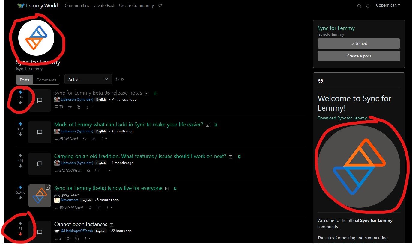
Honestly, Lemmy is the wrong one here. Red/orange for up and blue for down follows the nomenclature for raising and lowering temperature. I'm guessing they changed it to just be different from Reddit.
Yeah it's not exactly subtle that they went exactly opposite from Reddit