this post was submitted on 03 Dec 2023
695 points (95.3% liked)
linuxmemes
21251 readers
1596 users here now
Hint: :q!
Sister communities:
- LemmyMemes: Memes
- LemmyShitpost: Anything and everything goes.
- RISA: Star Trek memes and shitposts
Community rules (click to expand)
1. Follow the site-wide rules
- Instance-wide TOS: https://legal.lemmy.world/tos/
- Lemmy code of conduct: https://join-lemmy.org/docs/code_of_conduct.html
2. Be civil
- Understand the difference between a joke and an insult.
- Do not harrass or attack members of the community for any reason.
- Leave remarks of "peasantry" to the PCMR community. If you dislike an OS/service/application, attack the thing you dislike, not the individuals who use it. Some people may not have a choice.
- Bigotry will not be tolerated.
- These rules are somewhat loosened when the subject is a public figure. Still, do not attack their person or incite harrassment.
3. Post Linux-related content
- Including Unix and BSD.
- Non-Linux content is acceptable as long as it makes a reference to Linux. For example, the poorly made mockery of
sudoin Windows. - No porn. Even if you watch it on a Linux machine.
4. No recent reposts
- Everybody uses Arch btw, can't quit Vim, and wants to interject for a moment. You can stop now.
Please report posts and comments that break these rules!
founded 1 year ago
MODERATORS
you are viewing a single comment's thread
view the rest of the comments
view the rest of the comments

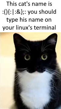
The ampersand looks very weird in that font. It would bug me.
It hails back to the early days of the ampersand, from when it was basically still just Latin "et": https://commons.wikimedia.org/wiki/File:Trebuchet_MS_ampersand.svg
Personally, I do like this font (Fira Mono+Sans), because it still looks professional, without being so boring that I get depression from looking at it.
But yeah, that ampersand is pushing it a bit, as I'm not sure everyone else knows that's an ampersand...