this post was submitted on 01 Nov 2023
257 points (97.1% liked)
Data Is Beautiful
6882 readers
2 users here now
A place to share and discuss data visualizations. #dataviz
(under new moderation as of 2024-01, please let me know if there are any changes you want to see!)
founded 3 years ago
MODERATORS
you are viewing a single comment's thread
view the rest of the comments
view the rest of the comments

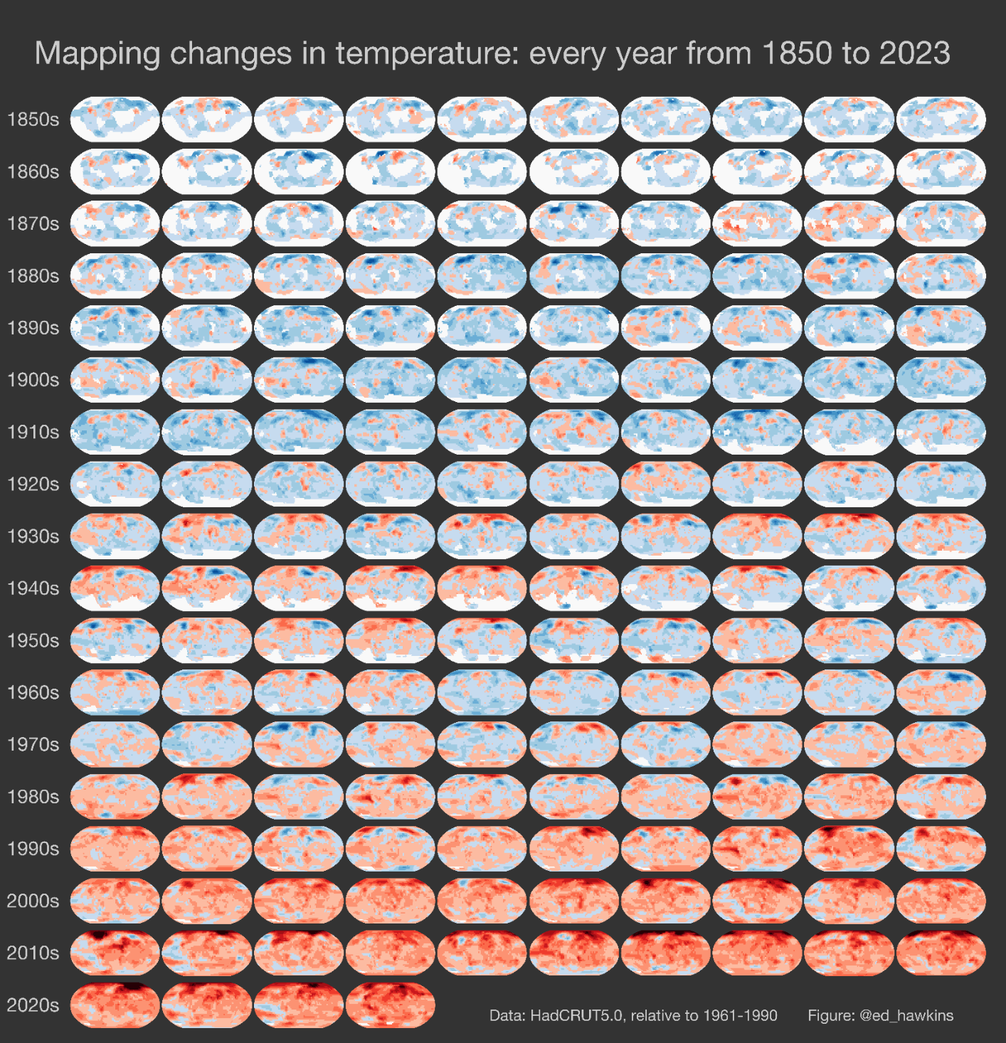
The temperatures are relative to the 1961-1990 average for that region, from the HadCRUT5 dataset.
Edit: I'm just going to find out if it's relative to the average, or just lowest value is blue, highest is red.
The footnote detailing this is maybe a little unclear.
Also by Ed Hawkins: The climate stripes