this post was submitted on 08 Oct 2023
258 points (97.1% liked)
Crappy Design
2998 readers
4 users here now
Noticed that theres no equivalent to r/crappydesign here yet so i made one
founded 1 year ago
MODERATORS
you are viewing a single comment's thread
view the rest of the comments
view the rest of the comments

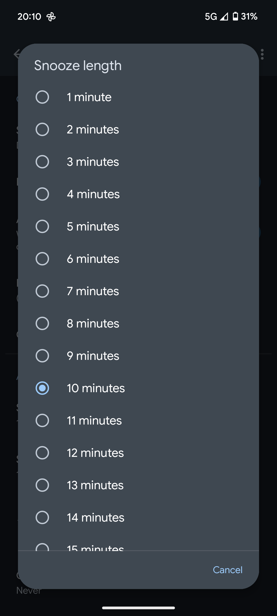
Are you mistaking this for a timer? This is a snooze length. You would likely want your snooze length from 5-30 minutes. This is bad UI design.
This is in the Google Clock settings. It's the snooze length that is buried deep down, that you're meant to set once, and it applies to all of your alarms.
I know what it is.
You're acting like it's something you need to do every time you set an alarm. That's not true, and until you were called out for it, you kept all of your replies vague to make it seem like it's something you had to do often.
I didn't even know the UI existed until I went looking, since you ignored my other comment asking which app this was.
Bad UI design is bad UI design. It doesn't matter how often you visit it.
And a slider is a bad design. When I'm trying to choose a password length in my password manager using a slider, I can never pick the exact number. It jumps as soon as I let go of the button.
Now imagine that garbage when trying to change the snooze length?
No thanks.