this post was submitted on 26 Aug 2023
53 points (93.4% liked)
AssholeDesign
7564 readers
6 users here now
This is a community for designs specifically crafted to make the experience worse for the user. This can be due to greed, apathy, laziness or just downright scumbaggery.
founded 1 year ago
MODERATORS
you are viewing a single comment's thread
view the rest of the comments
view the rest of the comments


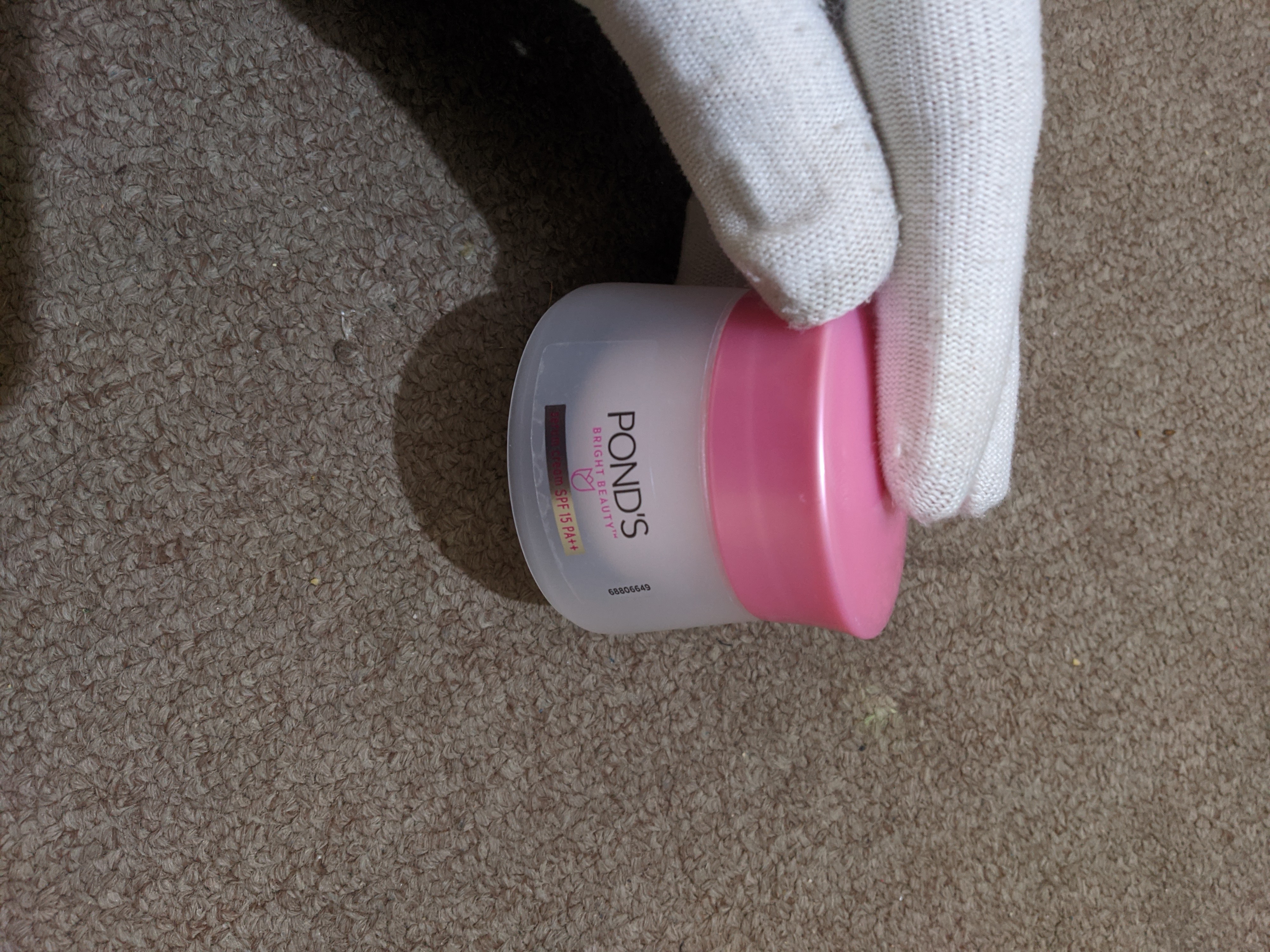
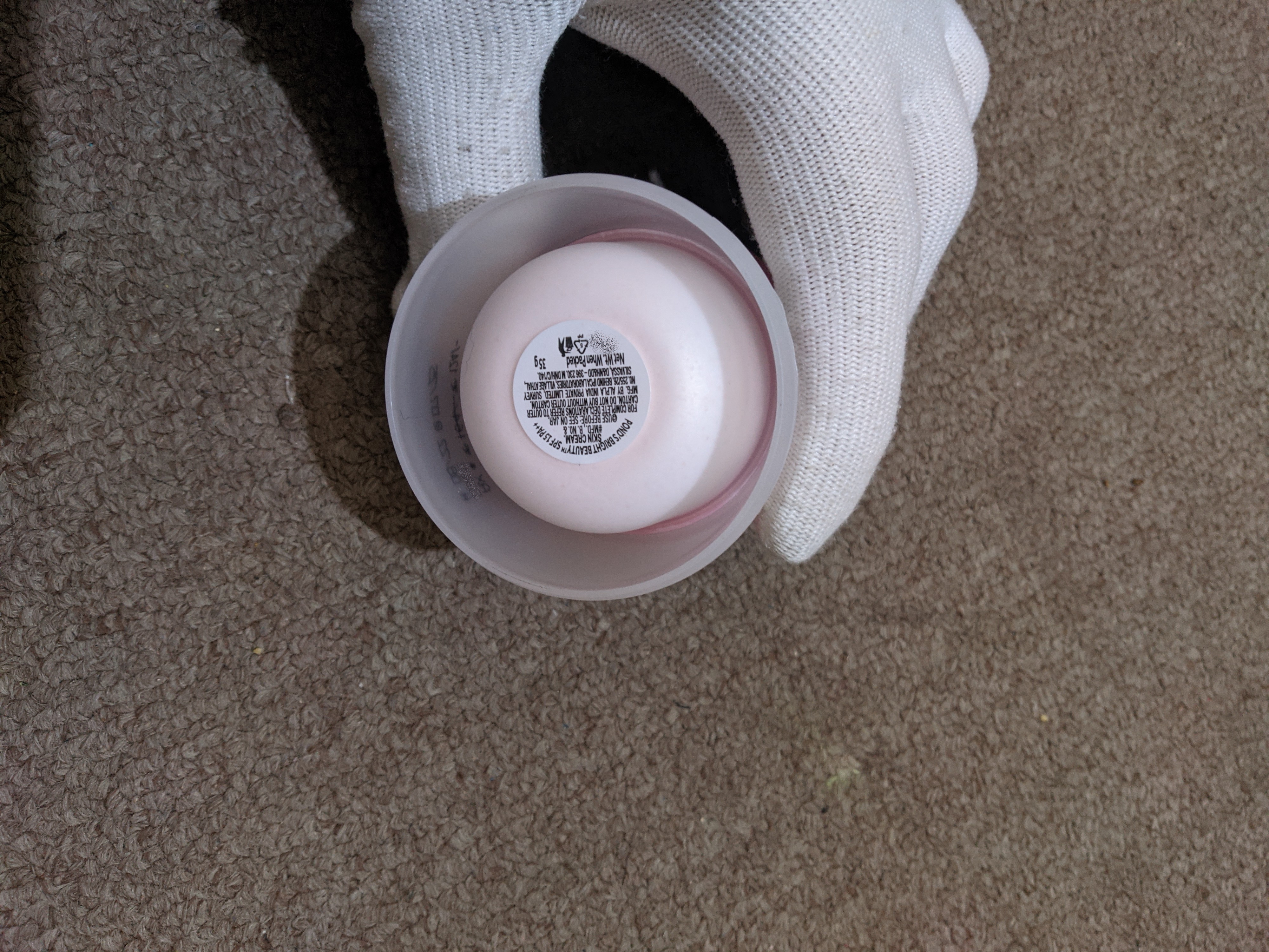
but as the cream came in a cardboard box, I couldn't have guessed that it'd be so small.
Then the design of the bottle couldnt have an influence on your purchase decision either.
yes it could have, the increased bottle size would require a larger box
And when you bought it, did you look at the description, or did you just look at the picture and assume it was bigger?
Generally these things have the weight of useable material listed in the description or listed on the container somewhere like the back which would normally be in one of the pictures of the item.
Unless there's absolutely no mention of the amount of product in the container this really isn't asshole design.