Last year I made a new pixelated free typeface for my 2d game. It has Arabic, Persian, and a subset of Latin glyphs enough for English, German and Spanish texts. Inside the repo you'd find makefile to build the font and generate test outputs.
Since it was my first experience designing a typeface ever, I might have made mistakes not known to me. That's why I post this, hoping someone would point them out. Here is the repo
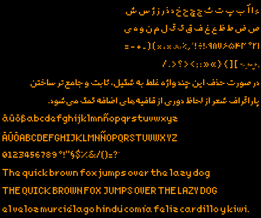
As nottheengineer pointed out, the umlauts being conjoined just doesn't feel right - your reasoning behind it makes total sense, it's just a little bit too wrong for my eyes.
I would instead personally prefer them misaligned/asymmetrical (ouch, i know) as that would make what they are clear (i would probably take a minute to adjust to that and imo that's not something that should be necessary for a typeface.
That nitpick aside, it does feel very well-rounded to look at, you did well!
I'm away from keyboard so can't really experiment with them now, so I'll try asymmetric form again, but make no promises :-)
Thanks for the kind words!