this post was submitted on 23 Jul 2023
744 points (92.5% liked)
Data Is Beautiful
6900 readers
1 users here now
A place to share and discuss data visualizations. #dataviz
(under new moderation as of 2024-01, please let me know if there are any changes you want to see!)
founded 3 years ago
MODERATORS
you are viewing a single comment's thread
view the rest of the comments
view the rest of the comments

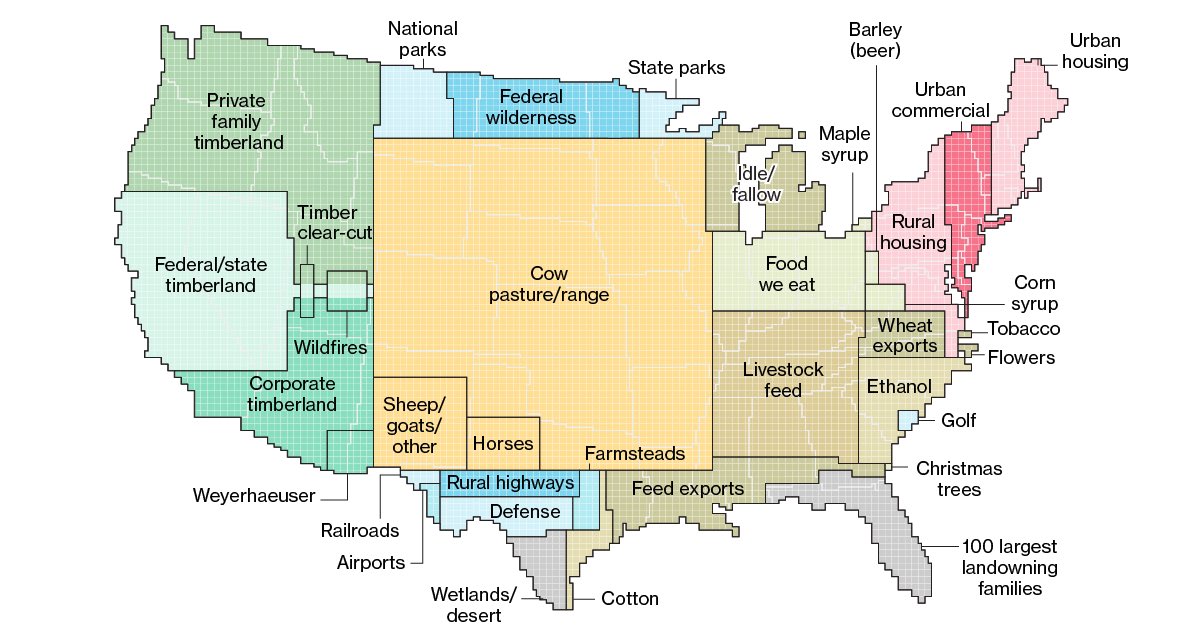
Yeah and Michigan doesn't contain all the idle/fallow land in the US but the problem is some people look at this and think that Michigan contains the most idle/fallow land in the US which is why it was used to represent that portion of the data.
I feel like there is a single sentence or phrase that could be written above the or near the graphic which would make it clear but I honestly don't know what it is.
Why is some people's inability to use critical thinking anyone else's problem? Like, don't make assumptions then. Or, take a beat to understand what's in front of you. There's nothing wrong with this graph.
Yes my inability to use critical thinking is obvious because I think this inforgraphic isn't clear enough to everyone. It's not like there are a shit ton of comments where people are obviously confused by this infographic and all of them must lack the critical thinking skills that you must have in spades. You seem like a real swell person. Keep being you and if everyone around thinks your insults make you come off as an asshole ignore them... they probably just lack critical thinking skills.
"land use amount is to scale, location is not"
Still seems kind of clunky, and given all the misunderstanding ITT it might do more harm than good.