this post was submitted on 24 Aug 2024
194 points (95.8% liked)
Unixporn
15364 readers
4 users here now
Unixporn
Submit screenshots of all your *NIX desktops, themes, and nifty configurations, or submit anything else that will make themers happy. Maybe a server running on an Amiga, or a Thinkpad signed by Bjarne Stroustrup? Show the world how pretty your computer can be!
Rules
- Post On-Topic
- No Defaults
- Busy Screenshots
- Use High-Quality Images
- Include a Details Comment
- No NSFW
- No Racism or use of racist terms
founded 5 years ago
MODERATORS
you are viewing a single comment's thread
view the rest of the comments
view the rest of the comments

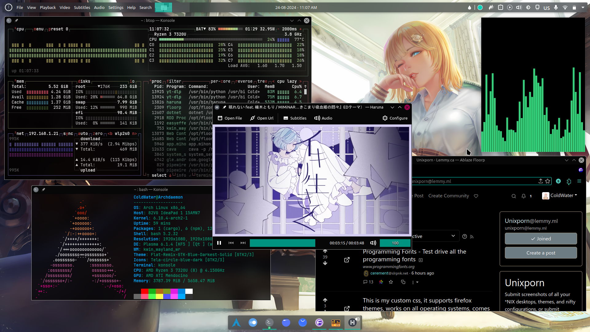
Very Interesting and pretty setup, although I never understood why people like to waste precious vertical space by having bars on the bottom and top of the screen 🤔
Also I didn't know KDE has global menu applet, makes me wonder if I can setup it to look like Ubuntu looked back in the old days (does it still have global menus anyway, or just use GNOME control thingies?)
I got a Framework, and the 16:10 aspect ratio allows for the two bars without messing up most applications as they're mostly geared toward 16:9. Full screen games go over both bars. It's nice.
App panel automatically hide itself when a window on top of it, I think kde global menu only work with qt apps (atleast on Wayland for now I think it also work with GTK on X11)
Vertical bars are great but they are terrible for displaying text, either the bar has to be huge or the bar's width readjusts or text and icons get easily misaligned when displaying dynamic stuff. Personally my horizontal bar is now 70% occupied and I have a keybind that toggles its hidden state.
Side bar is the way.
Yeah, I also prefer having a single side bar on the screen, but I recently found out that on small screens (like on a laptop) the side bar doesn't allow a lot of applications to be visible, so in this scenario I'd rather have it on the bottom.