this post was submitted on 06 Aug 2024
124 points (95.6% liked)
AssholeDesign
7575 readers
1 users here now
This is a community for designs specifically crafted to make the experience worse for the user. This can be due to greed, apathy, laziness or just downright scumbaggery.
founded 1 year ago
MODERATORS
you are viewing a single comment's thread
view the rest of the comments
view the rest of the comments


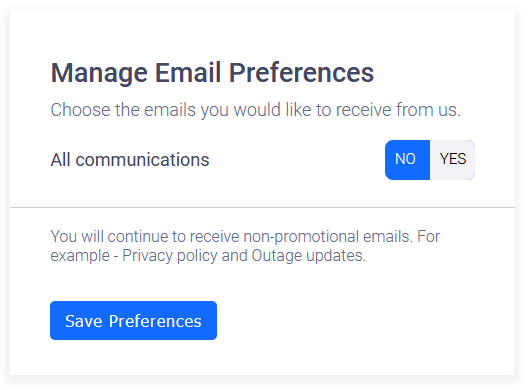
Yeah, what's the issue? Would you rather like 250 options? They'll probably code it so you need to toggle them separately. The color scheme is probably because of the same reason there is just one switch: They don't put that much effort in an elaborate scheme to spam people. It's just the bare minimum.