Nemmy

0 readers
1 users here now

Nemmy: The Neat Lemmy App for the Web (and phones later on)

This project is focused on building an App with the best possible User Experience.

Nemmy Early Access Website

Nemmy on GitHub

founded 1 year ago
MODERATORS
1


I like the animation, odometer style. It works exceedingly well = I can downvote thirty-seven times and see the vote decrease thirty-seven times.

Not sorry to the damn cat photo that got downvoted hard as I discovered this.

2
1
submitted 1 year ago* (last edited 1 year ago) by Cr4yfish@lemmy.world to c/nemmy@lemmy.world


Hi all, Dev Update #4 here

Today I didn't have much time to work on Lemmy, so not a lot has changed.

Installable App

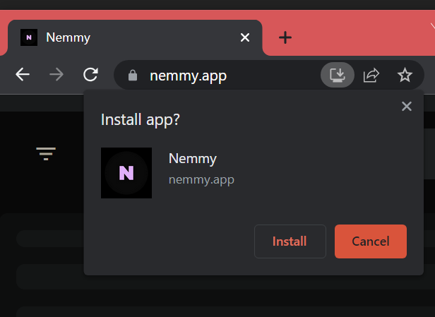
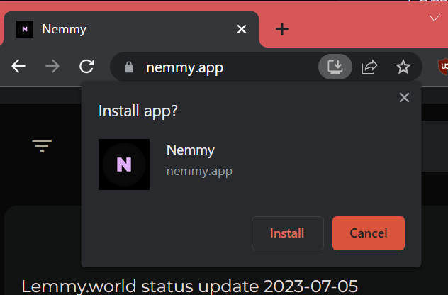
Nemmy is now available as an installable PWA for Android, IOS and Windows (10&11).

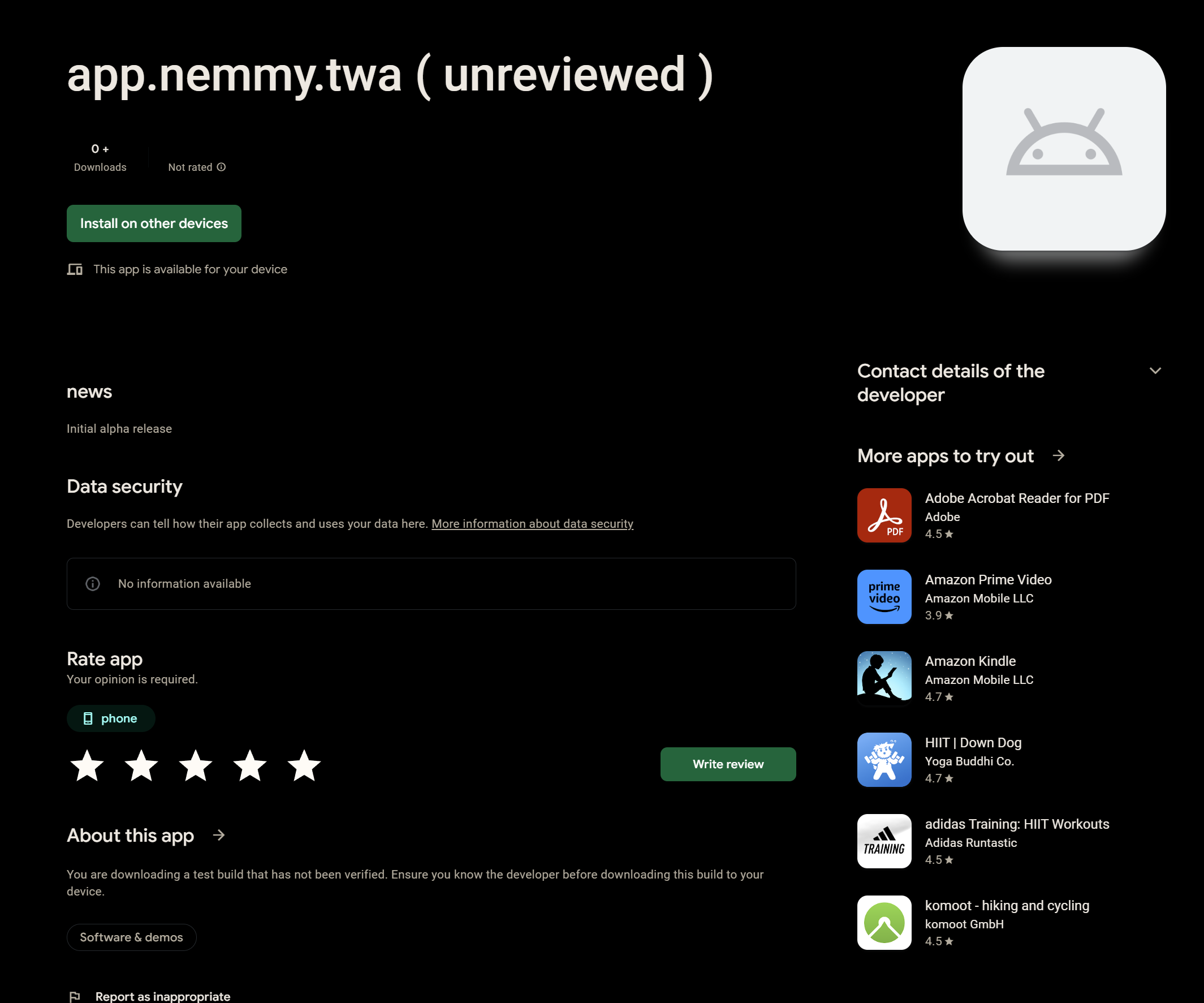
The App is also currently in review for a Google Play Store entry and I swear to god I only had bad experiences building Apps yet and this is just another one. So many errors and weird workarounds. Also, working with Java (Kotlin) sucks. (This also means that I will look for Alpha Testers soon)

However, Nemmy won't appear in the IOS App Store for at least some time since it's way too expensive (100$/Year just for the listing). So IOS Users will have to use the PWA (which is basically the same though).

With this update, Nemmy also received new Icons, Banners etc.

New Domain

Previously, Nemmy was available via a temporary URL provided by the hosting provider (www.nemmy.vercel.app).

Now, Nemmy is reachable via https:/nemmy.app and, of course, https://www.nemmy.app

Well, that's it for today.

I will continue working on the community page, Login and User page over the next couple of days.

See you soon :)

3
1
submitted 1 year ago* (last edited 1 year ago) by Cr4yfish@lemmy.world to c/nemmy@lemmy.world


To do that, visit the new URL nemmy.app and click the install button. On phones that's usually in the sidebar/options menu.

4


Hello again, time for Update #3

First off: As always, the live version is here for you to try out.

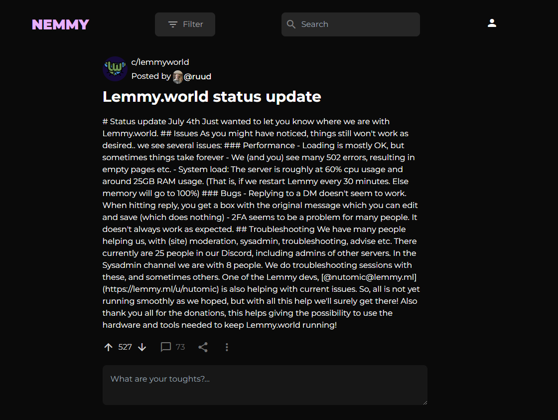
Post Page

Today I mainly worked on the Post page, which "works" now.

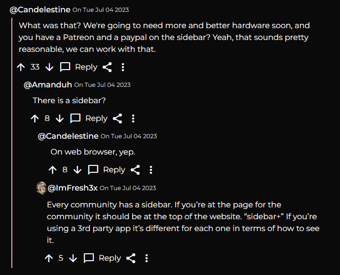
And here's how the comment section looks (there should also be comment chain lines for nested comments but I'm still working on that)

For some reason, the post content fails to load frequently and I'm not too sure if that's a problem on my side or if the popular Lemmy instances are still overloaded - I will investigate that further over the next days.

I've also made a loading card animation, which should be a lot better than the plain "Loading" text (which wasn't even visible in light mode)

Light Mode Updates

I also made big improvements to the Light mode (which right now can only be activated by setting the browser/OS theme)

Mobile design improvements

Well that's it for todays Update

Over the next days I will fix some current bugs and add more features like Login, Search and a Community Page. Thanks for stopping by!

5
1
submitted 1 year ago* (last edited 1 year ago) by Cr4yfish@lemmy.world to c/nemmy@lemmy.world


That version is live on Nemmy. Heads up: The Post page is buggy as hell right now. If it doesn't load, just refresh until it does.

6


Hey everyone, I'm back with todays progress update :).

As always, you can try out the newest version for yourself here

Design

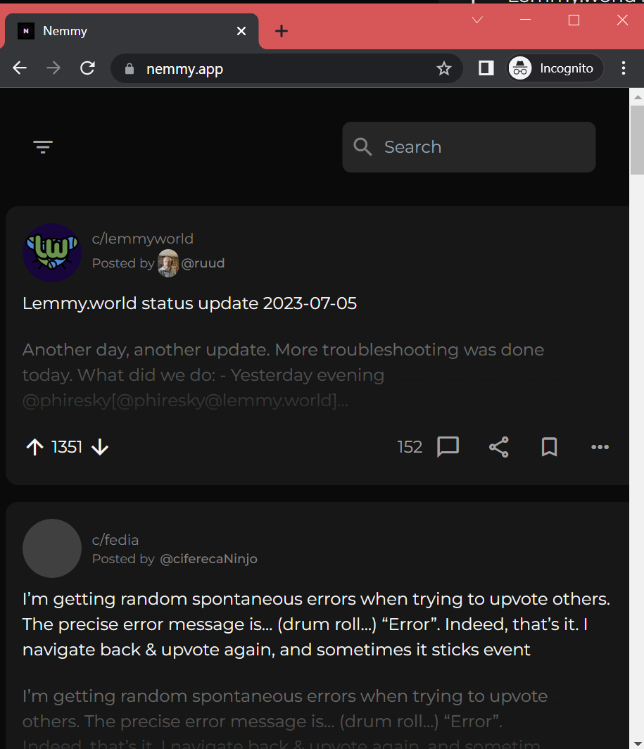
I updated the color palette because the black background was a little harsh on non-OLED devices. So now it's a little more shaded. The Post and Navigation Bar designs got also a little update.

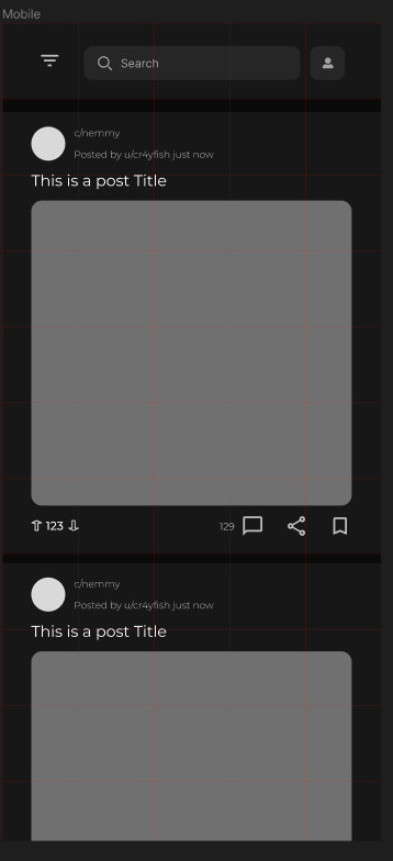
The new Mobile Design

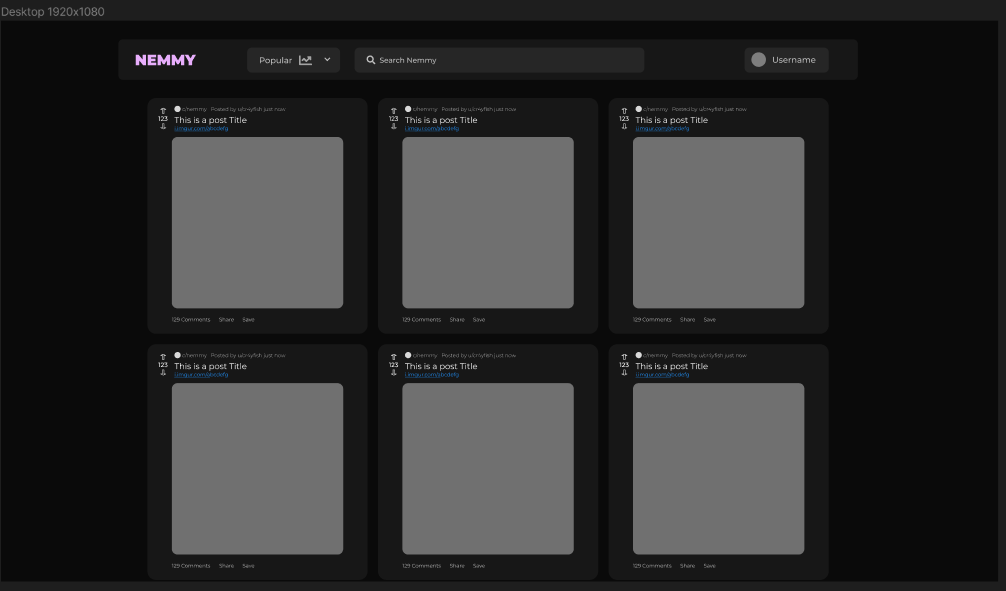
The updated Desktop design

Roadmap

For now, I will continue working on the Feed design and will also start designing the Post page tomorrow.

After that is done, I will code the login process and then all the features related to a user (e.g. the "Home" feed, commenting, voting etc.).

All-in-all I think it'll take about a week or so until the features are all there and the design is passable as a prototype.

Well, that's it for update 2!

Thanks for stopping by and I hope to see you next time :).

7
1
Dev update #1 (lemmy.world)
submitted 1 year ago* (last edited 1 year ago) by Cr4yfish@lemmy.world to c/nemmy@lemmy.world


Hi everyone,

this is the first progress update of Nemmy!

I'll start things off by answering a few questions you might have:

Why am I doing this?

I love the idea of Lemmy being a federated Network rather than a single entity like Reddit and I want to fully leave Reddit behind me and use Lemmy. However, I'm not that fond of the default design for Websites right now.

There are a few alternatives for phones, but not really yet for Desktop Browsers, so I'm doing one myself.

What are the Project goals?

The first goal will be to have all features a typical User would want working and a UX that's better than or on-par with the default Website.

Can I help out?

Yes! This project is, of course, fully open source. Here is the GitHub Repo.

Design

Currently, I'm designing the first iteration of the Website, this means that it's very rough (e.g. placeholder Images, Icons, Text).

As for the design, this is what I've got after around half an hour of trying things out:
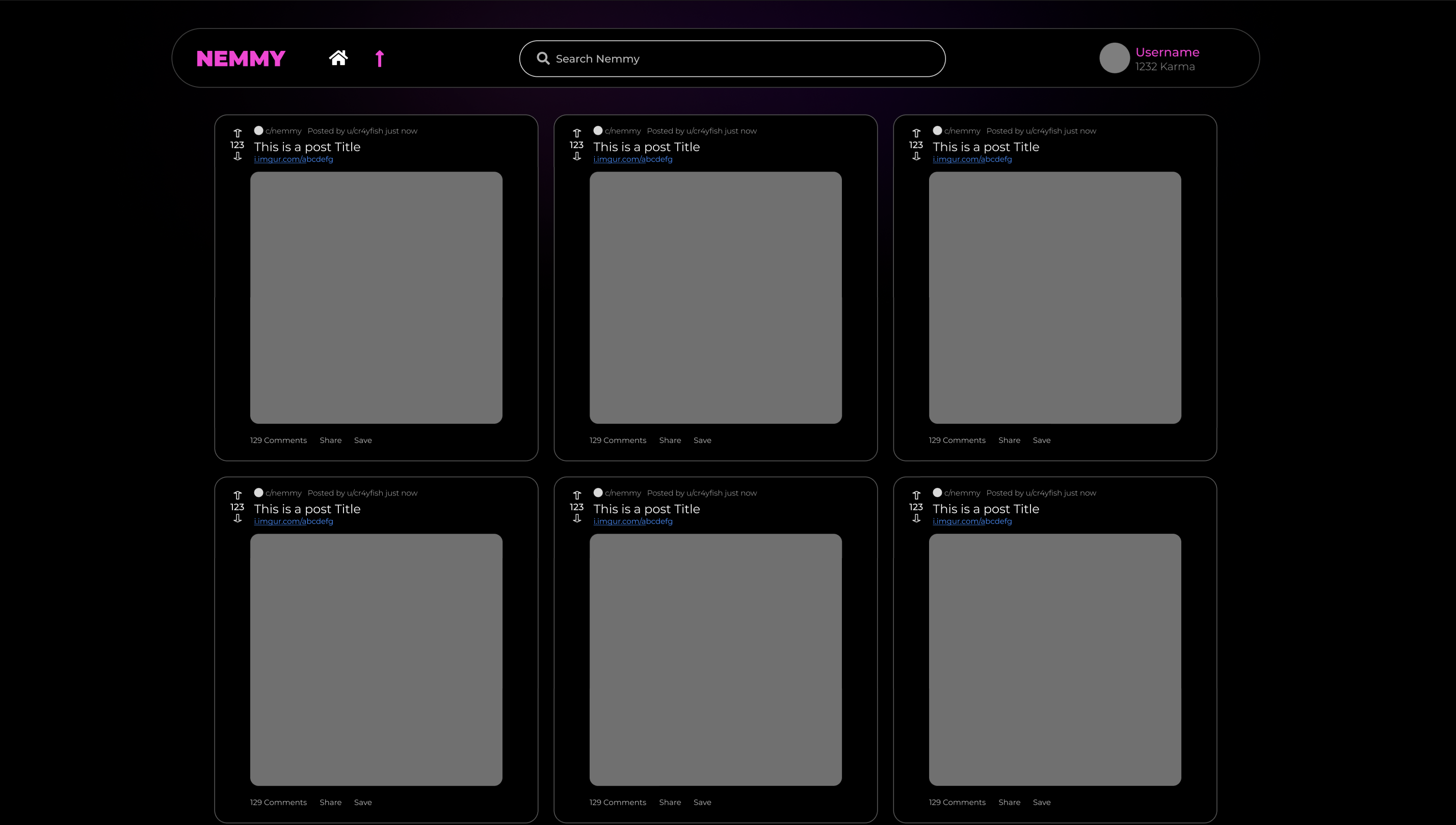
The Posts are "inspired" by Reddits design right now, but I plan to change that
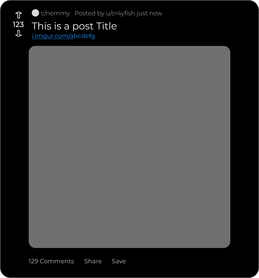
I'm also planning on adding a compact version (again, "inspired by Reddit for now)

Colors

As for the colors, I'm thinking dark mode by design with an optional light mode in the future. The Dark mode will heavily rely on black/shaded backgrounds, I'm going to refer to the Material Design 3 guidelines on that.

But I'm also planning on incorporating something like "Material You" into the Website, with which Users can change the complete color palette with ease.-->

That's it for Dev Update #1

If you have any questions, feedback, suggestions or anything else really, feel free to let me know :)
8


Welcome to Nemmy! This project is highly work-in-progress.

Right now I'm in the middle of the design phase and will be posting updates shortly.

If you have any feedback or suggestions, please feel free to share them with me :)