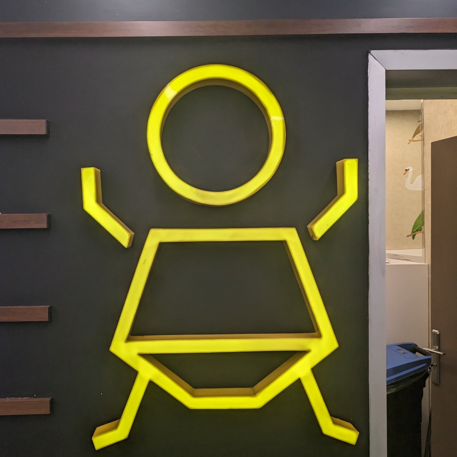
What's so bad about it?
Crappy Design
Noticed that theres no equivalent to r/crappydesign here yet so i made one
It's not the standard sign, so I'm not sure what it's trying to tell me. I'm guessing there's a diaper-changing station and it's a single-seat bathroom. Or maybe the seats are child-height?
But I'm not sure it's an issue in a place with a repeat userbase--the kids at a daycare, for example, will figure it out. However, at a skating rink or other place with a rotating userbase, it's confusing and unclear.
Looking at what's inside, it looks like a diaper changing station? The image is of a baby with a diaper?
But, yeah, if it's unclear then it's definitely not great.
I don't see anything wrong with it. It's clearly a picture of a baby outside of a bathroom that has a change station. What's the problem?
