this post was submitted on 30 Jan 2024
5 points (100.0% liked)

Constructed scripts for languages and number systems

15 readers
1 users here now

This is a community for sharing representations of language and number systems. Share any system you develop for any purpose, from fictional world building to alternative texts for real languages such as Shavian. Share what you create or interesting scripts you've found. Scripts can be for languages, number systems, or even other things like magic systems.

founded 8 months ago
MODERATORS
 

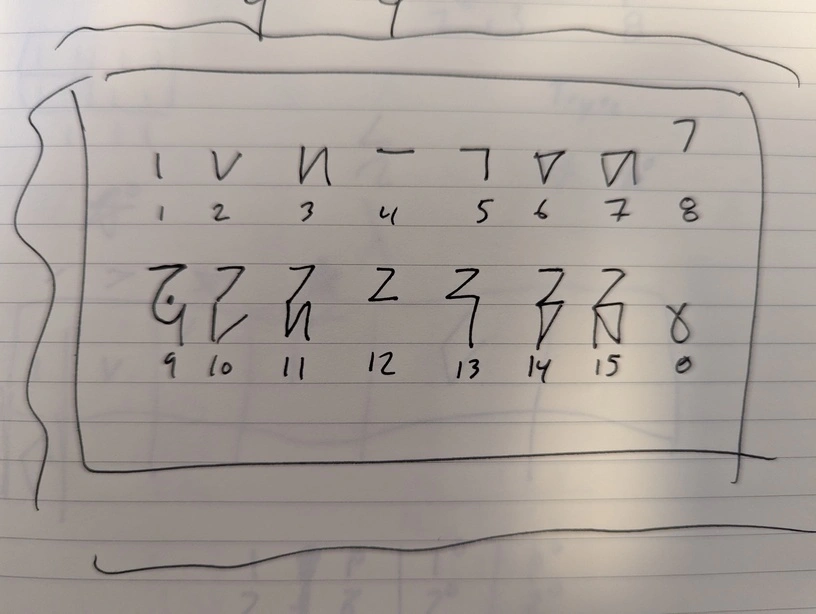
Hex characters 0-F don't visually provide any information about the underlying binary. I can't tell from reading 0-F representations of hex if a specific bit is set or not. It's necessary to convert to binary to notice things like parity set to odd/even/none. But raw binary isn't compact enough to easily look at.

Kaktovik Hex is a compact binary and hex representation based on some of the ideas behind Kaktovik Inupiaq. It supports the same visual arithmetic as Inupiaq, but also supports things like visual XOR. The bits of each nibble are represented as either | (for ones), V (for 2), or empty (for 0). The lower two bits are on the bottom, the upper two are rotated on the top. Every symbol can be written without lifting a pen.

top 7 comments
sorted by: hot top controversial new old
[–] exposable_preview 2 points 8 months ago (2 children)

This is very cool. So cool in fact that I want to contribute with some suggestions:

  • The part which I like the most is the ability to visualize how the numbers are constructed by adding parts together, and especially the fact that it (at least in my mind) reflects the binary representations. I'm specifically talking about the fact that to get a 3 you add the 1 to the RIGHT of the 2. The consistency is however broken with the number 15, supposedly for the easy of writing? I would prefer the 15 to look more like 3 / 7
  • There is some visual inconsistency with the 9, which has curved edges as opposed to all the rest (I don't mind the 0)
  • In addition to the previous point, I see the point (hah) as kind of a forced addition, despite it making sense, as I suppose you'd start confusing 9 and 11 / 13

After thinking about the above, I've made my own variation If the image is not clear enough, I've got a PDF which looks much better and I'll share somehow.

The main difference is the change of 8, which makes the >8s more consistent, and reduces the level of confusion. I've also added stroke order suggestions. My variation can also be written without lifting the pen off the paper, but for consistency's sake there are some symbols which I'd rather write with 2 strokes. I don't find that too bad though.

Please share some thoughts and good luck with the font!!

ps: for more inspiration there's also maya numerals

[–] hex_m_hell 2 points 8 months ago* (last edited 8 months ago) (1 children)

Thanks! This is awesome!

I like the change of 8 because it does make things a lot more consistent. Each mutation I've played with has some trade off. One element of the original is that it's actually constructed of only two glyphs, where the top is rotated. This means that the same rules apply to the top and the bottom.

The trade off of that is that 15 is hard to write (so, exactly right, I flipped it) and 9 becomes indistinguishable from 13 without some kind of marker. I used a curve and a dot to signify something like a zero in the 4's place. I've also played with integrating a zero glyph in the 4's place since that would serve the same purpose, could be written without lifting the pen, and would be consistent with the glyph pattern.

This mutation fixes both of those problems, but loses the consistency between the top and bottom. I do, however, like the cool side effect that 6 and 12 are mirrored. The writing guide is also nice.

I'll play around with these and see how they feel. I've been doing some math and writing dates with them to see how it goes. I'll try this mutation out and see how it compares in use.

Thanks again for the feedback!

Edit: oh, definitely want to call out that the coolest element (visual arithmetic) is not my own. That came from some kids in Alaska (thus the name) https://youtu.be/EyS6FfczH0Q

[–] exposable_preview 2 points 8 months ago (1 children)

Glad I could help! I'd like to follow the project, so please give some updates in the future. Also, when the font is finished, please make sure to share it!

I found about the writing system when searching for the Kaktovik on the web, but didn't see the video, so thanks for sharing!

[–] hex_m_hell 1 points 8 months ago

Absolutely! Someone else told me about /c/neography on lemmy.world. I will probably post there as well. I'll definitely keep you updated.

[–] exposable_preview 1 points 8 months ago
[–] territorial 1 points 8 months ago (1 children)

Is there more on this, or is this a first draft?

[–] hex_m_hell 3 points 8 months ago* (last edited 8 months ago)

It's just the first draft. I have a bunch of notes and I started a font file that repalces 0-9 A-F with these characters, but my font creation skills are somewhat lacking. I may upload that later just for completeness.

Edit: I have used it a bit for dates to see how it feels, and I've done some math with it. The deviation in the 9 character, and addition of a dot, comes from experimenting and finding that it looks a little to close to 13. I've switched the direction of the different sections a few times to make it easy to write.

It took a few iterations to get here, so this is maybe 1.5st draft. I'll try to add some follow up when I get a chance.