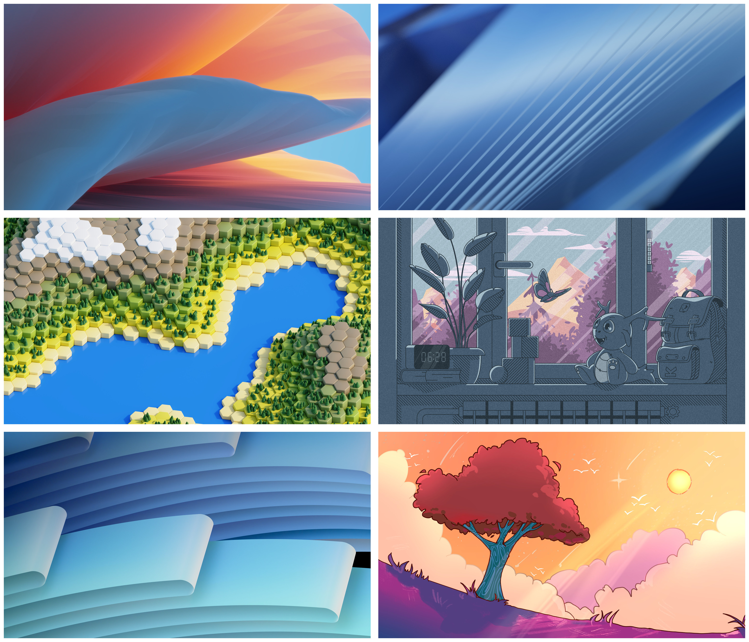
@kde@floss.social @kde@lemmy.kde.social An easy middle left from me!
KDE
KDE is an international technology team creating user-friendly free and open source software for desktop and portable computing. KDE’s software runs on GNU/Linux, BSD and other operating systems, including Windows.
Plasma 6 Bugs
If you encounter a bug, proceed to https://bugs.kde.org/, check whether it has been reported.
If it hasn't, report it yourself.
PLEASE THINK CAREFULLY BEFORE POSTING HERE.
Developers do not look for reports on social media, so they will not see it and all it does is clutter up the feed.
middle left
@kde@floss.social @kde@lemmy.kde.social Are you aware Mastodon supports polls in posts?
@kde@floss.social @kde@lemmy.kde.social I like the Maxfield Parrish riff on the one looking out a window
@kde@floss.social @kde@lemmy.kde.social Middle ones and bottom right. Especially the ones on the right are great!
- Middle right & Bottom Right --> love these
- Top row & Bottom left --> these are nice too, just a little generic
- Middle Left --> it's too bright and all the little details will make the icons hard to see
Bottom right
Middle right is epic!
Hexagon terrain is the best and super neat
@kde@floss.social @kde@lemmy.kde.social Yaaaay! Bottom and top left, for sure! They look cool, clean, and snazzy without being tied to any strange art style...
I'll have to say the style of bottom left gives a real sense of depth. And its a good size to be seen from afar on like a lockscreen, which is generally the only time my background is visible anyway.
I like the bottom left cause it's more in line with the style KDE normally selects.
Top right for "traditional", bottom right for something a little different/fresh from what you'd normally expect
I need real natural beauty like the mountains wallpaper
@kde@floss.social @kde@lemmy.kde.social The new wallpapers are very nice, I can't wait to see them in Plasma 6.0. As I understand this is not the final version, should we expect more improvements?
@kde@floss.social @kde@lemmy.kde.social I love all of these great artworks! 🥰 But the last one with the tree transports so much of detail and expression KDE stands for in such a lovely way which would make me choose this one! 😊✨
OOoh I love the bottom left and middle right
no 3 left side middle one
I'm a simple guy with simple tastes so I'm going to be apparently the only person in this thread to say top right
Non-figurative ones are boring, although beautiful: we had our share of those during previous editions of Plasma. But maybe they have a more corporate vibe... And they definitely are in line with current Plasma identity.
On the other hand, middle right and bottom right are really nice. I think I like middle right in particular, but it's probably too cute for me to be seen having such a wallpaper;). Bottom right it's much safer!
(That said... I will just switch to one of the "picture of the day" plugins, as usual).
Middle Right has a lot going on, you can look at it for a long time and not get bored.
