this post was submitted on 20 Jul 2024
491 points (95.4% liked)
Map Enthusiasts
3343 readers
556 users here now
For the map enthused!
Rules:
-
post relevant content: interesting, informative, and/or pretty maps
-
be nice
founded 1 year ago
MODERATORS
you are viewing a single comment's thread
view the rest of the comments
view the rest of the comments

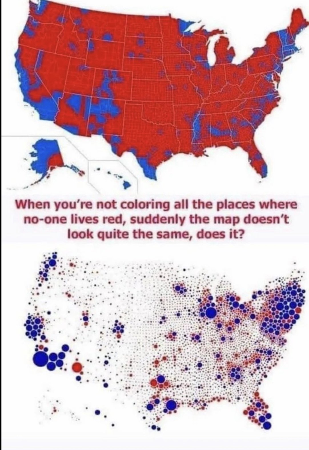
Frankly both of these maps are deceptive (though the top one is albeit more so). The dot gets colored the primary color in that region, and visually makes the Democrats seem way more dominant when it's much more bipartisan. A gradient would make this map better
the jpeg makes a lot of the smaller dots look grey too