this post was submitted on 30 Jul 2023
219 points (99.1% liked)
Unixporn
15359 readers
1 users here now
Unixporn
Submit screenshots of all your *NIX desktops, themes, and nifty configurations, or submit anything else that will make themers happy. Maybe a server running on an Amiga, or a Thinkpad signed by Bjarne Stroustrup? Show the world how pretty your computer can be!
Rules
- Post On-Topic
- No Defaults
- Busy Screenshots
- Use High-Quality Images
- Include a Details Comment
- No NSFW
- No Racism or use of racist terms
founded 5 years ago
MODERATORS
you are viewing a single comment's thread
view the rest of the comments
view the rest of the comments

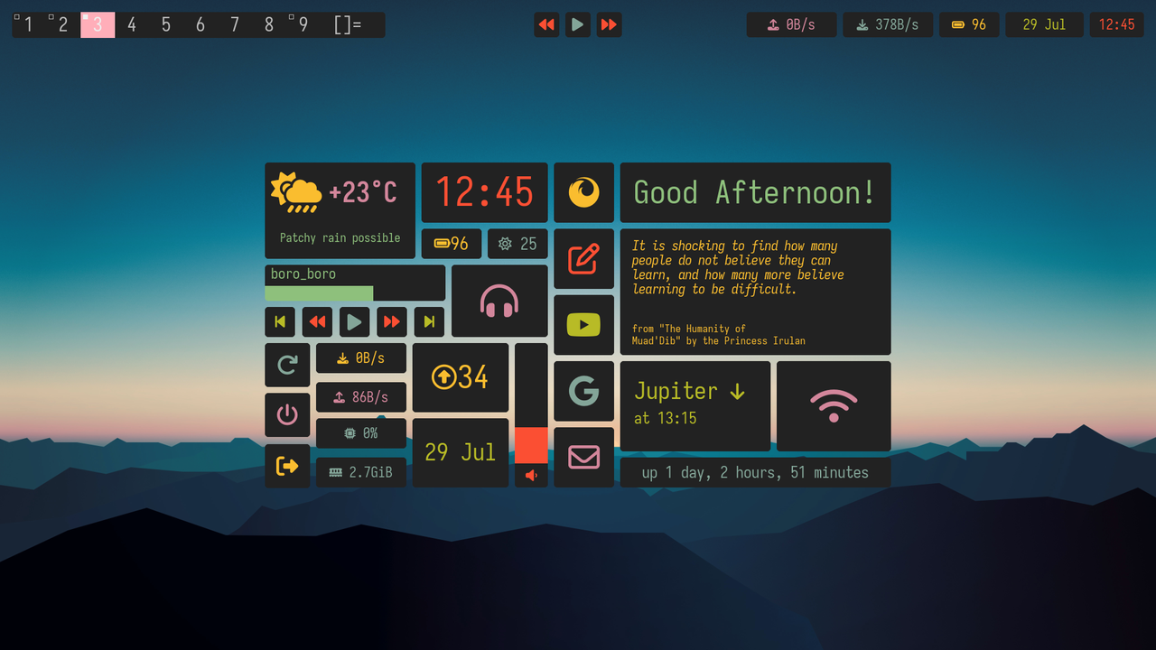
Everything seem to be neat but there is just one thing i couldnt bare with, please place play buttons icon just a bit right, i am sure it is in the center but since the left part is bigger it may seem better if it is near to right
Couldn't you fork the project and add an option to display icons centered in regards to their center of mass?
Yeah, but that was a suggestion for the OP, i dont like widgets indeed