this post was submitted on 23 Jul 2023
744 points (92.5% liked)
Data Is Beautiful
6891 readers
56 users here now
A place to share and discuss data visualizations. #dataviz
(under new moderation as of 2024-01, please let me know if there are any changes you want to see!)
founded 3 years ago
MODERATORS
you are viewing a single comment's thread
view the rest of the comments
view the rest of the comments

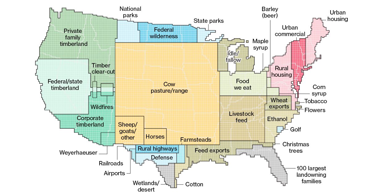
I have examined this abstraction of a map thoroughly.
I do not see any garbage dumps, recycling facilities, sewage processing, cemeteries, energy production, water production...
I could carry on, but this map means almost nothing with all sorts of factors missing.
Without digging in to the numbers further than just looking at this map, could this be because the relative areas of the factors you listed didn't pass a threshold to make it? @ezmack what data source was used for this?
Bloomberg article https://www.bloomberg.com/graphics/2018-us-land-use/#xj4y7vzkg