this post was submitted on 27 Mar 2024
693 points (98.3% liked)
linuxmemes
21378 readers
1868 users here now
Hint: :q!
Sister communities:
Community rules (click to expand)
1. Follow the site-wide rules
- Instance-wide TOS: https://legal.lemmy.world/tos/
- Lemmy code of conduct: https://join-lemmy.org/docs/code_of_conduct.html
2. Be civil
- Understand the difference between a joke and an insult.
- Do not harrass or attack members of the community for any reason.
- Leave remarks of "peasantry" to the PCMR community. If you dislike an OS/service/application, attack the thing you dislike, not the individuals who use it. Some people may not have a choice.
- Bigotry will not be tolerated.
- These rules are somewhat loosened when the subject is a public figure. Still, do not attack their person or incite harrassment.
3. Post Linux-related content
- Including Unix and BSD.
- Non-Linux content is acceptable as long as it makes a reference to Linux. For example, the poorly made mockery of
sudoin Windows. - No porn. Even if you watch it on a Linux machine.
4. No recent reposts
- Everybody uses Arch btw, can't quit Vim, and wants to interject for a moment. You can stop now.
Please report posts and comments that break these rules!
Important: never execute code or follow advice that you don't understand or can't verify, especially here. The word of the day is credibility. This is a meme community -- even the most helpful comments might just be shitposts that can damage your system. Be aware, be smart, don't fork-bomb your computer.
founded 1 year ago
MODERATORS
you are viewing a single comment's thread
view the rest of the comments
view the rest of the comments

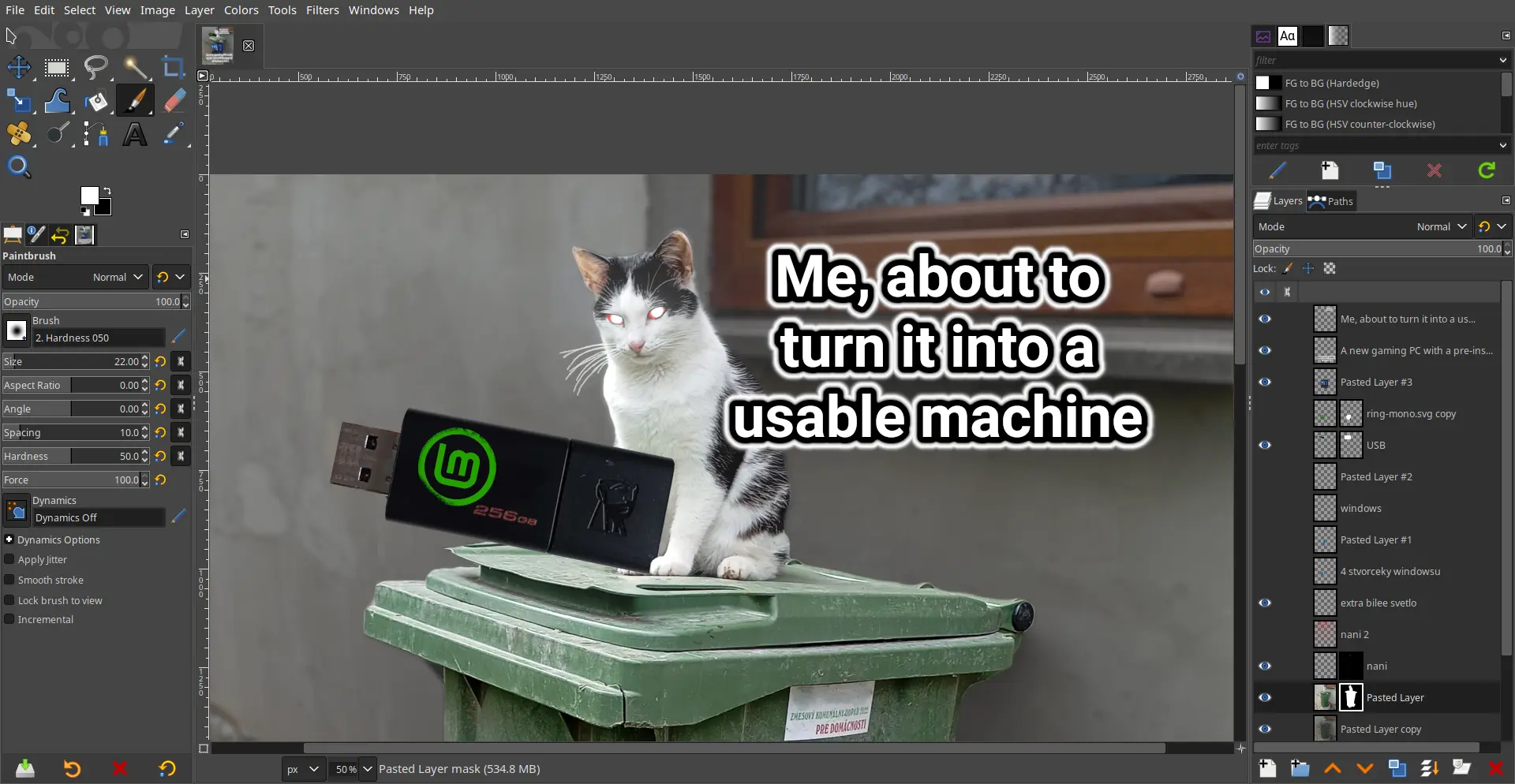
GIMP is great but it definitely needs its own Blender 3.0 moment where they just completely overhaul the UI.
I've used it as my primary raster app so I'm way used to it now, but I totally understand the people who just never even bother to learn it because they are so turned off by the absolutely bonkers design decisions.
The damn thing was written by a couple of College Students who had no experience with graphic arts and man does it show. The UI has been the number #1 complaint since the 1.0 release back in 1998; how it's never been updated / overhauled is simply beyond me.
It looks good to me...
Why? Looks basically the same as photoshop, which everybody seems to love.
Among other things:
You can change the icon theme in the settings to a color one. That's what I always do. The scaling can be changed as well.
May I ask what are some of the arcane options supposed to be?
How do you change scaling of buttons?
Not at PC for a few days but IIRC I was overwhelmed whenever going through any drop down menu.
Edit > Preferences > Interface > Icon Theme > Custom icon size
Newer versions of Photoshop have like 8 buttons and a toolbar which is terrible imo.
It is? How so?
Sorry for asking, I've used gimp forever, but I learned on photoshop. Its been a while since I switched, but I don't remember having any real issues learning gimp
The thing is, it's virtually useless for any real colour work, as it's rotten from the core.
So it needs:
I hate to say it, but it's probably more efficient to start fresh.
But it did get a UI overhaul a few years back. Seems good enough
Yeah, I learned to do what I need to do and if they ever change the UI now, I will forever be stuck with the version prior to that. I am NOT relearning the interface.