this post was submitted on 23 Jul 2023
744 points (92.5% liked)
Data Is Beautiful
6900 readers
1 users here now
A place to share and discuss data visualizations. #dataviz
(under new moderation as of 2024-01, please let me know if there are any changes you want to see!)
founded 3 years ago
MODERATORS
you are viewing a single comment's thread
view the rest of the comments
view the rest of the comments

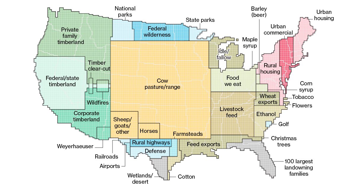
Seems like I'm getting 3 reactions to this map:
cannot believe how many people are confused that the use blocks aren't showing use in that location, just size in relation to the size of the country
Wait what? Oh God that's a horrible way to lay out data
I found it immediately extremely obvious and intuitive
I'd say put me under #3, but I'd need you to draw me a map and we all know how that went last time
Sick burn
Thanks for putting out what is at least an interesting and engaging graphic for us to comment on! I myself have two of the three reactions you listed