this post was submitted on 23 Jul 2023
744 points (92.5% liked)
Data Is Beautiful
6909 readers
1 users here now
A place to share and discuss data visualizations. #dataviz
(under new moderation as of 2024-01, please let me know if there are any changes you want to see!)
founded 3 years ago
MODERATORS
you are viewing a single comment's thread
view the rest of the comments
view the rest of the comments

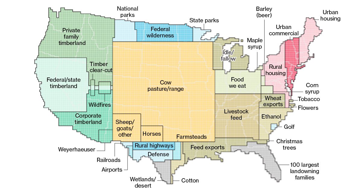
I have to tell you, there's plenty of farmed land on the entire west coast this map does not depict. Less than half of the areas labeled timberlands are forested, as a generous estimate.
Edit: as the comments under this state, I just didn't understand what was being represented and how.
I don't thing it's location specific. It's more like a pie chart where it's grouping the similar land typess together and then arbitrarily placing them on the US map.
I don't think this map shows where those things are, just how big they are in total. I'm not from the USA but I'm guessing there isn't just one gigantic ass national park up north and no more parks anywhere else.
You’re very much right! About 30/50 of our states have a national park, and every state has state parks. For example, Nebraska has only 8, while California has a whopping 284! The mean though is 45.6, which is still quite high.
I think the idea is, e.g. if farmed land would be a state what would be it's size?